The Android 5.0 Lollipop Review
by Brandon Chester on December 1, 2014 10:00 AM EST- Posted in
- Smartphones
- Android
- Tablets
- Android 5.0
Material Design
A good place to begin before discussing the operating system itself is to explain what exactly "Material Design" is. The term comes up a lot throughout the course of the review, which makes sense given how the biggest changes that users will see when moving from KitKat to Lollipop will be because of Material Design. Material Design is a set of design principles, and contained within them is something of a mission statement about Google's approach to services across multiple platforms. Material Design is definitely not Google's first big change to the Android interface, but this time I'm actually very confident that it will be the last we see for a very long time. I'm very impressed by the work Google has done to create an interface that looks and feels modern, simple, and beautiful. Before getting into what Material Design looks and acts like, I'd like to address and give my thoughts about Google's previous style of interface design which was called Holo.
To me, Holo always seemed like a transitional type of interface. Google had just brought on Matías Duarte, but as someone whose first smartphone was a Palm Pre, I didn't feel his influence anywhere at all. I think that Holo was a definite improvement over the previous Android interface, but that isn't really saying much. In my opinion, it still didn't feel coherent or look visually appealing. For example, if you showed me the two screens above without the status bar and navigation buttons, I would be hard pressed to tell you that they're from the same operating system. They don't share a single common interface element. The lack of color and use of grey was also questionable. While some users protest the heavy use of white in many modern interfaces, to me the grey that was commonly used in Holo Light applications was analogous to a dirty white cloth. The lacking color also made applications feel rather dull and lifeless, and I almost wondered if it was an effort to try and mask the fact that phones were shipping with either under-saturated or over-saturated displays by just having almost no color at all.
With my disappointment in Google's new interface, I was worried that it would just be something I would have to deal with for many years. Fortunately, less than one year after Android Ice Cream Sandwich was released, we were given a glimpse of the beginnings of a new type of design that was distinctly not Holo. It was in a feature called Google Now which launched with Android 4.1, and that many people now use everyday. This application used bright white cards to display relevant information, and had a much heavier use of color than any other applications that shipped along with Android. While at the time this could have been dismissed as the most obvious way to make an application that is constantly displaying and updating information for the user, in hindsight it was clearly the beginning of a new type of design being practiced at Google. It was still immature, lacking the animations, drop shadows, and dynamic nature of Material Design, but it began the dissolution of the Holo interface that had just been introduced.

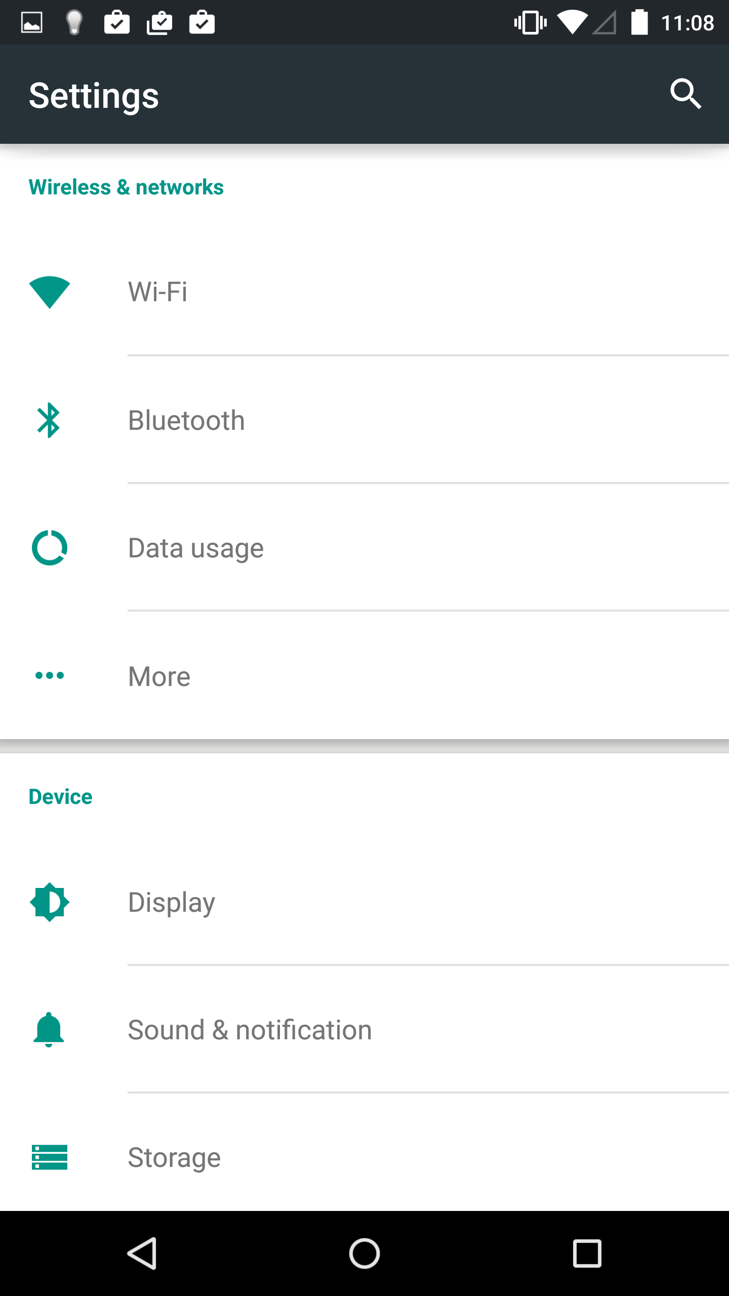
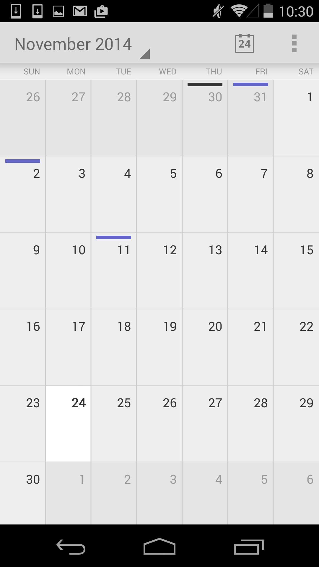
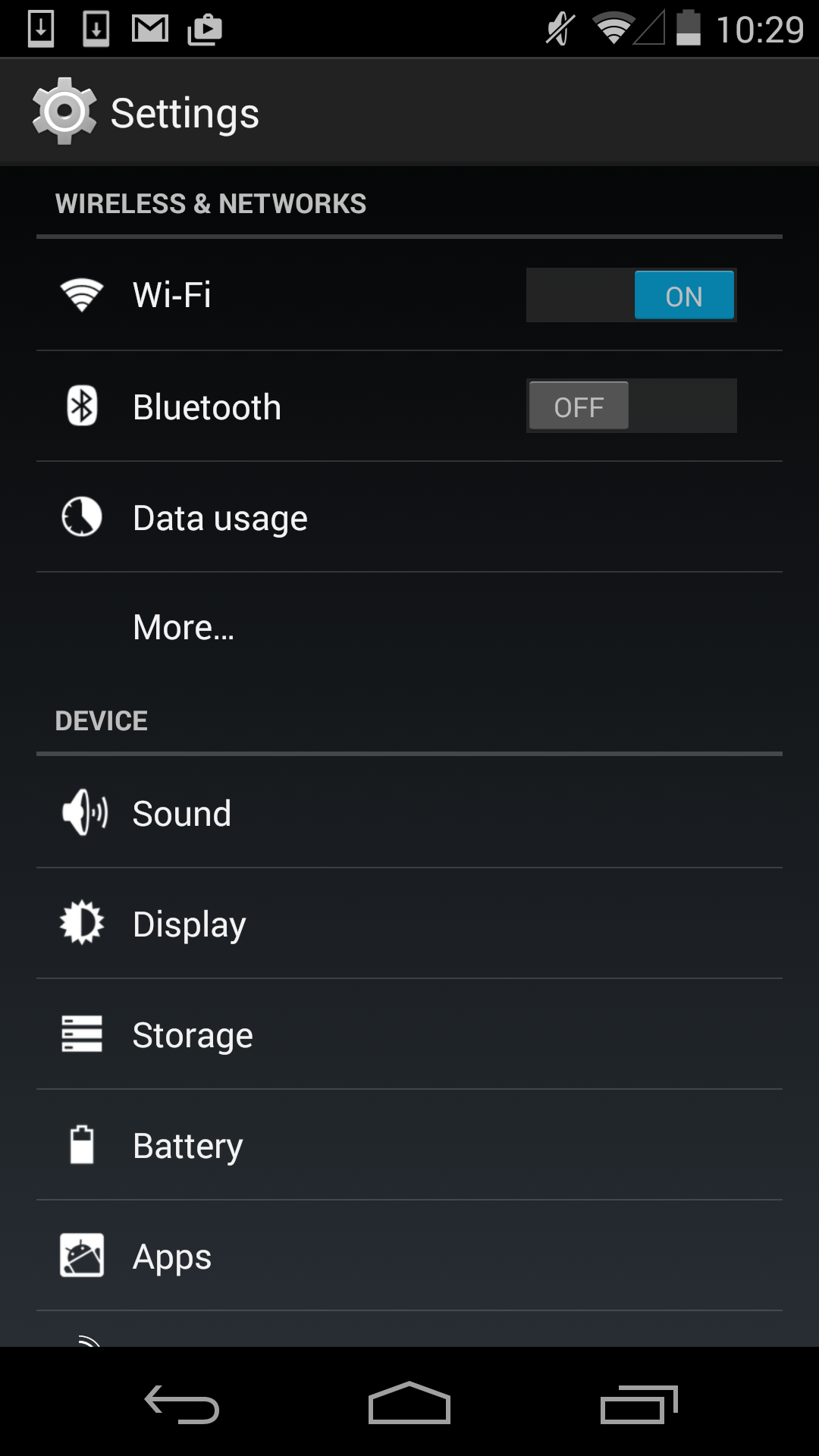
Finally with the end of Holo, comes the beginning of Material. When Google gave a sneak peek of the new interface for Lollipop at Google IO I was very excited by what I saw seeing. The basic idea of the cards in Google Now had been applied to the entire operating system, and expanded upon in ways that I hadn't expected but have been pleasantly surprised by. As you can see above, both applications display the sections of the interface on white cards that float above the background and cast slight shadows. There's also a much greater use of color, and a better use of screen real estate by dividing the application into multiple sections which can be seen in the new Calendar application. The Settings application is actually a bad example in this regard, as the increased spacing means the main page fits less on screen than before, but this is an exception and I included it primarily to show the contrast between new and old.
Material Design is based upon the ideas of paper, lighting, shadows, depth, and color. While this sounds a lot like the skeuomorphic interface of previous versions of iOS, Material Design doesn't limit itself based on the actual limits of physical items like paper, and it doesn't go to the point where applications are merely digital recreations of real world objects. There's also a heavy use of animations. Everything you touch seems to respond with an elegant animation, and the different cards in the interface can expand, contract, and stack atop one another to create an extremely dynamic feel. It is truly hard to explain, and it's really something that needs to be used to be fully understood.
The last thing to say about Material Design is how it represents more than just a way to design applications. Like I said earlier, within Material Design is a mission statement about Google's approach to services across multiple platforms. Although I've discussed it within the context of the Android platform, Material Design is going to be what you see in Google's applications across every platform. From web apps, to Android, to Chrome, to iOS applications, you will see a consistent style of design that adapts to different display sizes, use models, and methods of input. Overall this is a great step forward in making Google's services consistent across all devices, but I think in the context of iOS applications Google may be going a bit too far by ignoring the design guidelines of that platform in favor of their own.


126 Comments
View All Comments
tuxRoller - Tuesday, December 2, 2014 - link
I understand your frustration. There seem to be two issues at work: 1. not every one notices the slight stutters/lag in android, 2. Google doesn't care enough to fix the problem.vgjfelix - Tuesday, December 2, 2014 - link
If you fancy 50 Nexus 9 (and therefore pretty much 50 lollipop) tips and tricks in 15 minutes check out this video: http://youtu.be/aOkK0Dht2QAAlexey291 - Tuesday, December 2, 2014 - link
The question is however - have you actually tried using it on a 10" tablet (such as my nexus 10).Suddenly all that love for well thought out and impressive "material design" vanishes. And you realise that on a tablet the Material Design comes down to stretching a phone UI.
In fact the moment you realise you have to reach for the unreachable (with thumbs) middle of the screen to do anything to the notifications AND recents you realise that the whole "design" is basically screwed.
Oh and performance "increases" on droid are laughable seeing how the new UI is basically less responsive than it was before (because animations which take time = less responsive ui). In any case literally the first thing to do on a droid these days is unlock the dev settings and halve the animation duration. After that you may actually get some responsiveness. It was the same on 4.x and its even more so on 5.0
And the same UI stutter isn't going away either. Because you know... endless nand calls. Which is by the way the reason why Nexus 6 shows awful performance results. Because its Nand is slow (thanks forced encryption) the ui is slow. Its really amazing how a device that runs on better hardware runs slower and worse than a device that came a year before (N6 vs N5) because of encryption which is FORCED on a user.
But that's droid for ya. Its like the opposite of forced obsolescence - the newer the device the shittier it works...
darkich - Wednesday, December 3, 2014 - link
Ah I'm confused.. notebookcheck got great storage performance for the Nexus 6 in their review. (!?)Alexey291 - Wednesday, December 3, 2014 - link
I'll just leave this here :)http://www.anandtech.com/show/8725/encryption-and-...
Narg - Tuesday, December 2, 2014 - link
Yuck. New design is very bad, and looks much more difficult to navigate quickly and efficiently.Nandhu - Wednesday, December 3, 2014 - link
Hi,I am using Nexus 5 32gb. After Updating android version (5.0). Am not able to set custom rigntone in my phone.
Kindly help us on this.
baycorn - Wednesday, December 3, 2014 - link
nexus 9 review : pleasssssssssssssssssse!!!!!Hixbot - Thursday, December 4, 2014 - link
I don't mind the design with the exception of so much white color. Don't they know that OLED screens are dramatically more power efficient with non-white colors. Black pixels can be turned off all together. White colors actually lead to significantly worse energy efficiency on OLED compared to LCD.Alexey291 - Friday, December 5, 2014 - link
I think that its the case of "we know and don't care".