The Android 5.0 Lollipop Review
by Brandon Chester on December 1, 2014 10:00 AM EST- Posted in
- Smartphones
- Android
- Tablets
- Android 5.0
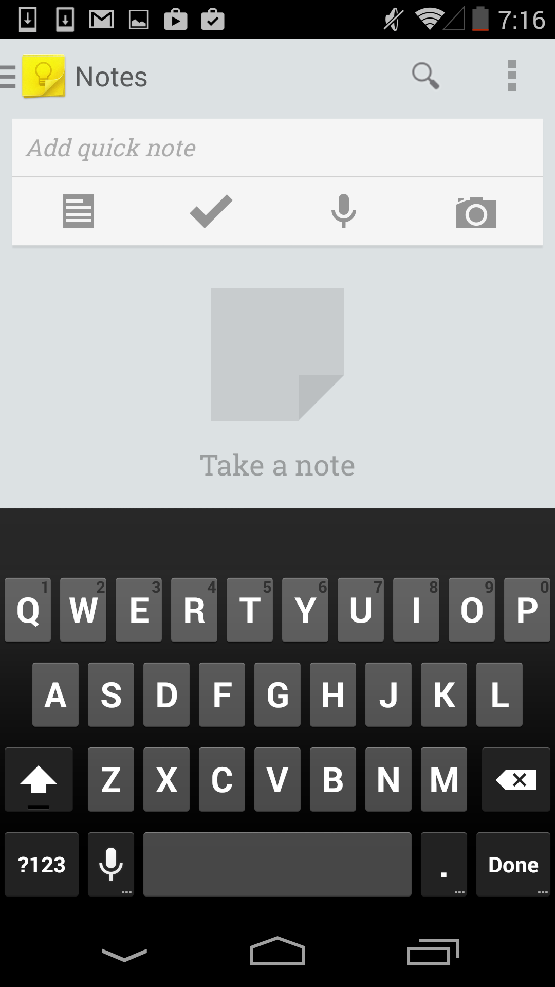
Lock Screen
The Android lock screen has gone through a number iterations over the years. With Ice Cream Sandwich Google settled on a design that was a lock symbol surrounded by a circle, which could be dragged to the right to unlock the phone, and to the left to open the camera. This solution didn't really have any issues, although I feel like the move away from the previous method of sliding right to unlock had more to do with legal pressure than anything else. As Android evolved, Google maintained the same overall design, but relocated the camera to a button in the bottom left, and allowed the user to drag the ring anywhere to unlock the phone. Google Now was also integrated into an upward facing arrow at the bottom. At this point, I think Google was adding too much for that original lock screen design to handle. The upward arrow seemed to imply that you were to swipe the circle upward to unlock, and the camera button functioned not like a button, but like a slider. This meant that Google had to have the camera slide in from the left even when the user had only touched the camera icon so they would be aware of what they were actually supposed to do, and at that point you need to accept that your design is flawed.
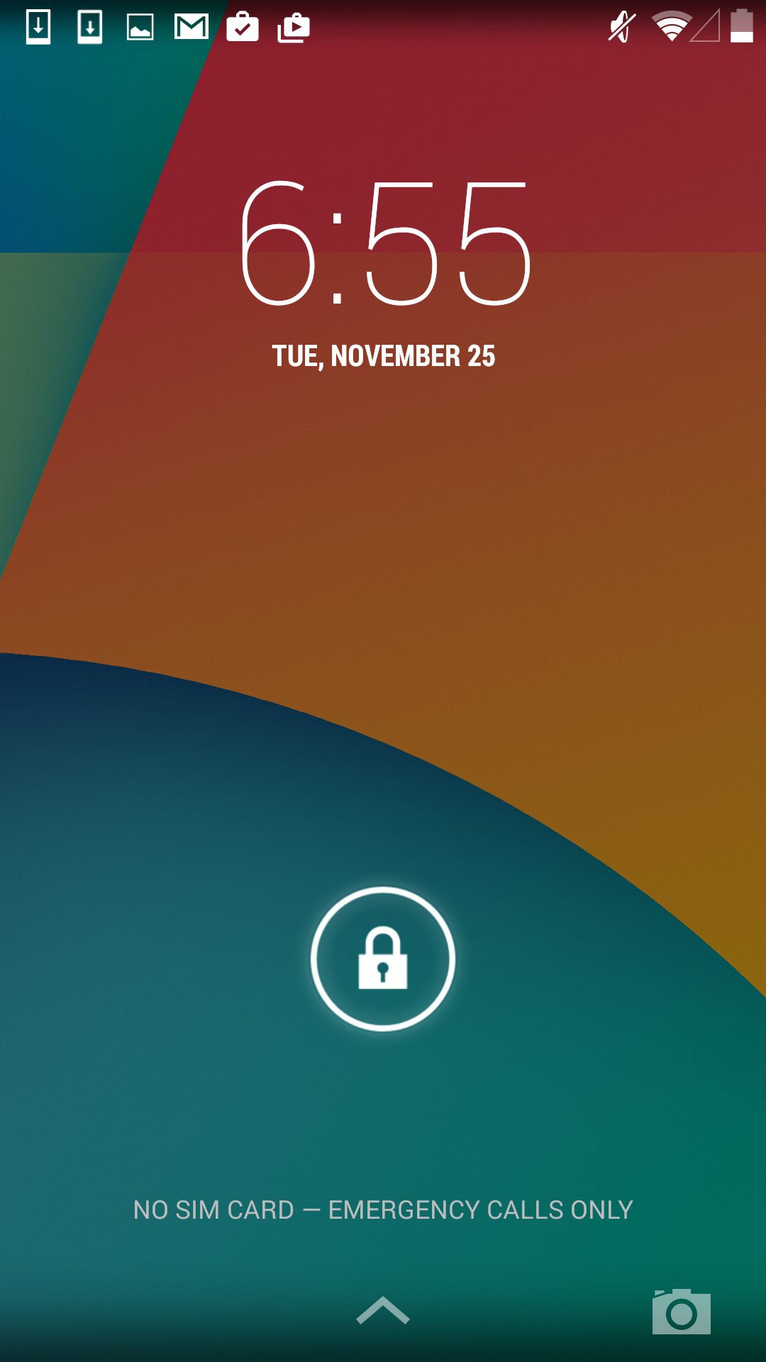
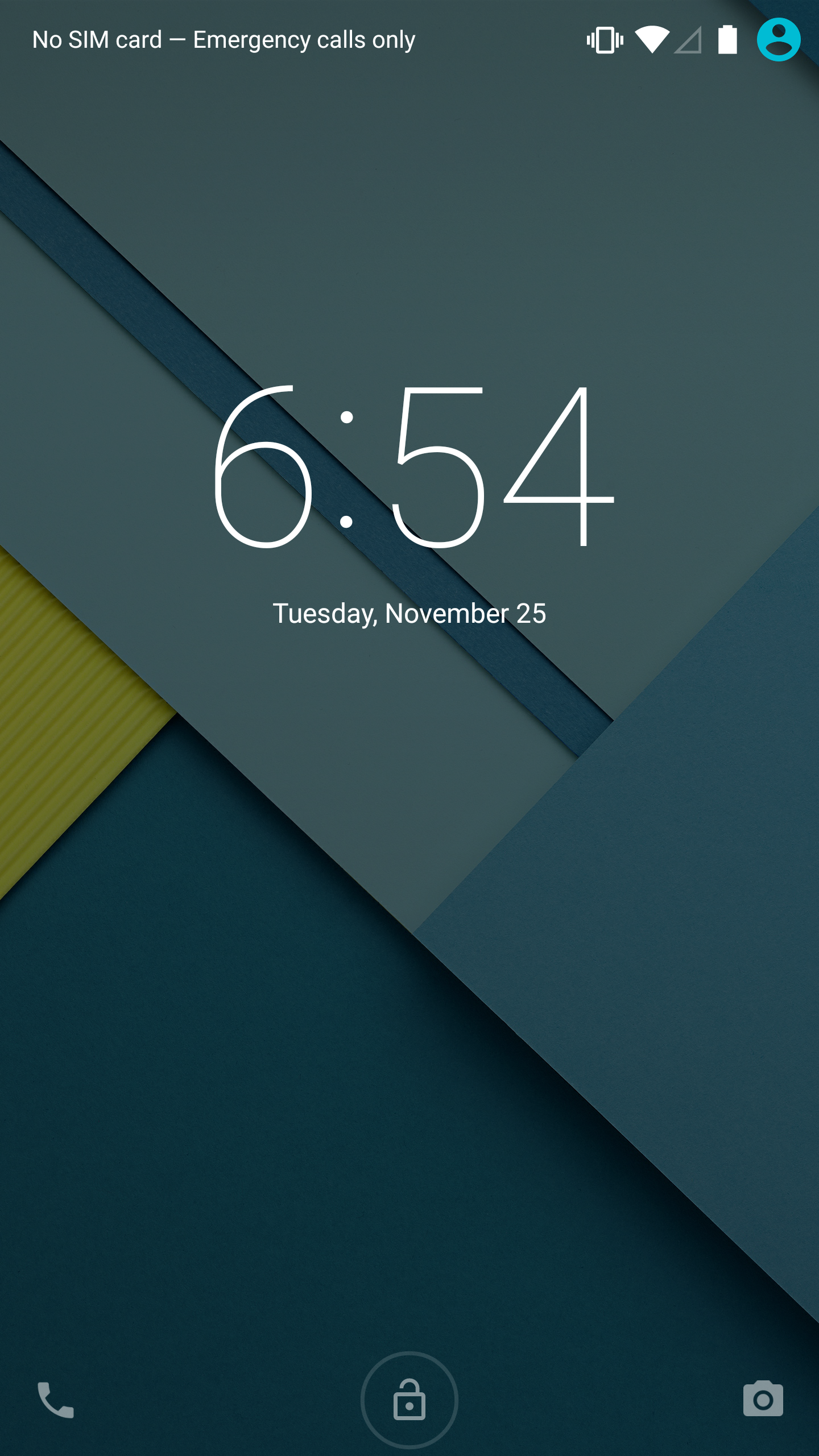
With Android Lollipop, Google has redesigned the lock screen to be much simpler. Although it's not immediately obvious what action should be performed to unlock the phone, tapping anywhere except the camera and phone icons causes everything on screen to bounce upward, and text appears telling the user to swipe up to unlock. I would argue that text could just be there constantly to make it more obvious how to unlock the phone, but the current design doesn't really hinder usability. Not constantly displaying the text also allows Google to let the user know how to use the icons on the sides, which are activated by touching and dragging toward the middle of the display. Tapping these icons displays a message explaining what to do to use them, and an arrow is displayed which points in the right direction. As you drag, a circle begins to expand outward from the icon, eventually automatically expanding past the edges of the display and revealing either the phone or camera application. It's a much more elegant solution than the previous lock screen quick access button, and I'm really happy that Google has put work into making it functional but understandable.
Launcher
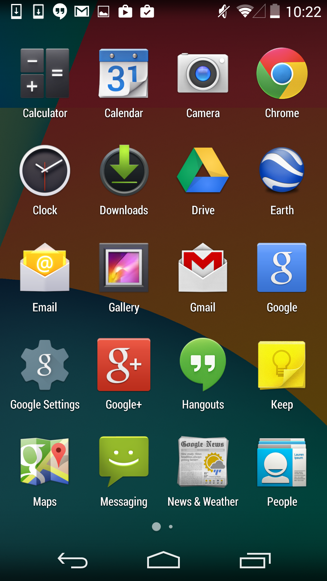
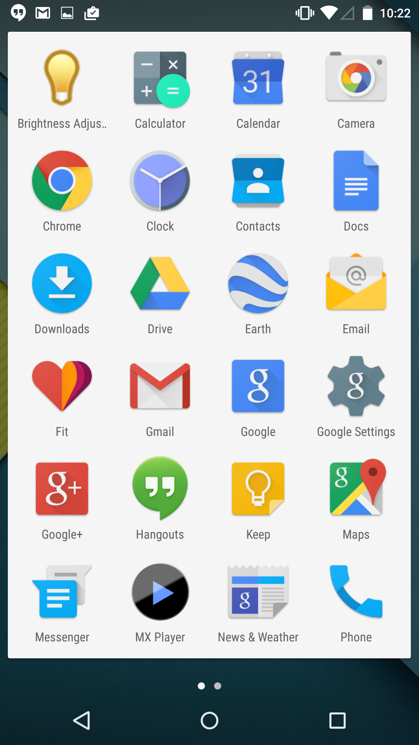
The Google Now launcher that ships with Nexus devices is functionally identical to its KitKat iteration in Android Lollipop. Visually, Google has made some tweaks to make it fit in with the rest of the Material Design applications. The most obvious is the change you see above, with the app drawer being given a white background that the icons now sit upon. The dots at the bottom that represent the current page you're on have also been made smaller, and the current page is now represented by a purely white circle rather than an enlarged one. Google has also made some more subtle changes with the animations. Attempting to swipe past the last home screen or page of apps in the launcher no longer has an animation where the icons appear to tilt to give it an appearance of depth. Similarly, the new animations in the app drawer are simple left and right transitions, without the depth of the original animation which showed one page sliding away and the next moving in from beneath. I'm not sure if I like the new launcher as much as the old one. While it definitely fits in better with the rest of the operating system, I liked the old transparent app drawer background more than the original black background or this new white one.
One other thing to note about the launcher is about Live Wallpapers. I'm including this here because it doesn't fit anywhere else but it's something I thought was worth mentioning. It feels like over time Google has been slowly removing stock Live Wallpapers from Android. I don't know if this is due to performance reasons, battery life issues, or some other problem. In any case, it should be noted that while the Nexus 5 maintains its Sun Beam wallpaper when upgrading to Lollipop, the Nexus 6 does not come with a single live wallpaper.
Keyboard and Navigation Buttons
Apart from the removal of the orange text highlighting in the suggestions bar, Google's Android keyboard has been essentially unchanged since Android Gingerbread. This was fine for quite some time, as it fit in well with the overall design of Android. But with Lollipop, that black and grey keyboard would look quite out of place. Thankfully, like the rest of the OS, the keyboard receives a visual update in Lollipop. Most obvious is the change from a black to a white background, and the removal of the separate key for each letter. It's a very interesting and minimalist take on a keyboard, and although I initially thought it might make it more difficult to hit the right keys, I've had no such issue in actual use. Google has also moved the voice dictation button up into the suggestions bar, which will be a welcome change for users who want it enabled but that ended up accidentally hitting it due to its position next to the space key. Users who prefer the darker colors of the old keyboard are able to switch to a Material Dark themed keyboard which is dark blue with white letters, but is otherwise the same as the Material Light version.
The last thing I'd like to comment on are the new navigation buttons. Like the keyboard, they're much simpler and more minimalist in Lollipop than they were in KitKat. Users who are familiar with Android will have no trouble with them, as they're in the same position and in the case of the back button and the button for recent apps they have a similar shape. The home button is a bit of an exception. Keeping in sync with the other two buttons which are simple shapes, the home button is now a circle. This is fine, and I'm glad it fits in well, but it's not quite as obvious as the old icon which looks sort of like a house with it's rectangular base and triangular top. The connection between house and home was fairly easy to make, and so it was obvious what it did. I suppose that Google believes that users are now familar enough with smartphones to be able to figure this sort of thing out relatively quickly.


126 Comments
View All Comments
nevertell - Monday, December 1, 2014 - link
And no comment on the move to 64 bit target platforms ?Brandon Chester - Monday, December 1, 2014 - link
That's just a result of the move to ART. I didn't want to just carbon copy Andrei's article, but it's linked in there and it's definitely worth the read.Maleficum - Friday, December 26, 2014 - link
It's the other way around: Android absolutely needs AOT-type compiler (ART) to decide between aarch32 and aarch64 prior to starting the process. If an app contains even a single JNI call to an aarch32 subroutine, the whole app HAS TO be compiled to aarch32, because no mode switching is allowed within a process.Your saying "apps are primarily written in Java" and Andrei's article are also misleading in just stating what Google claimed: 85% apps are written in Java.
Google most probably isn't lying with that, but the fact is: most TOP apps AREN'T written in Java.
I once checked top 25 apps in the US store: only two of them were written purely in Java.
What this means? 64-bit will remain just a gimmick on Android for the upcoming 4 years thanks to the fragmentation.
For 64-bit NDK apps, the devs HAVE TO set Lollipop as the minimum requirement since it REQUIRES AOT.
And will they do that? You know the answer.
OreoCookie - Monday, December 1, 2014 - link
Also, it seems much less clear whether and how much of a speed boost you actually get (as evidenced by the benchmarks run on the Nexus 9 where basically there is no difference between running Android in 32 and 64 bit mode).Krysto - Monday, December 1, 2014 - link
And what benchmarks are those? So far all the benchmarks I've seen are done in the 32-bit mode.kron123456789 - Monday, December 1, 2014 - link
Geekbench 3, for example.Martuv93 - Monday, December 1, 2014 - link
I haven't seen anyone do an AArch32 vs AArch64 showdown on Android yet.The Denver CPU is also a very weird thing so it might not benefit from the move to AArch64 in the same way for example the Exynos 7 Octa will.
kron123456789 - Monday, December 1, 2014 - link
I'm not even sure that Exynos 7 Octa will support AArch64))http://anandtech.com/show/8537/samsungs-exynos-543...
And, yes — Exynos 7 Octa and so-called Exynos 5433 are the same SoC.
garretelder - Thursday, December 4, 2014 - link
Good news! Now it's about time to upgrade to a TOP phone (see rankings such as http://www.topreport.org/phones/ for instance).extide - Friday, December 5, 2014 - link
Almost the same, the Exynos 7 does not have AArch64 disabled, like the 5433