Original Link: https://www.anandtech.com/show/8628/the-android-50-lollipop-review
The Android 5.0 Lollipop Review
by Brandon Chester on December 1, 2014 10:00 AM EST- Posted in
- Smartphones
- Android
- Tablets
- Android 5.0
Google has been very busy with their expansion of Android as a platform this year. At Google IO we saw the announcement of endeavors like Android TV and Android Auto. But the stars of the show were a preview of the next version of Android, code named Android L, and Google's new Material Design principles for interface design across all of their products. In the years since Android 4.0 Ice Cream Sandwich released, we've seen the launch of Jellybean and KitKat, but both of these versions were very iterative improvements upon 4.0 and had equally iterative version numbers with Jellybean being major versions 4.1 through 4.3 and KitKat being 4.4. Lollipop is given the major version number of 5.0, and it's quite fitting as it's arguably the biggest advancement to Android in a long time. It comes with an entirely new interface based on Material Design, a new application runtime, and many new features that I could not hope to summarize in this paragraph.
It can be difficult to begin a review of Android, as the definition of what Android is can be very dynamic. Android as an operating system that performs a set of functions is fairly well defined, but it's nearly impossible to define what Android looks like based on how it appears on most smartphones. The interface that Google has created for Android has matured greatly from its original iterations, but OEMs continue to put their own interfaces on top of Android to differentiate their devices. What applications are part of Android is also an interesting question. We can look to what applications are included in AOSP, but truth be told even Nexus users with "stock Android" aren't really getting an AOSP experience.
That may not be a bad thing for users, because many AOSP applications are quite bare compared to the Google applications that have superseded them. However, it poses a problem when deciding what should be discussed in a review of Android, and it has implications relating to how much of "Android" truly is open source. Google has also moved many applications over to Google Play so applications can be updated independently of the operating system, which bypasses many of the concerns about fragmentation from the days when application updates would come with Android updates that a user might never get. This adds an additional level of consideration when deciding which of these Google Play applications should be considered part of Android and discussed during a review.
For the purposes of this review specifically, I've attempted to take a look at most of the applications that come pre-loaded on a Nexus device which includes applications like Gmail that other people may contend are not actually part of Android due to them not being part of AOSP. It should also be noted that Google has been updating their applications to have a Material Design interface since it was originally revealed at Google IO, and some of the earliest updated applications have been excluded from the review as users are already very familiar with how they look an act by this point. We have covered many of these over the course of the year, and so readers who wish to see changes that were made to apps like Gmail and Google Sheets can look to our past coverage from when those applications were updated. To begin the review, we need to explain exactly what it means for something to have Material Design.
Material Design
A good place to begin before discussing the operating system itself is to explain what exactly "Material Design" is. The term comes up a lot throughout the course of the review, which makes sense given how the biggest changes that users will see when moving from KitKat to Lollipop will be because of Material Design. Material Design is a set of design principles, and contained within them is something of a mission statement about Google's approach to services across multiple platforms. Material Design is definitely not Google's first big change to the Android interface, but this time I'm actually very confident that it will be the last we see for a very long time. I'm very impressed by the work Google has done to create an interface that looks and feels modern, simple, and beautiful. Before getting into what Material Design looks and acts like, I'd like to address and give my thoughts about Google's previous style of interface design which was called Holo.
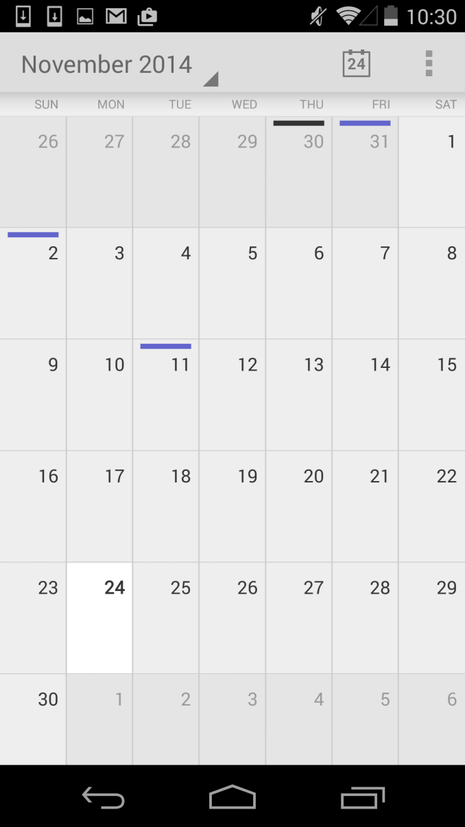
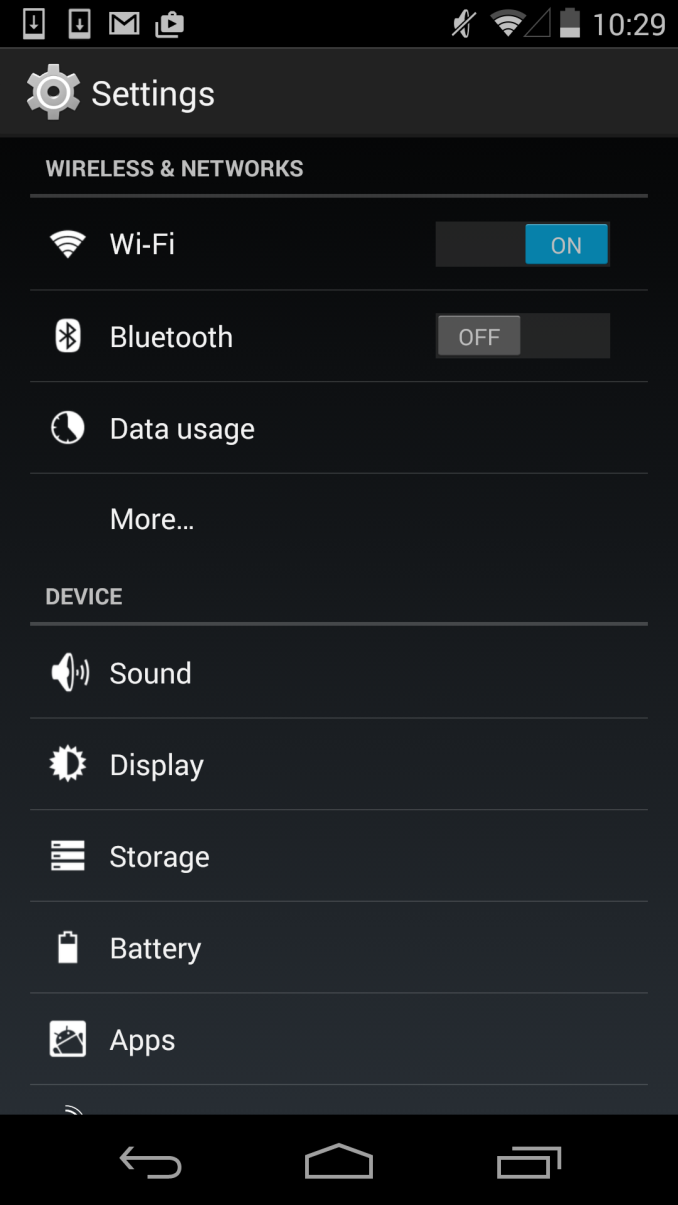
To me, Holo always seemed like a transitional type of interface. Google had just brought on Matías Duarte, but as someone whose first smartphone was a Palm Pre, I didn't feel his influence anywhere at all. I think that Holo was a definite improvement over the previous Android interface, but that isn't really saying much. In my opinion, it still didn't feel coherent or look visually appealing. For example, if you showed me the two screens above without the status bar and navigation buttons, I would be hard pressed to tell you that they're from the same operating system. They don't share a single common interface element. The lack of color and use of grey was also questionable. While some users protest the heavy use of white in many modern interfaces, to me the grey that was commonly used in Holo Light applications was analogous to a dirty white cloth. The lacking color also made applications feel rather dull and lifeless, and I almost wondered if it was an effort to try and mask the fact that phones were shipping with either under-saturated or over-saturated displays by just having almost no color at all.
With my disappointment in Google's new interface, I was worried that it would just be something I would have to deal with for many years. Fortunately, less than one year after Android Ice Cream Sandwich was released, we were given a glimpse of the beginnings of a new type of design that was distinctly not Holo. It was in a feature called Google Now which launched with Android 4.1, and that many people now use everyday. This application used bright white cards to display relevant information, and had a much heavier use of color than any other applications that shipped along with Android. While at the time this could have been dismissed as the most obvious way to make an application that is constantly displaying and updating information for the user, in hindsight it was clearly the beginning of a new type of design being practiced at Google. It was still immature, lacking the animations, drop shadows, and dynamic nature of Material Design, but it began the dissolution of the Holo interface that had just been introduced.
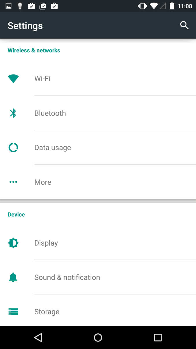
Finally with the end of Holo, comes the beginning of Material. When Google gave a sneak peek of the new interface for Lollipop at Google IO I was very excited by what I saw seeing. The basic idea of the cards in Google Now had been applied to the entire operating system, and expanded upon in ways that I hadn't expected but have been pleasantly surprised by. As you can see above, both applications display the sections of the interface on white cards that float above the background and cast slight shadows. There's also a much greater use of color, and a better use of screen real estate by dividing the application into multiple sections which can be seen in the new Calendar application. The Settings application is actually a bad example in this regard, as the increased spacing means the main page fits less on screen than before, but this is an exception and I included it primarily to show the contrast between new and old.
Material Design is based upon the ideas of paper, lighting, shadows, depth, and color. While this sounds a lot like the skeuomorphic interface of previous versions of iOS, Material Design doesn't limit itself based on the actual limits of physical items like paper, and it doesn't go to the point where applications are merely digital recreations of real world objects. There's also a heavy use of animations. Everything you touch seems to respond with an elegant animation, and the different cards in the interface can expand, contract, and stack atop one another to create an extremely dynamic feel. It is truly hard to explain, and it's really something that needs to be used to be fully understood.
The last thing to say about Material Design is how it represents more than just a way to design applications. Like I said earlier, within Material Design is a mission statement about Google's approach to services across multiple platforms. Although I've discussed it within the context of the Android platform, Material Design is going to be what you see in Google's applications across every platform. From web apps, to Android, to Chrome, to iOS applications, you will see a consistent style of design that adapts to different display sizes, use models, and methods of input. Overall this is a great step forward in making Google's services consistent across all devices, but I think in the context of iOS applications Google may be going a bit too far by ignoring the design guidelines of that platform in favor of their own.
Lock Screen
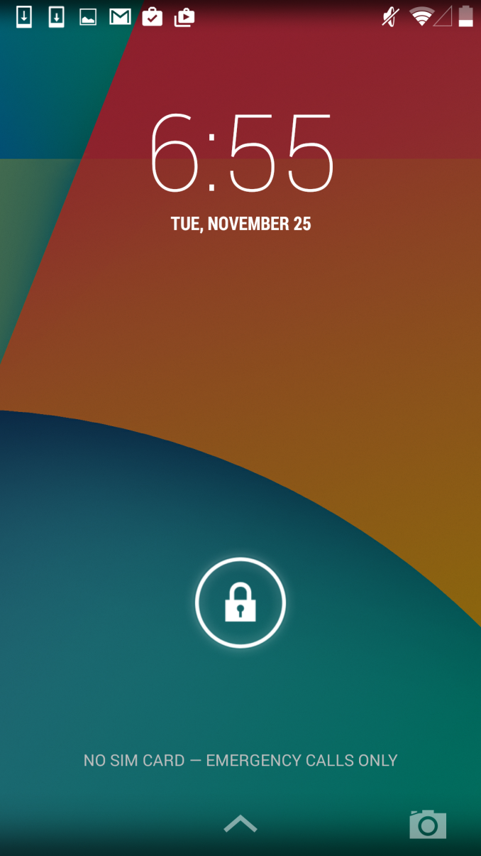
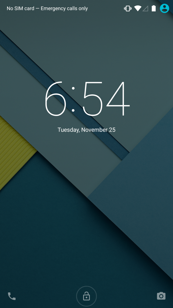
The Android lock screen has gone through a number iterations over the years. With Ice Cream Sandwich Google settled on a design that was a lock symbol surrounded by a circle, which could be dragged to the right to unlock the phone, and to the left to open the camera. This solution didn't really have any issues, although I feel like the move away from the previous method of sliding right to unlock had more to do with legal pressure than anything else. As Android evolved, Google maintained the same overall design, but relocated the camera to a button in the bottom left, and allowed the user to drag the ring anywhere to unlock the phone. Google Now was also integrated into an upward facing arrow at the bottom. At this point, I think Google was adding too much for that original lock screen design to handle. The upward arrow seemed to imply that you were to swipe the circle upward to unlock, and the camera button functioned not like a button, but like a slider. This meant that Google had to have the camera slide in from the left even when the user had only touched the camera icon so they would be aware of what they were actually supposed to do, and at that point you need to accept that your design is flawed.
With Android Lollipop, Google has redesigned the lock screen to be much simpler. Although it's not immediately obvious what action should be performed to unlock the phone, tapping anywhere except the camera and phone icons causes everything on screen to bounce upward, and text appears telling the user to swipe up to unlock. I would argue that text could just be there constantly to make it more obvious how to unlock the phone, but the current design doesn't really hinder usability. Not constantly displaying the text also allows Google to let the user know how to use the icons on the sides, which are activated by touching and dragging toward the middle of the display. Tapping these icons displays a message explaining what to do to use them, and an arrow is displayed which points in the right direction. As you drag, a circle begins to expand outward from the icon, eventually automatically expanding past the edges of the display and revealing either the phone or camera application. It's a much more elegant solution than the previous lock screen quick access button, and I'm really happy that Google has put work into making it functional but understandable.
Launcher
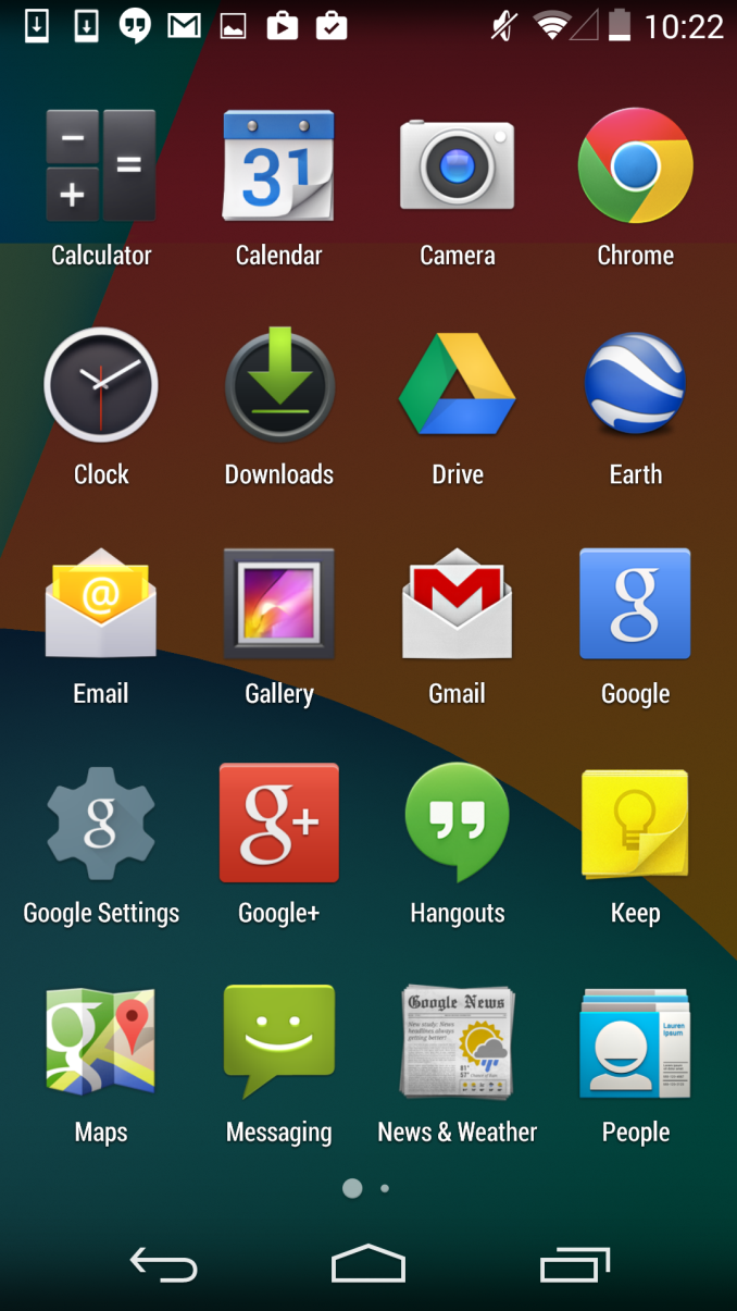
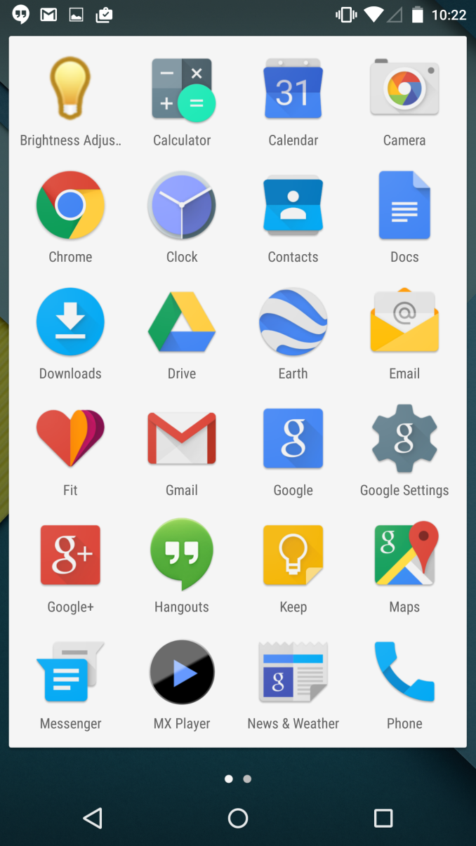
The Google Now launcher that ships with Nexus devices is functionally identical to its KitKat iteration in Android Lollipop. Visually, Google has made some tweaks to make it fit in with the rest of the Material Design applications. The most obvious is the change you see above, with the app drawer being given a white background that the icons now sit upon. The dots at the bottom that represent the current page you're on have also been made smaller, and the current page is now represented by a purely white circle rather than an enlarged one. Google has also made some more subtle changes with the animations. Attempting to swipe past the last home screen or page of apps in the launcher no longer has an animation where the icons appear to tilt to give it an appearance of depth. Similarly, the new animations in the app drawer are simple left and right transitions, without the depth of the original animation which showed one page sliding away and the next moving in from beneath. I'm not sure if I like the new launcher as much as the old one. While it definitely fits in better with the rest of the operating system, I liked the old transparent app drawer background more than the original black background or this new white one.
One other thing to note about the launcher is about Live Wallpapers. I'm including this here because it doesn't fit anywhere else but it's something I thought was worth mentioning. It feels like over time Google has been slowly removing stock Live Wallpapers from Android. I don't know if this is due to performance reasons, battery life issues, or some other problem. In any case, it should be noted that while the Nexus 5 maintains its Sun Beam wallpaper when upgrading to Lollipop, the Nexus 6 does not come with a single live wallpaper.
Keyboard and Navigation Buttons
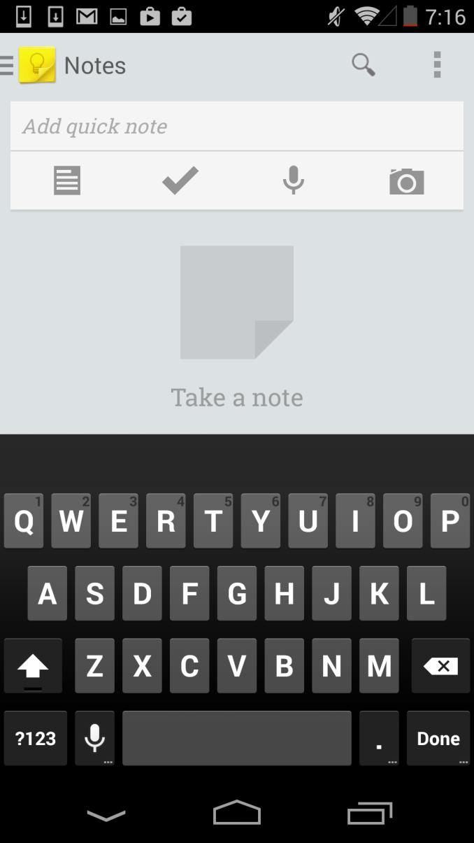
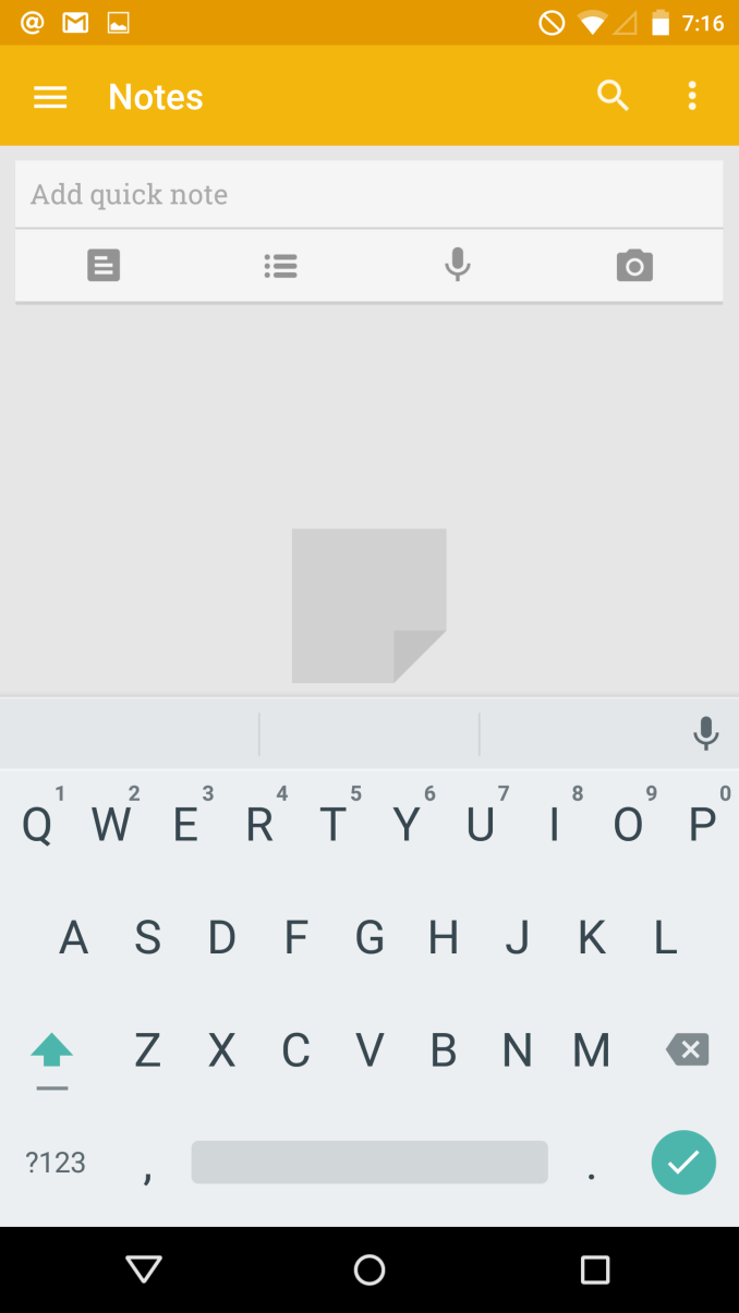
Apart from the removal of the orange text highlighting in the suggestions bar, Google's Android keyboard has been essentially unchanged since Android Gingerbread. This was fine for quite some time, as it fit in well with the overall design of Android. But with Lollipop, that black and grey keyboard would look quite out of place. Thankfully, like the rest of the OS, the keyboard receives a visual update in Lollipop. Most obvious is the change from a black to a white background, and the removal of the separate key for each letter. It's a very interesting and minimalist take on a keyboard, and although I initially thought it might make it more difficult to hit the right keys, I've had no such issue in actual use. Google has also moved the voice dictation button up into the suggestions bar, which will be a welcome change for users who want it enabled but that ended up accidentally hitting it due to its position next to the space key. Users who prefer the darker colors of the old keyboard are able to switch to a Material Dark themed keyboard which is dark blue with white letters, but is otherwise the same as the Material Light version.
The last thing I'd like to comment on are the new navigation buttons. Like the keyboard, they're much simpler and more minimalist in Lollipop than they were in KitKat. Users who are familiar with Android will have no trouble with them, as they're in the same position and in the case of the back button and the button for recent apps they have a similar shape. The home button is a bit of an exception. Keeping in sync with the other two buttons which are simple shapes, the home button is now a circle. This is fine, and I'm glad it fits in well, but it's not quite as obvious as the old icon which looks sort of like a house with it's rectangular base and triangular top. The connection between house and home was fairly easy to make, and so it was obvious what it did. I suppose that Google believes that users are now familar enough with smartphones to be able to figure this sort of thing out relatively quickly.
Notification Drawer
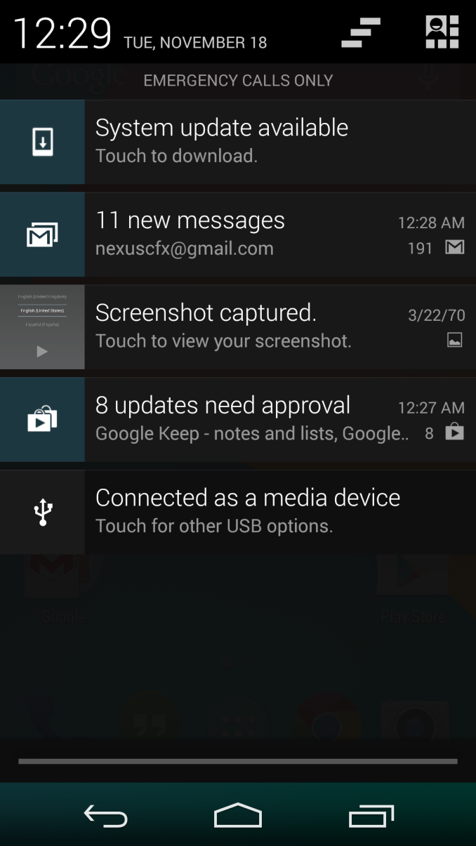
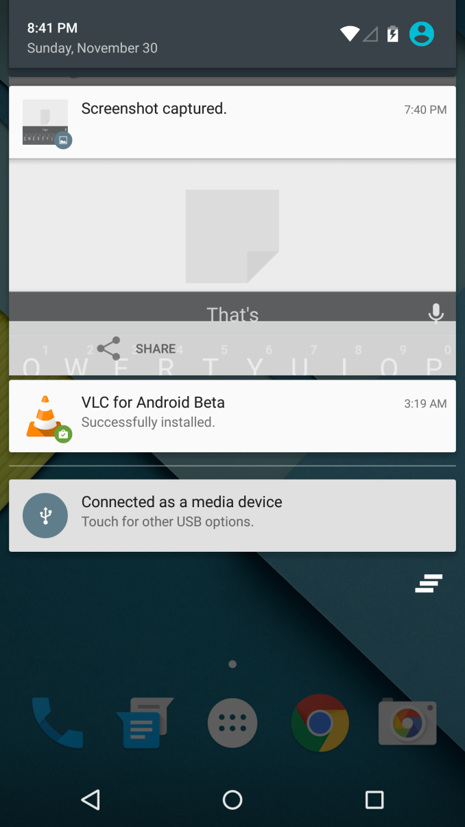
Android was the first of the major smartphone operating systems that we have today to implement the idea of a Notification Drawer. The idea of a screen to store all notifications that can be accessed from anywhere is something that both iOS and Windows Phone 8 have borrowed from Android. Although today it seems like the utility of such a design should be self-evident, it clearly was not, as iOS had previously resorted to intrusive alerts that displayed in the middle of the screen and interrupted the user. The designers behind Android's Notification Drawer certainly deserve a lot of credit for improving the state of notifications on mobile devices. In Android Lollipop the Notification Drawer has been redesigned to display like a list of cards, and has been simplified to include the quick settings page alongside the notifications themselves.
I never quite understood the animation for Notification Drawer in previous versions of Android. If you pull out the drawer in a desk, the first objects you see will be the ones that are closest to the side of the drawer with the handle. This is how the animation for pulling down Notification Centre on iOS functions. But on Android, pulling down Notification Drawer was like pulling down a magic bar that revealed notifications from top to bottom, as though they were already there and the bar somehow revealed them as it went over them. It just didn't really make any sense. In Android Lollipop, Google is clearly displaying each notification as its own separate card, and pulling down the drawer causes them to all expand and slide out from one another. Now it's not much of a drawer, but it's an extremely intricate animation that looks amazing and fits in perfectly with the Material Design aesthetic.
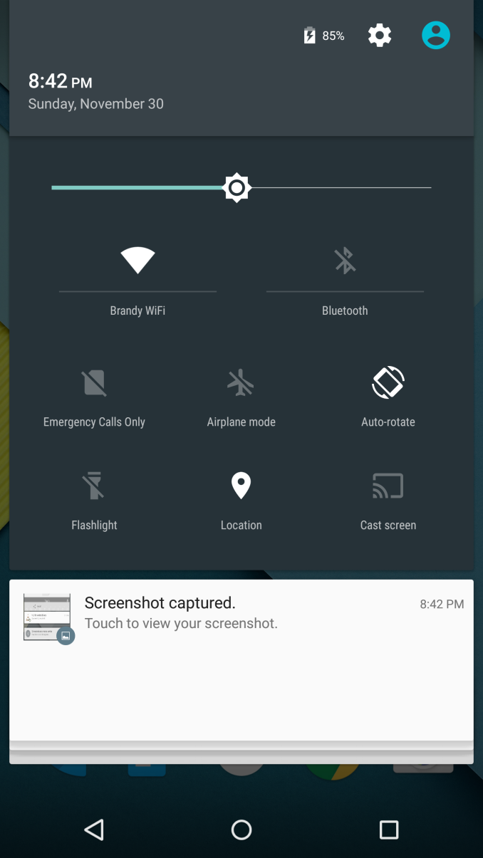
As you'll see above, the quick settings have been integrated into the same section as the notifications themselves. It's now accessed by simply swiping downward a second time after bring down the drawer. I think this works much better than the separate pages that Google was doing previously, which felt more like a way to just throw in quick settings without having to change the design of the drawer beyond the addition of a button. For the most part the settings are the same, but the brightness control is now a slider that can be accessed without having to press anything, and there are a few additions like the Cast screen and Auto-rotate toggles. Google has also finally included a built-in flashlight feature, which may not be welcomed by the developers of ad-ridden flashlight applications, but will certainly be welcomed by users.
The last thing to take note of is the icon in the top right corner. This would normally have your Google avatar, but in my case it's just one of the generic contact icons. Tapping this brings you to the menu where you can add, manage, and switch between multiple user accounts, which is a new feature for phones running Lollipop.
Overall I'm very happy with the new Notification Drawer. It looks better and does more than its previous iteration. My only issue is that it seems that the button to clear all notifications that appears beneath the last notification will not show up if there are too many cards. Swiping upward collapses the list of cards, allowing it to be displayed, but I think Google would be better off just putting it back up top where it was previously so it can always be shown.
Recent Apps
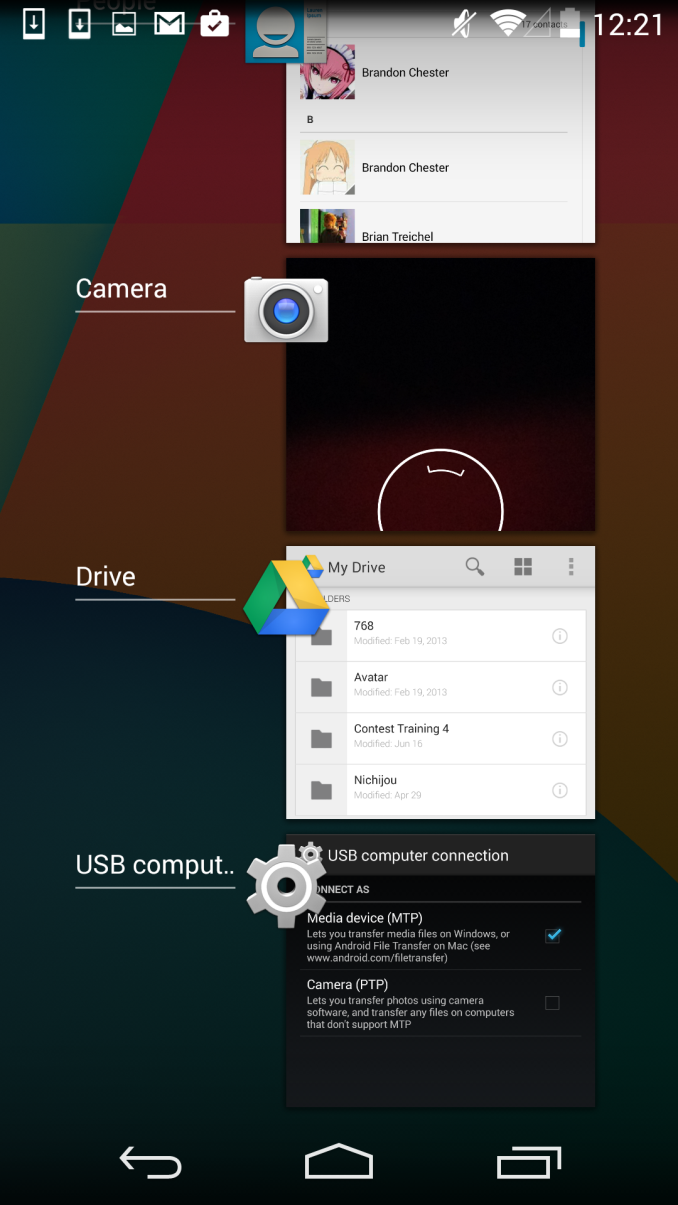
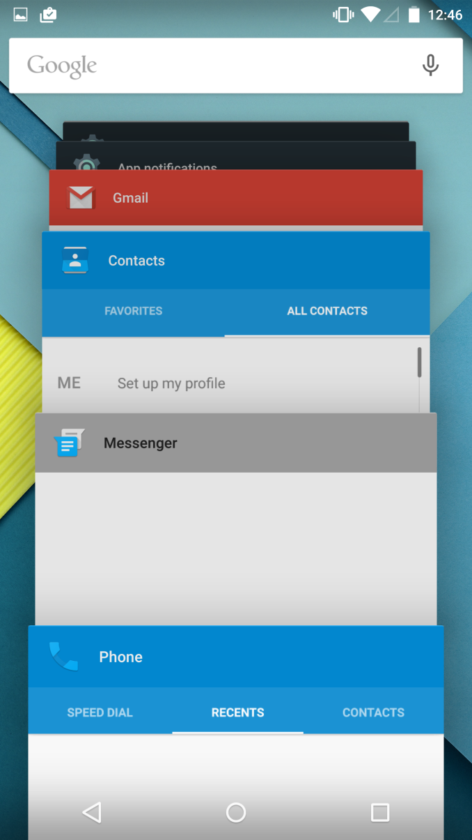
Like the Notification Drawer, Recent Apps also receives a design overhaul in Android Lollipop. What was once a list of square application previews is now something like a stack of cards which displays the full view of every application, although the perspective limits your view to the upper half. The new design also works well with the new animation when accessing it from within an app, which shows the application falling down beneath the navigation buttons and becoming the first card in the stack.
Functionally, it works the same as previous versions of Android for the most part. There is one significant change, and it's specific to Google Chrome users which I would expect is a sizable portion of the Android user base. In Lollipop, tabs in Google Chrome now appear as separate cards in the Recent Apps switcher. This is an interesting move on Google's part because in a way it knocks down a lot of the segregation between native apps and web apps, as web apps will be displayed in the list along with everything else. The only downside to this feature is that it can make it hard to keep track of tabs, and I've actually disabled it in the settings section of Chrome in favor of having the tabs within Chrome itself because I simply have too many tabs open at a single time to have to search for them among every recently opened application.
Google Fit
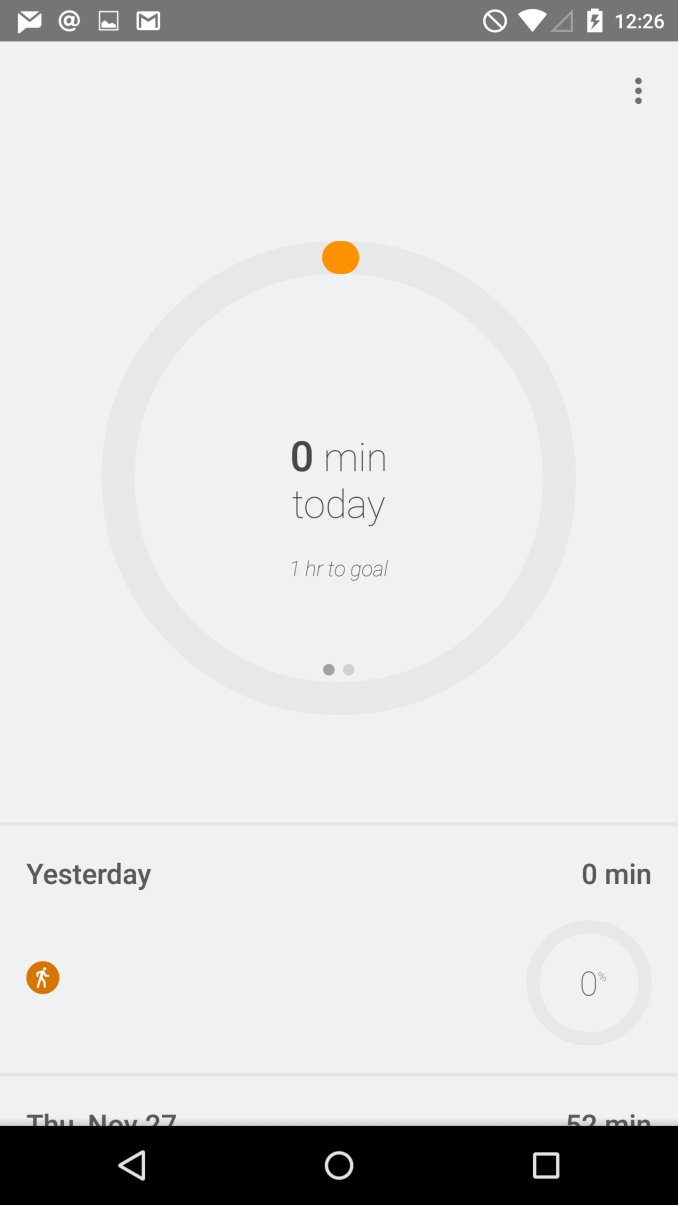
Google Fit was launched at Google IO, as an answer to other health systems put forth by Apple, Samsung, and other companies. Much like Healthkit and the Health app on iOS, Google Fit is a set of APIs and services which is accompanied by the Fit application on your Android device. With Lollipop on the Nexus 6, Google has included Fit by default as an application that cannot be uninstalled, which may be to the annoyance of users who don't really care for fitness applications.
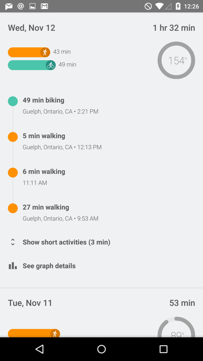
That being said, there are obviously quite a number of users who do use fitness applications, as the list of fitness applications and initiatives from both first and third party developers is growing rapidly. The distinction between health and fitness applications should probably be made here, as while Apple's Health app can track and store things like medical information, applications like Fit are limited to tracking exercise. As you can see above, the application is organized as a list of dates, with information about your fitness activity on each day. You can specify a goal for the amount of time you want to spend exercising, and the application will send you a notification when you reach it. The tracking is done by monitoring the various sensors in your device, and you can also input information manually if you prefer to exercise without your phone. I'm not really big on exercise, but during my time using the app it seemed to work reasonably well. I did notice it can sometimes categorize time spent in a vehicle moving slowly as time biking, but that's really just a limitation of how the information is being tracked.
Updated Applications
Contacts
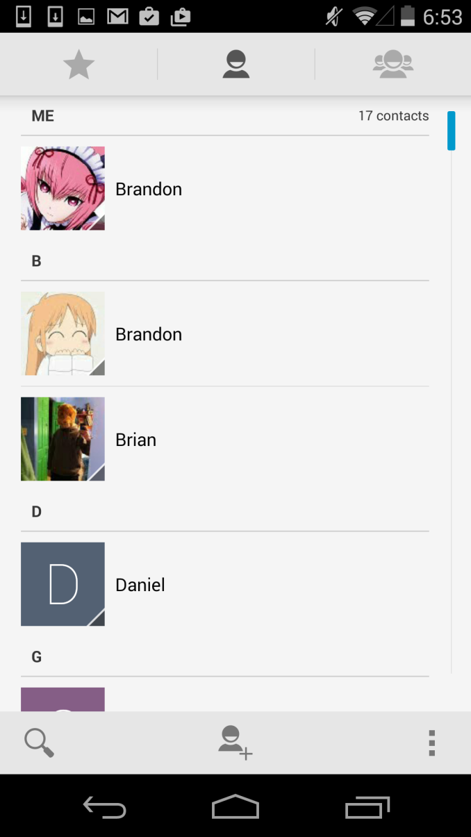
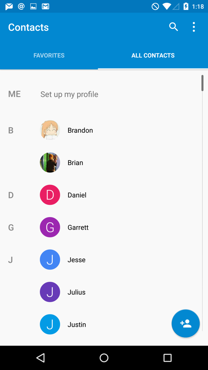
The People application has become Contacts in Android Lollipop, and the design is greatly improved from what was quite frankly an awfully designed interface. As you can see above, Google has given the interface a blue accent color and adopted the circular contact photo style that we've seen on other platforms. They've also cleaned up the interface significantly by consolidating the controls into the top part of the application, and by removing unnecessary parts of the interface like the lines that separated the contacts into sections based on their initials. These changes also improve usability significantly because the simplified interface is now made up of only two sections which are clearly labelled by their name, rather than by 3 icons that do not make it obvious what each section contains.
Calculator
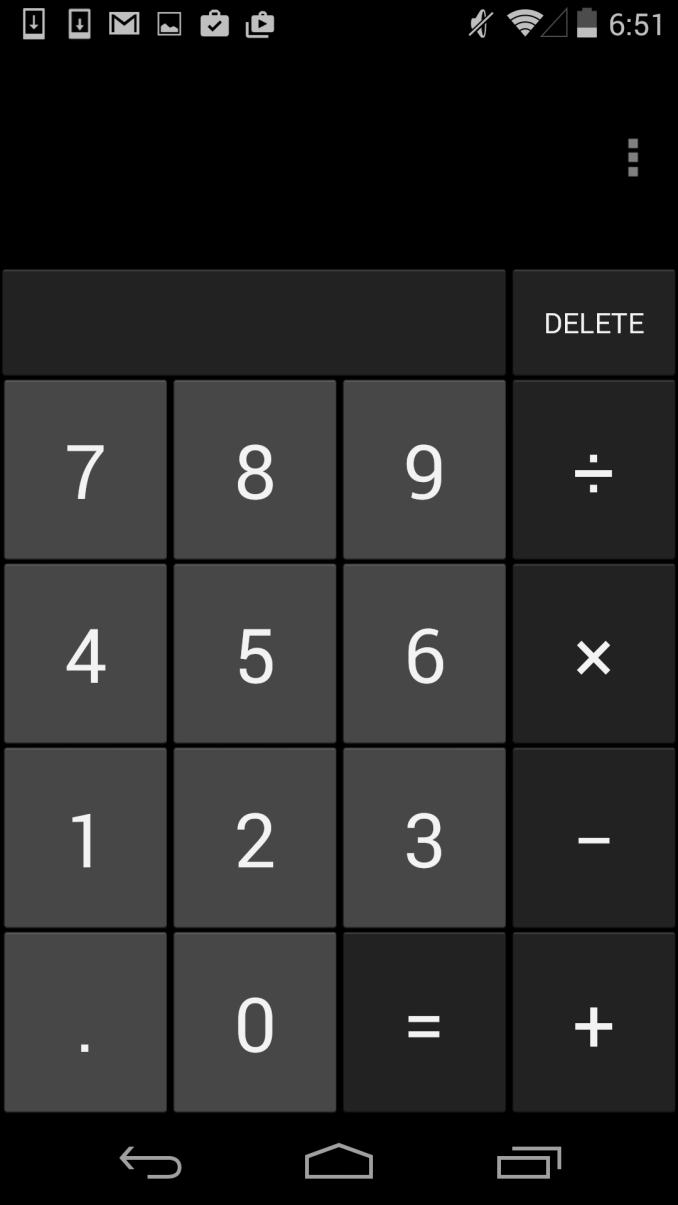
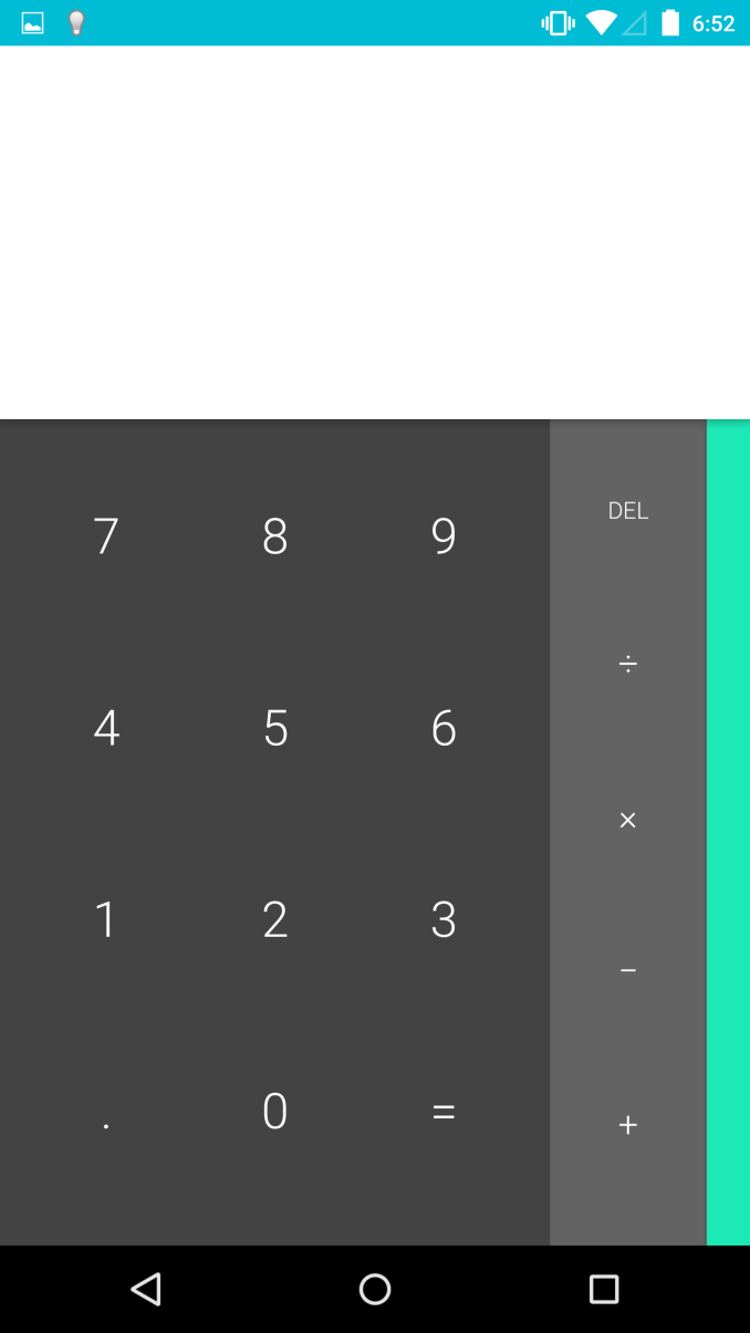
The calculator application also receives a complete visual overhaul in Lollipop. Much like the keyboard, Google has done away with the separate visual keys for each button in the calculator, allowing them to simply float atop a solid colored background. This also allows them to not be constrained by the rules of a virtual grid, which has made it possible to move the delete key downward in the row with the basic math operators. This change means that there's no longer an empty rectangle above the keypad in portrait mode, and more space to enter numbers and operators in landscape. You can also see above how the edge of the overlay with trigonometric, exponential. and logarithmic operators is visible on the right side of the main part of the application, which lets the user know that there is something to the right that they can pull on.
Google has also greatly improved the landscape view. In the previous version, switching to landscape simply put two buttons for parentheses alongside the numerical keys, with the more advanced operators still in a section that you would have to swipe to. This layout didn't do a very good job of taking advantage of all the horizontal space available in landscape mode. With the calculator in Lollipop, the landscape view shows every button in the calculator on a single screen, separated into three separate colored sections. This is a good improvement, although I think it would be helpful if Google implemented some more features, like dedicated keys for the cubic and cube root functions.
Messenger
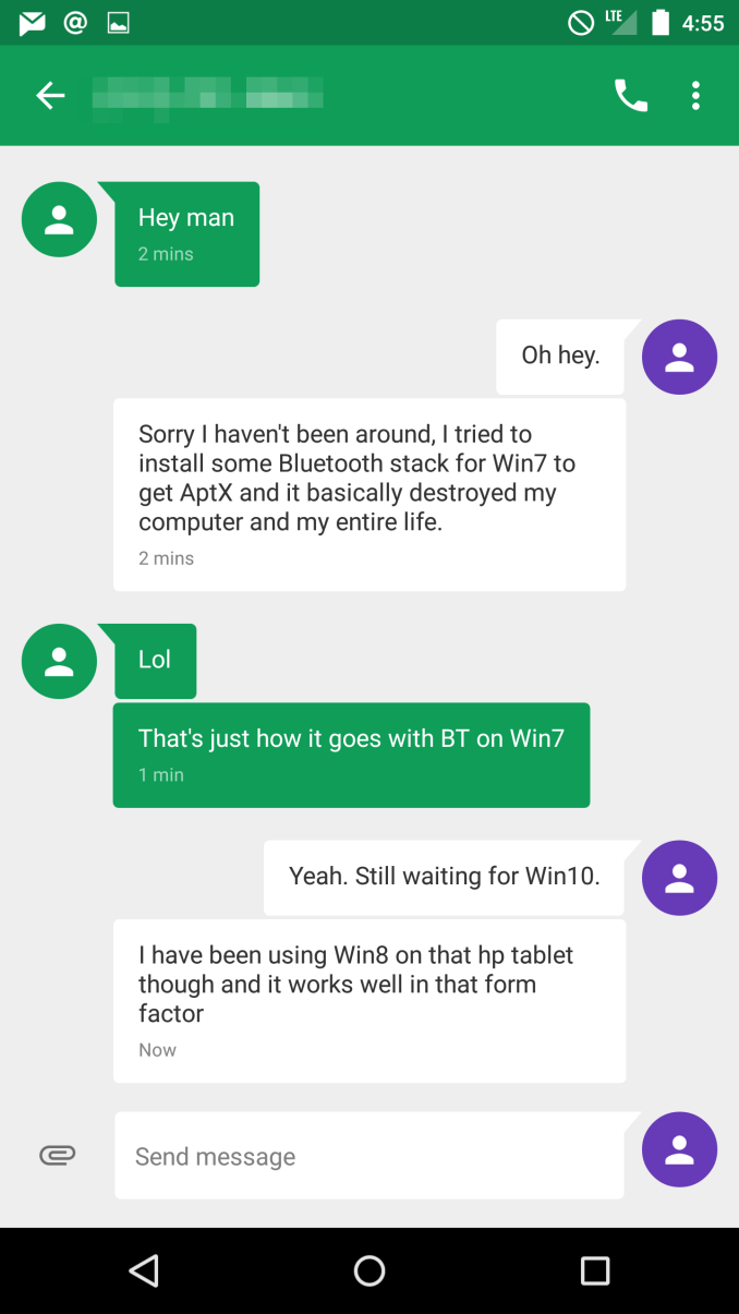
For a long time, I thought Google had just forgotten about the Android Messaging application. It seemed like users were being pushed toward using Hangouts as their SMS application. Lollipop brings an unexpected new application called Messenger, which is like a better version of the AOSP Messaging app. This is a good example of how what people think of as stock Android on a Nexus device is not really stock Android in the sense of using everything from AOSP. It should be noted that the Nexus 5, which never had the AOSP Messaging app, does not get the Messenger app when upgrading to Lollipop.
Messenger is also an interesting example of an application actually using more grey in Lollipop than in KitKat. The application uses a grey background, with white speech bubbles for messages you send, and colored ones for messages you receive. The color of the receiving ones can depend on if you have a contact photo assigned for the person you're texting or not. If you don't, it sets a random color for the speech bubbles. This makes for an interesting dynamic interface, but it can sometimes result in bright pink conversations that may be unwanted.
Google has also made some interesting changes to adding attachments for MMS messages. The paper clip icon has been moved beside the field for entering your message, and tapping it brings up an in-app camera interface that allows you to quickly take a photo of something and send it. Swiping upward expands the camera preview to the entire size of the display, and tapping the check mark takes a photo of whatever is in view. Google also also added an interface for the Photos app which behaves in the same manner beneath the text input field, and there's now a microphone button for recording and sending audio messages.
There are many more updated applications in addition to the ones I've discussed here, some of which appear in other parts of the review. Some applications which have been redesigned are very similar to their KitKat counterparts, but with new color schemes and small changes to header bars and buttons to fit in with the new Material Design style. Overall, I'm very happy with the updated applications in Android Lollipop. Truly redesigning an operating system requires a lot of work, and a lot of planning. For the most part, Google has avoided creating any inconsistencies by leaving in parts of the interface from older versions of Android, and it results in a new design that feels very thoughtfully created and implemented.
Camera2 API
Android's Camera2 API is one of the improvements in Lollipop that hopes to improve the camera experience on Android. While many users simply use a highly automatic single button mode for taking photos, the advancement of smartphone sensors and optics has created interest in greater control over options like ISO, white balance, and overall exposure. Unfortunately, Android's camera API has been quite lacking in many regards, with something as simple as tap to focus not being included until Ice Cream Sandwich. To include more features and improve the camera experience, OEMs and chip makers produced their own undocumented camera APIs. This worked for users who use the stock camera application, but it gave developers no way to create their own camera applications with manual controls. Josh did an article on Camera2 earlier this year after its announcement at Google IO, and rather than restating all of it I'll simply put it here so those interested can take a look at it.
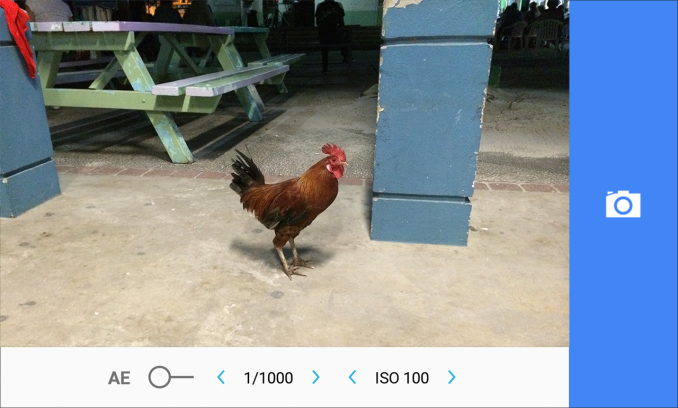
Unfortunately, Google's camera application doesn't use many of the features in Camera2. Google is obviously going with a more automatic approach which will cater to general users, and leaving it up to developers to create applications with manual camera controls. All users really need to know is that Camera2 will give developers the ability to include full manual camera controls, RAW/DNG output, and even custom white balance and exposure algorithms. Unfortunately, I haven't been able to find many third party applications that takes advantage of everything Camera2 has to offer, so this will be something to look forward to in the future. There is an application that is currently in development called L Camera, which you can see pictured above. Anyone who wants to try out the new manual controls in Android Lollipop can check it out here on its Github. I can say that Google's camera application does still benefit from the new API For example, there's a considerable improvement in the capture time for HDR+ photos compared to KitKat.
ART
The move to Android Runtime, or ART, as the only Java runtime on Android Lollipop was one of the big announcements at Google IO. Google had actually included ART as an option that users and developers could enable on Android KitKat, but Google's older Dalvik runtime was still the default option. For users who don't know, Android applications are primarily programmed in Java. An application's Java bytecode is translated into native instructions for the hardware in a device. As of Android 2.2, Dalvik used a Just-in-time (JIT) compiler to compile code when it was run. This was primarily due to the limited RAM and NAND that was included in Android devices in the past. ART uses an Ahead-of-time (AOT) compiler to compile bytecode into native code at the time of install. Although this requires more space to be used by applications due to the storage of the entirely translated application, it allows the conversion from bytecode to native code to be done only the first time an application is run.
This shift from JIT to AOT compilation has large implications for application performance. By giving the compiler a view of the entire codebase, it's possible to do greater optimization than the JIT compiler which could only do optimizations based on the chunks of code it was working with at the time. At IO, Google claimed that benchmarking applications see a performance increase of up to 2x when moving from Dalvik to ART, and certain cases like Chessbench see improvements up to 3x.
Improvements to memory management also contribute to performance improvements. Being written in Java, Android applications rely on automatic memory management. This has unfortunately put them at the mercy of Dalvik's garbage collection routines, which have been a large contributor to visual stutters, or "jank", in the past. For a very in depth look at the new garbage collection in Lollipop, as well as the improvements in ART as a whole, I recommend taking a look at the article Andrei wrote on the subject earlier this year.
Performance: Interface
Most of the people reading this review are likely to be familiar with what jank is, but for those who aren't it can basically be described as the drops in frame rate that have existed on Android since its inception. There are two ways this can be categorized. The first is an outright stutter, where the frame rate of an animation effectively goes to zero for a moment in time as frames are dropped. This has been particularly pronounced during scrolling animations, and it can be reproduced simply by scrolling in the Google Play application. The cause of this usually relates to applications overloading the UI thread, or the Java runtime's garbage collector causing a visible pause in the application. The second category is a frame rate below 60fps, but at some number that allows an animation to be displayed. This is what causes sluggish animations in the interface, where there is some animation that is not as smooth as it could be. There are numerous reasons why applications can have sluggish animations, ranging from a lack in CPU or GPU power, to badly programmed applications.
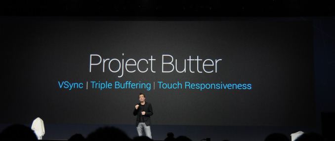
With every release of Android, Google continues to claim that they have improved performance on Android by reducing jank. In hindsight, initiatives like Project Butter obviously did bring improvements, but Google clearly oversold them by saying the interface was brought to a consistent 60fps. If it had done that, we wouldn't still be getting the promise of improvement with every subsequent release. Jank has just been a trade off for running Android, and while Google has worked to minimize it through better software, and device makers through faster hardware, it was always there to some extent.
With Android Lollipop, I'm actually confident in saying that many areas where jank was still a problem are now actually running at a consistent 60fps. There is a caveat, which is that I don't know exactly how many devices this is going to end up applying to. For whatever reason, the Nexus 6 has performance issues in areas the Nexus 5 has none. During the writing of this review, I looked over several 240fps videos of animations on the Nexus 5 and Nexus 6, both running Android Lollipop, and I analyzed the time between distinct frames shown on the display. It was clear to me that in any area the Nexus 5 still has issues, the Nexus 6 performs even worse. For that reason, I'm going to limit my impressions to Android Lollipop on the Nexus 5, as I don't think it's fair to judge Lollipop based on whatever poor implementations were made on the Nexus 6.
What's very exciting is that there's actually not much to say, as it can be summed up by saying that Lollipop is really the first time where basically everywhere on my Nexus 5 feels smooth, or "buttery" as it was supposed to be with Android Jellybean. It almost feels uncanny for an Android device. Using Android's onscreen GPU profiling confirms that there are few, if any stutters. There are a couple of problematic areas like scrolling the new Calendar app, and in the eternally poorly performing Google Play app, but these are very rare exceptions in an extremely fast interface. Additionally, I have no reason to believe that the applications that currently have some performance issues can't be improved with future updates. Overall, I think this puts to end any discussion about how Android is slow or laggy, except in some strange situations like the performance of the Nexus 6 which I am really at a loss to explain.
Final Words
I think Google really hit the nail on the head with Android Lollipop. It evokes the same sort of feeling that the release of iOS 7 did, without some of the negative experiences that followed. Getting a brand new interface is always exciting, as it can dramatically change how it feels to use your phone. Moving from KitKat to Lollipop still provides you with a familiar Android experience, but it almost feels like getting a brand new phone in a way. There's a brand new UI, and big improvements to performance. But unlike the upgrade to iOS 7, Android Lollipop hasn't plagued my devices with application crashes and other bugs. In fact, I haven't really noticed any significant bugs at all after upgrading to Lollipop, which says a great deal about the work Google has put into testing to make sure things are stable.
Material Design impresses me, and I think it's going to be around for many years to come. I find this feeling reassuring, as Google has a track record of redesigning large portions of Android with every major release. With the past designs, I never really felt like they were going to stick around for very long, and they never did. Material Design feels like Google has finally gotten Android to where they want it to be, with an interface that doesn't need any OEM overlays to be presentable. Of course, some OEMs will never change their policy of putting their own skin, but that's something Google isn't going to be able to fix. While we may see very iterative changes to Lollipop's interface in future updates, I don't think they're going to be anything beyond changes to the placement of buttons or the color of icons. Material Design also extends far beyond your Android device. It will eventually apply to all of Google's services on all platforms, so that your web browser, your tablet, your smartphone, and even your watch will all look and behave similarly.
The performance increases are also greatly appreciated. Android hardware has advanced rapidly, and the move to a new application runtime is overdue, but warmly welcomed. The improvements it can bring to a device are actually amazing; it can feel like getting a brand new phone. The interface performance on Android still isn't quite perfect, but to be quite honest, it's not at all alone in this regard. I can name areas of every major smartphone OS that are susceptible to drops in frame rate, it's just not possible to write perfect software. I think what can be said is that overall, Android is pretty much at the same level as Windows Phone and iOS for animation smoothness and general performance. There is still the exception of certain poorly written applications which are up to developers to fix, and some of these even come from Google themselves, but I'm confident that we're moving toward a point where these remaining issues will be fixed simply because they aren't acceptable anymore.
Of course, the last thing to discuss about an Android update is whether or not you're going to get it. Unfortunately, I still can't answer this question for most users. Android's nature means that Google doesn't have any influence over users receiving their updates, except the users that have Nexus and Google Play Edition devices. Although I can't guarantee you an update, I can say that the situation is looking good for more users than it has in the past. We've seen updates ship in record time from companies like LG, NVIDIA, and Motorola, and they should be commended for putting in the effort to get updates out to users in a reasonable time. Other companies like HTC have made promises to update their flagship devices from this year and last year to Lollipop within a 90 day time frame. While this doesn't cover every Android user in the world, it covers more users than we've ever seen in the past.
Going into the future, there are some improvements Google should make. Continuing to work on the performance of problematic applications is definitely necessary, as they stand out more than ever alongside a library of extremely well performing apps. I think it would be worth it to start creating special landscape layouts for applications, and to introduce more features that take advantage of larger displays. Google has entered the phablet market with the Nexus 6, and they need to create software that provides a reason for having such large devices. The only other thing they need to do is to continue innovating and improving, which they've been able to do time and time again. We haven't yet seen everything that Android Lollipop has to offer, as developers are only beginning to take advantage of the new APIs and features it brings. But with a great new interface, new applications, a new runtime, and new users adopting Android every day, the future of Android certainly looks bright.

