Google Redesigns Hangouts for Android With Version 4.0
by Brandon Chester on August 10, 2015 11:15 AM EST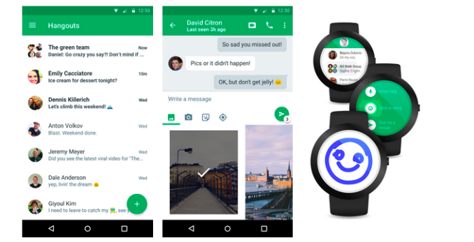
Today Google shipped a major update to their Hangouts application for Android. Ever since Hangouts for iOS was updated to 4.0 a little over a month ago Android users have been waiting for the update to make its way to Android. This update has been in the pipeline for quite some time, and it comes with a comprehensive redesign that brings the Hangouts app in line with Google's Material Design visual guidelines.
Visually, Hangouts 4.0 for Android is very similar to what shipped on iOS a little while ago. This isn't surprising, as Google's applications for iOS use their Material Design principles heavily. There are a few small differences, such as the spacing of the quick access buttons underneath the message input field, and the calling controls not being hidden behind the three dot overflow menu, but the overall appearance is the same. The appearance is definitely a departure from the previous design which had a strange dual list design which was separated into two tabs.
On top of the redesign, Google claims that Hangouts 4.0 has noticeable improvements to performance, reliability, and battery consumption. I personally have never had many issues with Hangouts on Android, but any improvements to performance are always welcomed.
Hangouts 4.0 is currently rolling out in stages, and users can expect to receive the update in the near future if they haven't already.
Source: Official Google Blog


37 Comments
View All Comments
prisonerX - Monday, August 10, 2015 - link
So sick of Google's "updates." It's like there's a bunch of people in Mountain View who feel they should do something for what they're paid so they keep making arbitrary, shallow and quite often retrograde changes to various Google products. Meanwhile real, annoying bugs and structural problems persist because the few engineers who actually have the technical chops are too busy.leoblaze9 - Monday, August 10, 2015 - link
would you care to elaborate?As an engineer, I can tell you that resolving any structural problems in an existing product are actually quite difficult because of the numerous dependencies and features that also need to be modified in order for the product to still perform adequately. Unless, the product itself is small in scope, such things require lots of time to be analysed, changed, tested and implemented.
Hence, companies opt to take a more manageable and longer-term approach to fixing bugs by providing said "updates" which fix the small bugs while also adding "improvements".
soccerballtux - Monday, August 10, 2015 - link
If you use Android and have an eye for design, you should have found some of these by now. Most of them are pretty small issues and would be trivial to remedy.personally, 3 years ago I was able to see this stuff, but I don't anymore-- after being bombarded with it I became desensitized
RandomFool - Monday, August 10, 2015 - link
That's pretty much the opposite of elaborating.LauRoman - Monday, August 10, 2015 - link
I, for one hate the floating button in Material inspired apps. I kind of hate the whole white theme thing. I guess Google cought on that not all people love white so that's why they have a darker M overall theme. I was a big fan of Holo, probably not the TRON-iness part of it, though.I hate it when the latest message in hangouts gets covered by the keyboard. It may just be the phones or the keyboard i used but still. It doesn't happen in other message apps.
While i do like the Hamburger menu, i don't think it's a good design decision when there are only two menu options on it (see the Chrome Remote Desktop app).
Software buttons are a bad idea, because they don't always disappear when you need them to or don't appear if you hide them. Even on big phones i often times end up touching the home button instead of the space bar.
Impulses - Monday, August 10, 2015 - link
Must be a phone size/hold thing, I love software buttons and I tend to favor apps that use them properly. Pretty much never hit home by mistake, tho I've swiped up from it by mistake once or twice (easy to let go without activating Now tho).I did like holo too tho, and although I've never had an AMOLED phone I do think not providing a generally darker theme to piggyback on AMOLED's strengths is a wasted opportunity.
The last message thing in Hangout bugs me too but i think some of those things are subjective, they may well have had a vote on it and purposely designed or kept it that way.
Gigaplex - Monday, August 10, 2015 - link
That's also a different person replying.soccerballtux - Monday, August 10, 2015 - link
I've given up fighting it, I simply avoid installing an update unless I'm ready to learn something new and have a backup. There are various backup sites you can use to retriever older versions, for example I'm running the more feature-rich non-MDL-version of Gmail and love it.anyways, since I've given up fighting it, I've also given up fighting certain types of bugs professionally. Why bother? Bringing order to the universe is never appreciated, just liberally paint the 80/20 rule everywhere.
Gigaplex - Monday, August 10, 2015 - link
That behaviour shows a pretty significant effort in maintaining the fight. You haven't given up.soccerballtux - Monday, August 10, 2015 - link
MDL is more appropriately named Messy Desk Language-- stacks of paper, all sliding over each other.... the cards for app switching are visually complicated but acceptable, the real problem is the 2D-but-layered slide-hiding of the Play-store-page for any given app.Most of what Google pushes is about glamour, very little about efficiency or reason-- for example, after billions invested into AMOLED performance (great battery life for black backgrounds like Holo UI), Google changes everything up to be White in MDL and we start having to use metrics like APL...