Vivaldi Web Browser Launches With Version 1.0: Built For Power Users Of The Web
by Brett Howse on April 6, 2016 3:00 AM ESTToday, Vivaldi has gone from a beta project to a production web browser with the official launch of version 1.0. After more than a year in public development, the team led by Opera Software co-founder Jon Stephenson von Tetzchner is ready to release their take on the modern browser with this first release. They are calling it a new browser for the web’s most demanding users, and they are trying to build an approach that focuses on the tasks that people want to do on the web.
The company has looked at the approaches by the other major browser makers, and seen a move towards simplification of their interfaces. With Vivaldi, the team wants to bring back features that have been dropped over the years, as well as create new functionality that doesn’t exist today, or perhaps needs extensions added to the browser to work. I use Microsoft Edge and Google Chrome as my two primary browsers, and both of them have been lacking for me in different ways, so I took the final release version of Vivaldi for a brief spin.
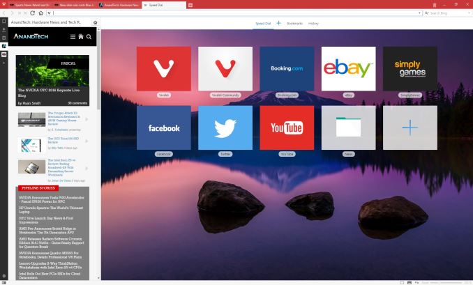
Vivaldi is built on the Blink layout engine, which is part of the Chromium project and the layout engine used by Google’s Chrome browser. But Vivaldi adds a lot of functionality right out of the gate, with a wide range of features consolidated into the basic install, and with the ability to customize the browser to your own liking as one of the key goals of the project.
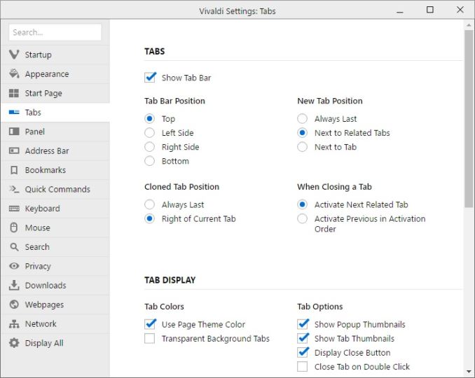
The customizability is apparent from the first install. Right away the install asks several questions about tab layout, looks, and more, before diving into the web itself. Once up and running, you can go into the settings and configure a huge array of options, including changing the tab locations, startup, appearance, and privacy. There are literally too many settings to go through here, but the end result is quite a bit of choice for the end user, and that’s a good thing.
Vivaldi also has some great features for managing the web and customizing your workflow. It includes Tab Stacks, and you can set that up by just dragging a tab onto another one, and then you can access each stacked tab with keyboard shortcuts or by clicking the top of the stack. It also has Tab Stack Tiling, allowing you to display multiple pages at the same time, with multiple tab stacks. You can also set websites up as Web Panels, giving you a smaller slice of the website pinned to the side. This works great for things like Twitter, and lets you monitor it while having another page up in the main area. Mobile responsive sites will also nicely collapse into these web panels.
Vivaldi also features the ability to save web sessions, and you can then open the entire session at once to get back to work quickly. If you need to jot something down quickly, it features built-in notes as well. Navigation can be done quickly with a fast forward and rewind function, with fast forward taking you to the next logical page of the site you are on, and rewind takes you back to the first page you browsed to if you’ve gone to several pages on a site.
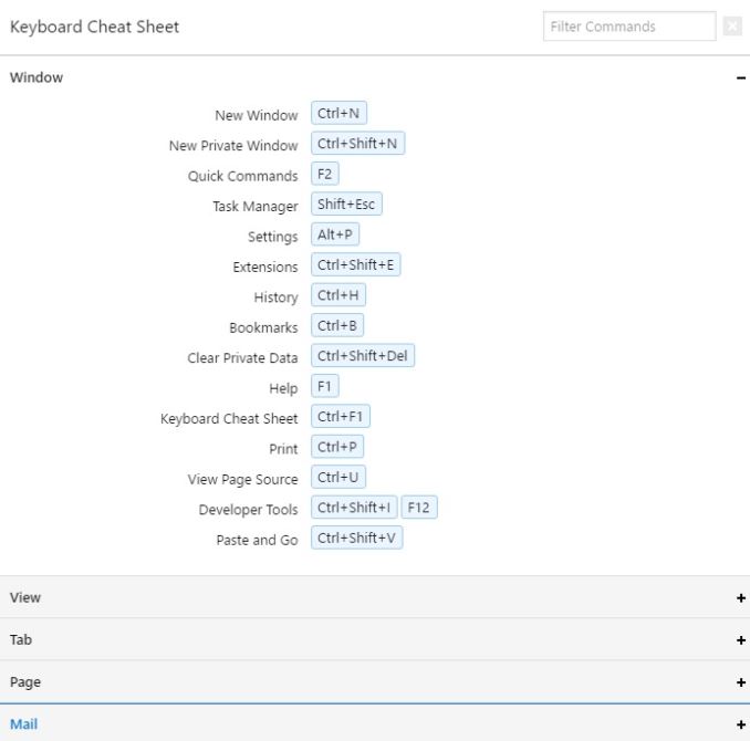
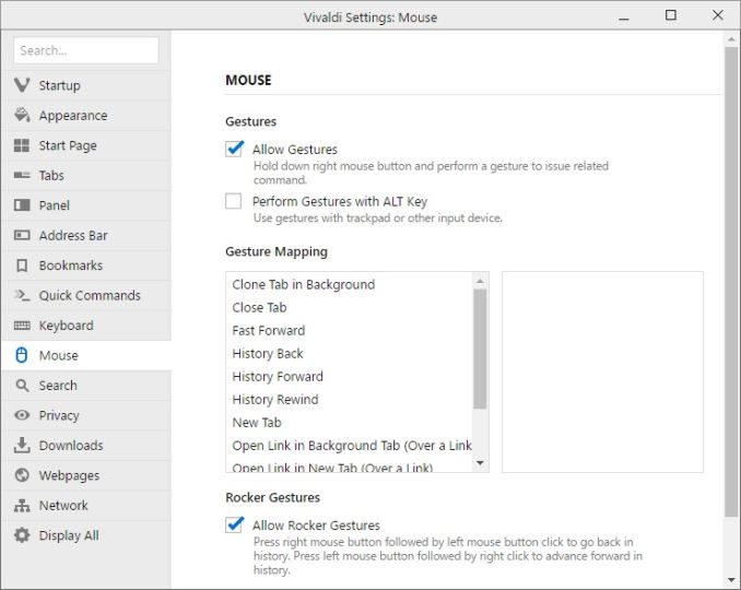
Since this browser is built for the power user, it also features a large list of keyboard shortcuts to keep your hands ready for typing, and in addition it also supports a pretty big list of mouse gestures, which can be accessed by holding the right mouse button. For example, you can go back and forward with just a mouse gesture by holding the right mouse and gesturing left or right. For those with a trackpad, you can optionally enable holding the Alt key to enable the same features on a trackpad.
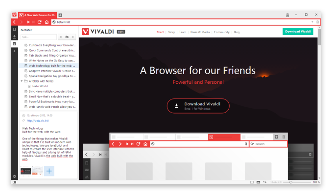
The user interface for Vivaldi is built around the same web technologies that it renders, such as HTML 5, node.js, and more. The interface can do nifty things like automatically change colors based on the page you are on.
One of the nicest little features I've already noticed is that Vivaldi will show you the size of a web page in the address bar as it loads, giving you a nice little glimpse at just how much data you are pulling in on a single page.
I’ve tested Vivaldi on a high DPI display, and both the installer and browser itself seems to adapt very well to higher resolution displays, at least on Windows. It wasn’t always the case earlier in the preview stages for the browser, so the team has done some nice work to get this sorted out.
I’m not sure if the world is ready for yet another web browser, but the Vivaldi product seems to pack in a pretty impressive set of features, along with a nice looking interface with plenty of customizability. As someone who has been somewhat disappointed in the browsers I’ve been using, Vivaldi is going to get some screen time on my PCs and we’ll see how it handles day to day use. Being based on Blink should be a good start for things like page layout and performance, but with more functionality built in than you get out of the box on Chrome.
If you want to give Vivaldi a spin, check it out here:





55 Comments
View All Comments
Alexey291 - Wednesday, April 6, 2016 - link
Nice advert disguised as an article.Brett Howse - Wednesday, April 6, 2016 - link
They sent me the information about this, I tried the browser, liked it, and wrote about it. Just like every other piece of news we do.Alexey291 - Wednesday, April 6, 2016 - link
If you say so.Mondozai - Wednesday, April 6, 2016 - link
Yeah, Brett is totally on the payroll of the Vivaldi team.Jesus the trolls are fucking idiotic.
close - Wednesday, April 6, 2016 - link
This is a press release combined with personal experience. There's nothing wrong with this as long as the facts are presented correctly.I've seen other examples on AT where there was no fact checking done on the details of that press release and as such it had plenty of misleading information. But this is not the case.
DanNeely - Wednesday, April 6, 2016 - link
The same troll gets posted on every pipeline article. Generally paired with a complaint bemoaning that it's not an in depth analysis that took 3 months to complete and another whine about a product that's been out a few days and not reviewed yet.Samus - Wednesday, April 6, 2016 - link
Alexy do you really think Anandtech was paid to write a page about a new piece of software? That's like saying Engadget gets kickbacks for every Kickstarter they mention, like Pebble, Iga's Castlevania clone, and the video game Superhot.They get mentioned because they are interesting tech. That's what news is supposed to be. I now might try this browser because I otherwise would have never known about it. Do you really think some startup has capital to advertise their product? Think God damnit. What the hell are you doing on a media site if you fundamentally don't understand what media is.
JoeyJoJo123 - Wednesday, April 6, 2016 - link
There's a different between media (the news report on channel 12, for example) and the commercial breaks that play in between the news report segments.extide - Wednesday, April 6, 2016 - link
So, you mean there is a difference between an article and a banner ad?Samus - Wednesday, April 6, 2016 - link
Do you watch the news? Media covers shit for free all the time. Donald Trump has received over 2 billion dollars in free media coverage this year alone!Reporting the news inherently involves some sort of placement, promotion, or in most cases, demotion of a product, person, place or event. This article is no different. The important thing to keep in mind here is Vivaldi is a FREE product, so the argument here is baseless because Brett isn't trying to "sell" anything for monetary gain because there isn't one.