iPad mini Review
by Anand Lal Shimpi & Vivek Gowri on November 20, 2012 6:10 PM ESTDesign & Smart Cover
The smaller screen of the mini is joined by the super-slim industrial design from the fifth generation iPod touch that debuted a couple of months ago. I’m actually a pretty big fan of the direction Apple’s mobile design teams have taken recently, the overall visual style is much cleaner and focused now, with less pronounced radiusing and more rectangular profiles across the board. The edges are rounded enough for a very smooth in-hand feel, but the front edge has the same highly polished, chamfered ring around the bezel as the iPhone 5.
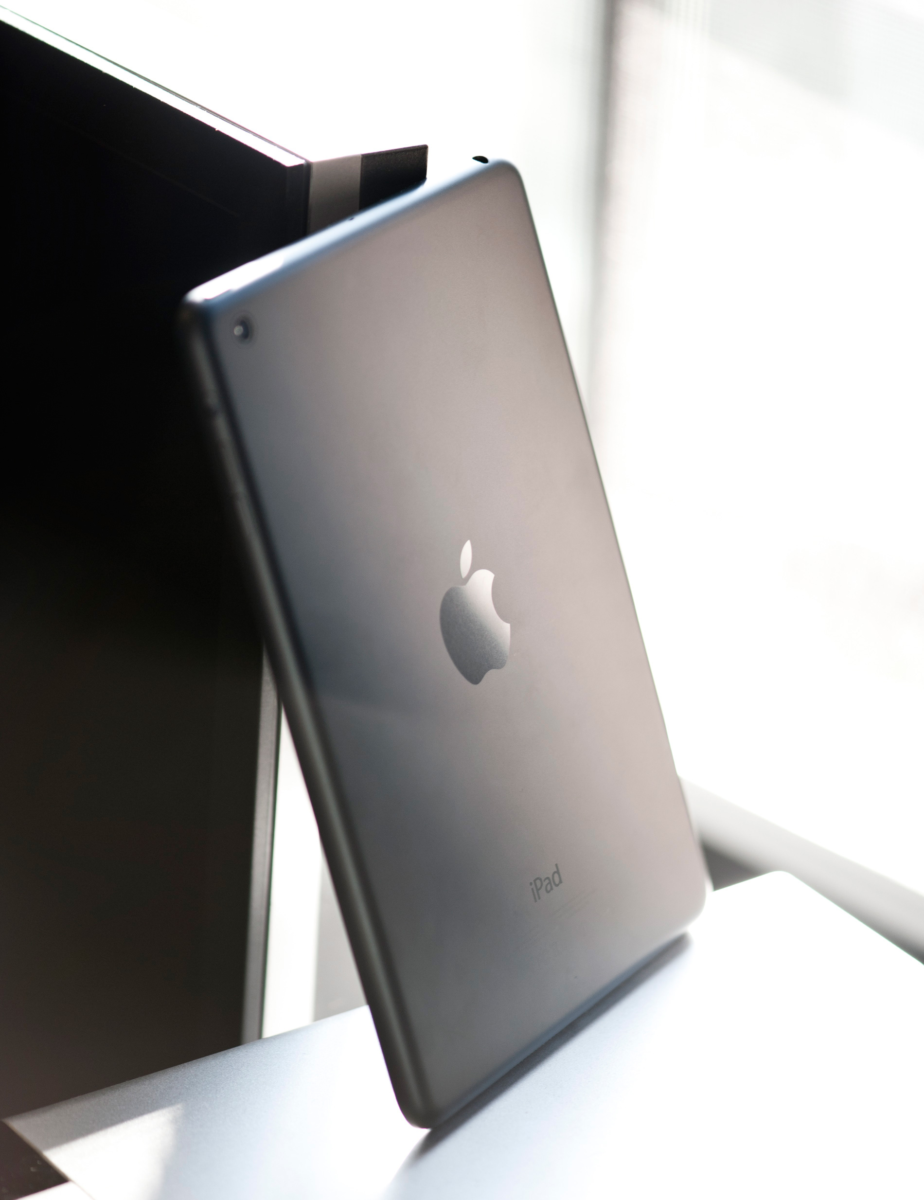
The dark monochromatic look is very sleek; combined with a brightly colored Smart Cover like the red one, the effect is pretty striking. The white/silver colour scheme, as on the iPhone 5, is elegant, but nowhere near as visually striking as the uniformly dark mini.
The face should be very familiar to iDevice users - a front facing camera centered at the top, an ambient light sensor to the left of it, and a home button at the bottom. The home button has been shrunk, though it’s set far enough away from the screen that I feel like they could have easily kept the same home button that is used in the other iDevices. I’m assuming there’s a reason for the downsizing, probably relating to the placement of the hardware around the display, because this isn’t the type of thing typically overlooked by Jony Ive and Co.
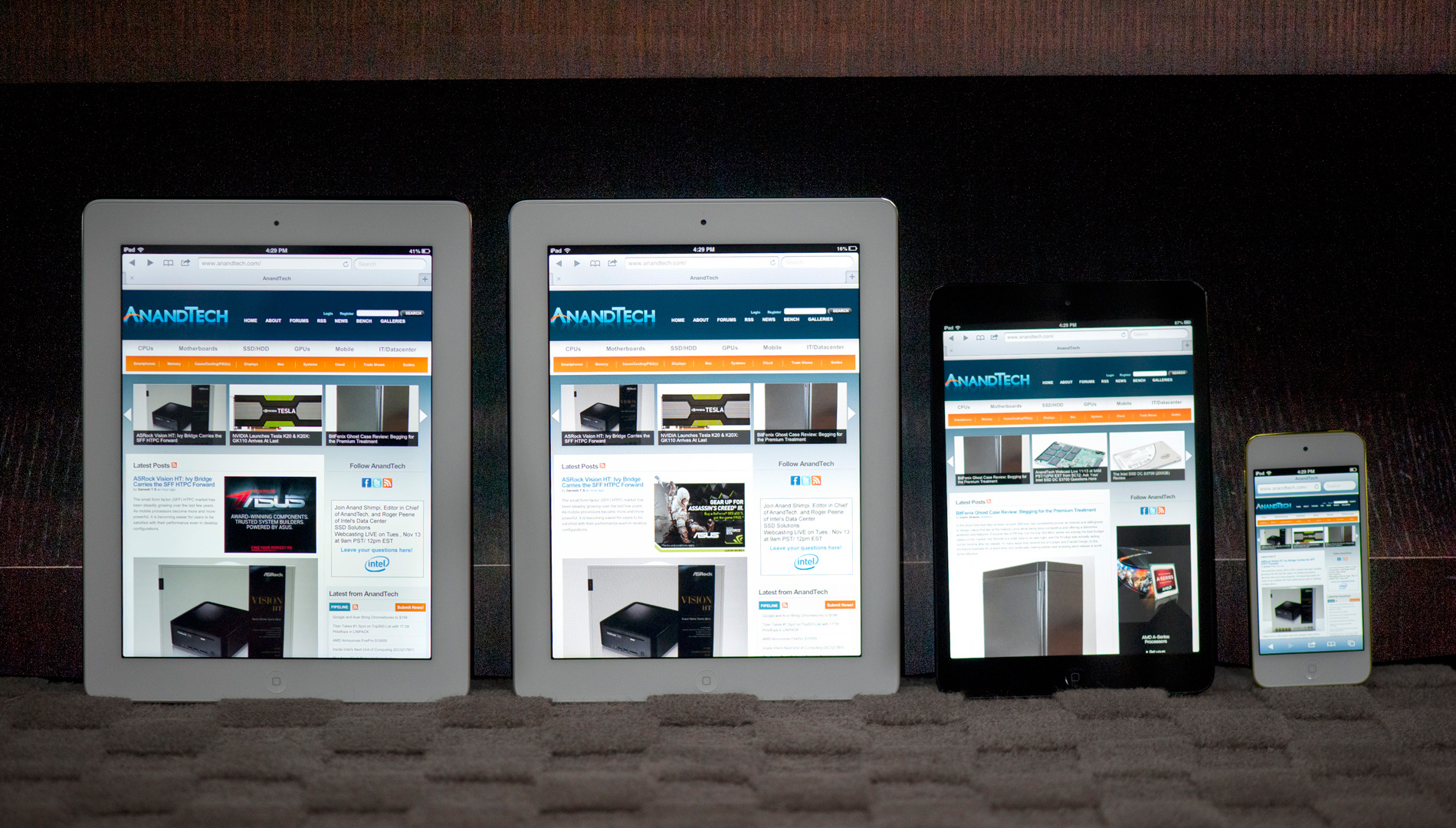
From left to right: iPad 4, iPad 2, iPad mini, iPod Touch (5th gen)
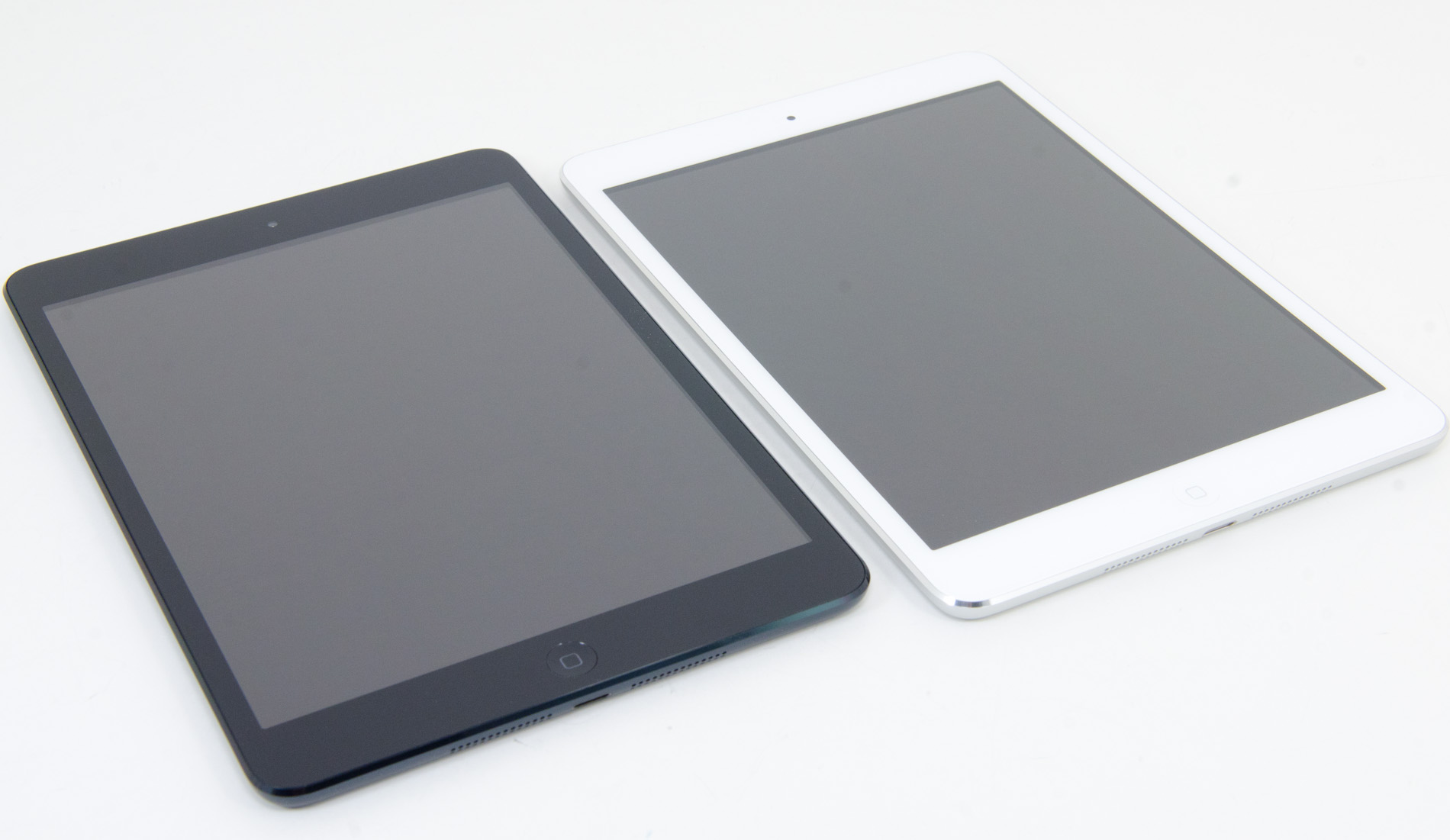
The bezel has been reduced considerably in size in all four directions, but more so on the sides than to the top and bottom. The result is a device with a slightly different physical aspect ratio than the 9.7” iPad - 4.45:3 instead of 3.90:3 (where, in both cases, the display has an aspect ratio of 4:3). The narrower bezel looks good - cleaner and more modern, and I think the iPad mini is better proportioned aesthetically. Of course, the smaller footprint is also one of the main factors in the awesome in-hand feel, so it’s a functional decision as much as an aesthetic one. Surprisingly enough, the lack of bezel on the sides of the mini doesn't impact normal use. Apple tweaked iOS a bit to improve touch rejection along the edges of the mini.
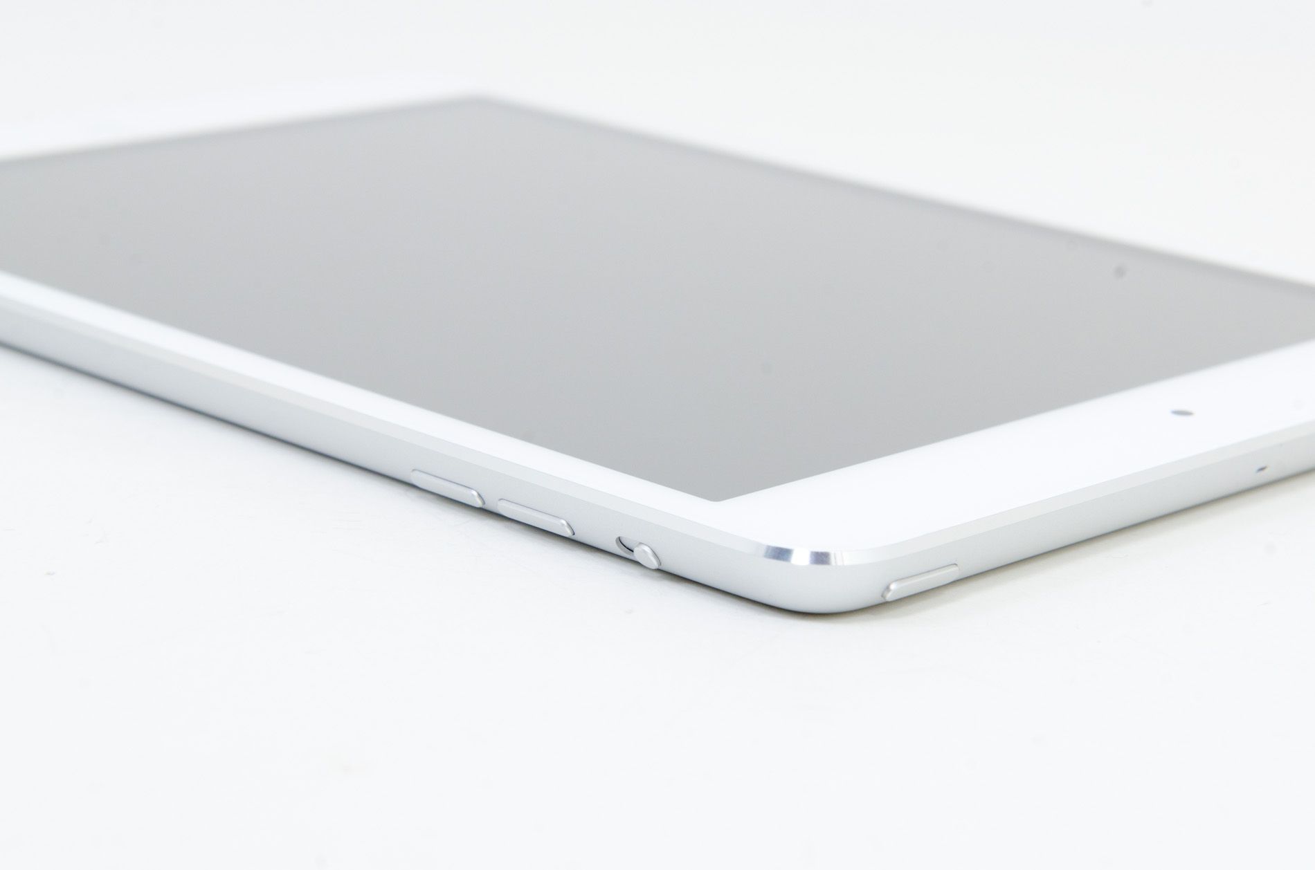
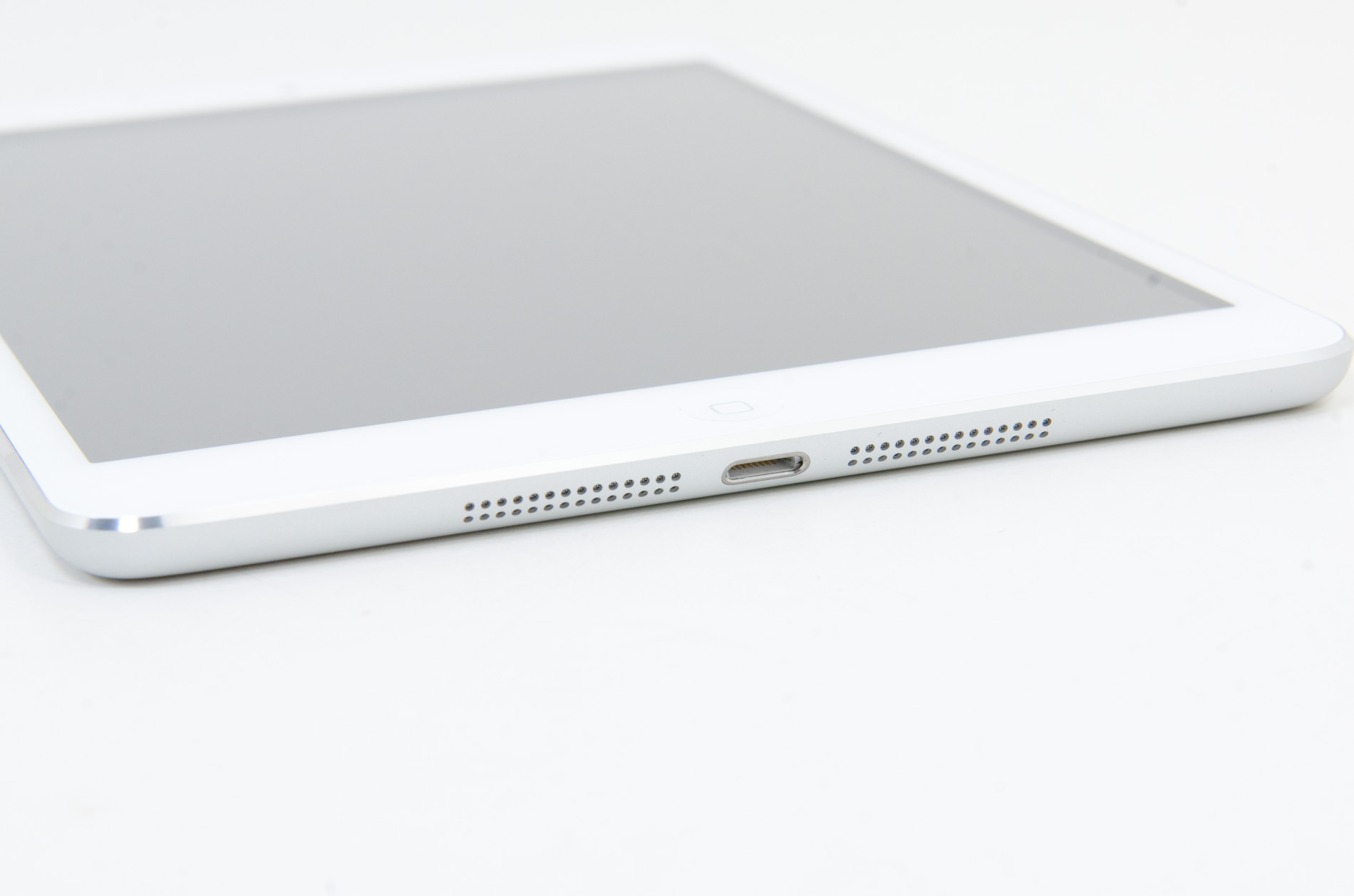
Button and port placement is identical to the preceding iPads, with a few minor but important changes. The silence/rotation lock slider in particular feels much more robust than in previous editions. The top edge has the power button on the right and headphone jack on the left, with volume buttons on the right edge, next to the camera. The buttons themselves are now metal, and offer better feel and feedback than the plastic buttons of the 9.7” iPad.
Coming around the edge to the bottom, we see that the 30-pin dock connector has been replaced by the new Lightning port, centered as always. The mono speaker in the right corner of the back is now gone, superceded by a pair of speakers set on either side of the Lightning port. That’s right - the iPad finally has stereo speakers, and they’re actually pretty decent. Clean sound output, and loud enough to fill a 400 sq ft room without distorting at high volumes. As with most mobile devices, the sound is a bit thin, but a decent improvement over my admittedly low expectations.
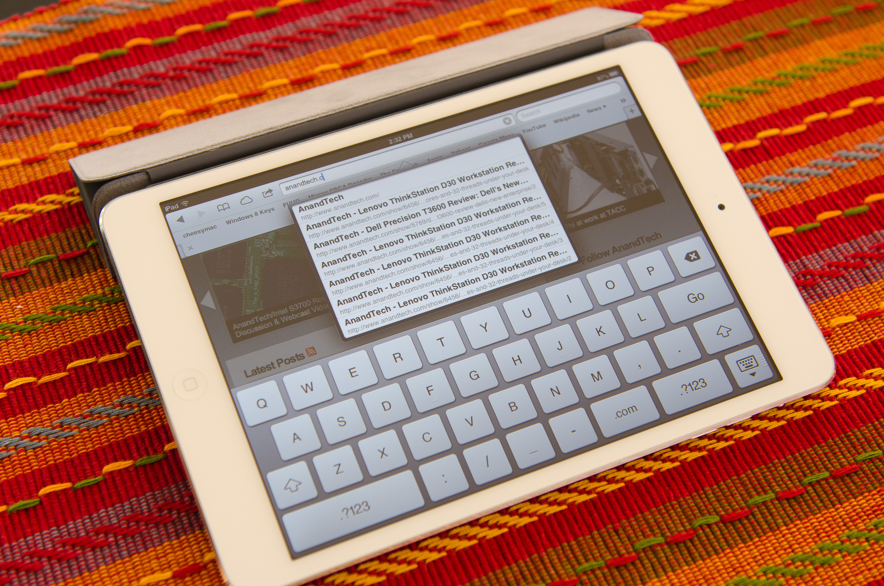
Given that the iPad mini shares the same colors and materials as the iPhone 5, I was curious to see whether the paint would be as fragile and whether we’d see a repeat of the quality control issues Apple had with it at launch. Thankfully, the anodization seems far more robust and significantly more resistant to scratching, even on the polished aluminum band at the front. I didn’t see any material or paint defects when I unboxed it, even after a thorough going over, and through two weeks of not particularly gentle use, I haven’t seen any scratching. It’s a very different experience than my iPhone 5, which came out of the box with the front panel not properly clipped into the aluminum frame and scratched whenever I looked at it wrong. This isn’t a device that needs any other kind of case unless you plan on abusing it, and I feel like a larger case would undo some of the benefit of the ultralight chassis.
Apple does built a custom Smart Cover for the mini, available in a number of colors. Unlike the bigger Smart Cover, the mini's cover integrates the magnetic hinge into the same material as the rest of the cover, resulting in a very cohesive design:

The big benefit of the Smart Cover is the ability to use it as a stand:
The angle of the folded Smart Cover is considerably larger than on the standard iPad, making the iPad mini lean back more vs. standing upright on the bigger model:
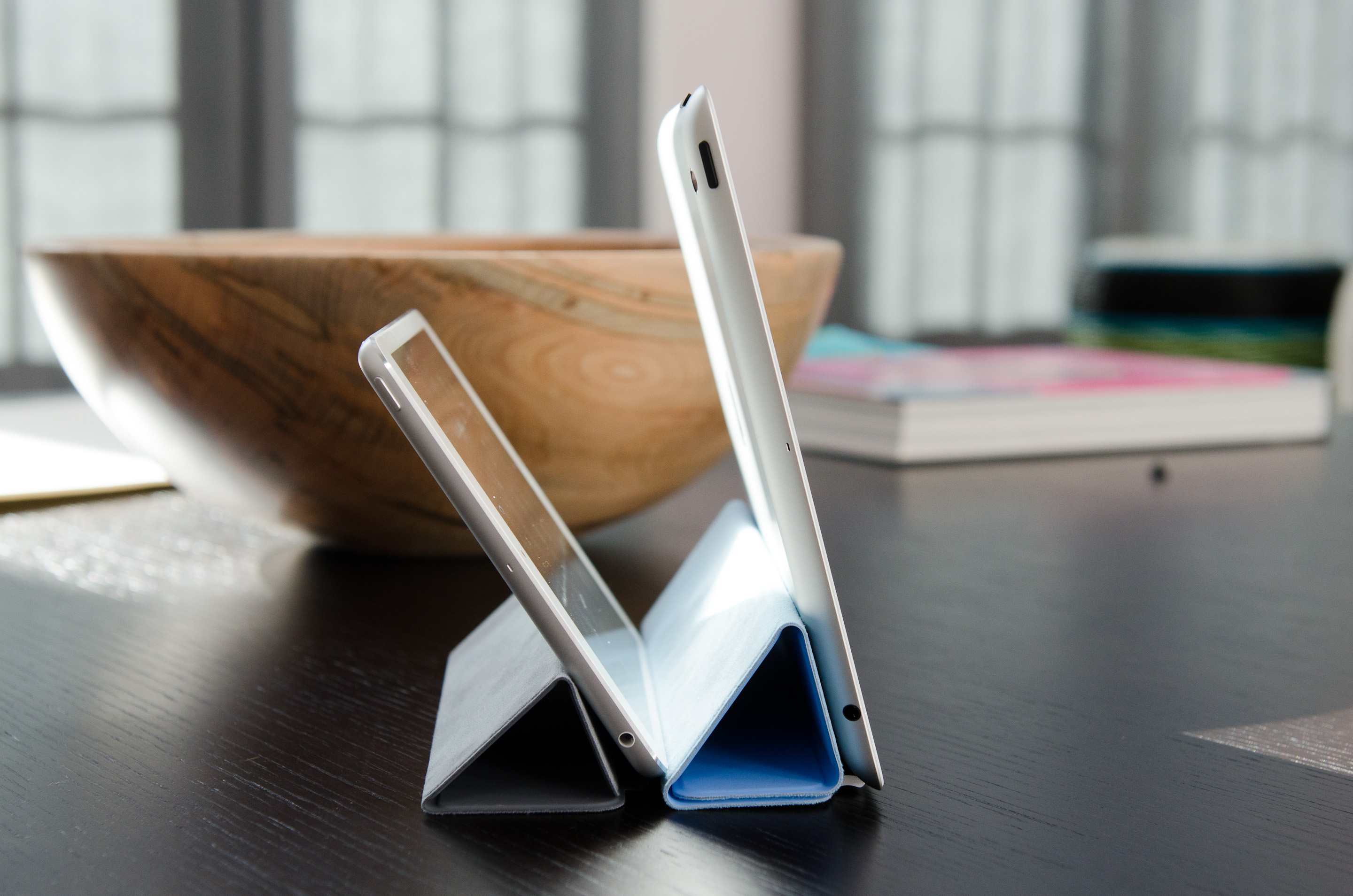
I would recommend getting a Smart Cover for the versatility of the stand and to have some form of protection for the screen. Plus, the black iPad mini + red Smart Cover combination just looks awesome.


140 Comments
View All Comments
Calista - Wednesday, November 21, 2012 - link
^+1I bought the original iPad and as many was amazed by the build-quality (stupid sharp edges excluded) and how fluid surfing the web felt considering the hardware. But I also within 15 minutes realised that it was badly memory-starved. Apple is an amazing company taking great pride in the user-experience of its products, but back then they goofed up badly.
I feel the same about the Mini. The CPU may be old but it's still fairly competent, the GPU still among the best, and the screen size may be close to perfect. But only 512 MB of RAM just ain't sufficient for today, even less for tomorrow.
ltcommanderdata - Wednesday, November 21, 2012 - link
Being slow to increase RAM and VRAM is consistently an issue with Apple. That's the case with Macs as well.For the iPad 1, it wasn't just that 256MB of RAM was small. Rapid drop-off in app support for the iPad 1, especially in games, is due to the resolution being so high in comparison to the RAM. The GPU was also underpowered compared to the resolution. 3rd gen devices have 480x320 screens and 256MB of RAM while the iPad 1 has 5.1x the pixels with the same 256MB of RAM. The 4th gen iPod Touch is affected by this too having a 960x640 screen with 256MB, but the iPad 1 is even worse with 1.3x the pixels of the 4th gen Touch. Support for the 4th gen iPod Touch in games isn't perfect, but is better than the iPad 1, which indicates that 256MB in itself isn't the limitation, but the drop in support for the iPad 1 is a combination of 256MB RAM with the higher 1024x768 resolution and the iPad 1 no longer being sold after 2011. The iPad 1 received 2 major OS updates (iOS 4.x and 5.x) post launch like other iOS devices so its OS support wasn't prematurely terminated.
I think the situation will be different for the iPad Mini 1. The iPad 2/Mini doubles the RAM to 512MB while keeping the resolution the same, which alleviates the poor resolution-RAM ratio of the iPad 1. 512MB of RAM represents the majority of iOS devices including the iPhone 4, iPhone 4S, iPad 2, iPad Mini 1, and 5th gen iPod Touch, of which given historical patterns, the iPhone 4S and 5th gen iPod Touch and perhaps even the iPad Mini 1 itself will sell into 2014. Given historical patterns, OS support for the iPhone 4S, 5th gen iPod Touch, and iPad Mini 1 should continue into 2015. Seeing it's only in 2012 that developers are really beginning to require 512MB of RAM, I don't see them already upping the minimum requirement to 1GB in 2013. Especially not when that eliminates the majority of their potential customer base, when those devices are still being actively sold into 2014, and receiving OS support into 2015. I think 2014 is a more realistic date for when apps will begin to stop supporting 512MB devices.
Personally, seeing the CPU was unchanged and the GPU is only 2x faster despite the 4x increase in resolution making it slower at native resolution than the iPad Mini 1 and iPad 2, I wouldn't be surprised if the iPad 3 loses app support before the iPad Mini and iPad 2.
Of course, just because apps continue to support 512MB devices doesn't mean the usage experience won't be degraded or sub-par. I can see that becoming an issue faster than app support.
Klug4Pres - Wednesday, November 21, 2012 - link
I guess you reviews the Wifi-only version, but I'd like to see some analysis of the cellular connectivity options, especially what LTE bands are supported in the available SKUs.HighTech4US - Wednesday, November 21, 2012 - link
The mini lacks a GPS on the base model making it useless for using any map software with turn-by-turn prompts.The Nexus 7 has a built in GPS chip (and a very effective one and way better pin pointing location than a TomTom) and Google Maps works great on the Nexus 7 (you can download maps for offline use).
The lack of GPS on any tablet is a deal breaker for me.
Adding in the omission GPS with the other short comings along with its sky high price makes the mini just an overpriced iToy. The Nexus 7 is a much much better deal.
Calista - Wednesday, November 21, 2012 - link
I think we have all forgot what gave us forgot what gave us 7" tablets. A "tablet" - i.e a tablet PC running Windows was normally in the 12-14" range. The JooJoo was a 12" tablet as well. Apple brought it down to 10" and sold a ton of those.At the same time a large number of more or less obscure manufacturers brought out 7" tablets *not* because 7" was considered the best compromise but because those panels could be bought dirt-cheap. But this also gave us this idea that a small tablet was supposed to be 7" while a large tablet was to be 10". I would say this is an anomaly, tablets have for the last ten years been larger than 10".
Maybe the "correct" size for a small tablet is in the 8-8.5" range? I was playing with my friends Motorola Xoom 2 (8.2", 1280x800) and while a bit heavier than my 7" tablet it seemed to hit the perfect size. Not so big or heavy as to be cumbersome, while still packing almost 40" more screen area.
Too much focus is being put on the device being pocket-able, how many really bring a tablet in their coat or pants? Just the idea of asking for a device to be pocket-able while still lacking a 3G/4G connection is just plain silly. Instead focus should be put on how it feels in hand but also how much space it occupies on a table. The 10" iPad was always too big to fit comfortable on my table while still having space for a cup of tea, a notebook, a plain book or the remotes for the TV and receiver.
Quad5Ny - Wednesday, November 21, 2012 - link
There is a Pop-over interactive banner ad running that opens when you try to hit the x, please take a look. Thanks.http://forums.anandtech.com/showthread.php?p=34271...
vicbdn - Wednesday, November 21, 2012 - link
"but in terms of repsonsiveness" In the conclusion.BSMonitor - Wednesday, November 21, 2012 - link
Incredibly too much... By the 4th generation of these, 32GB should be standard and 64GB a $100 upgrade...The BOM on 32GB NAND in this fashion is what? $15? Even if it's $20($10 x 2 16GB), they are getting a 1000% profit margin on that upgrade from 16 to 32 GB??
But they know we all have huge iTunes libraries we'd want on it...
Unfortunately there will never be a do-it-yourself tablet similar to the PC market. I stopped paying Dell and Gateway and HP a LONG time ago for their ridiculous profit methods.
TouchPadKing - Wednesday, November 21, 2012 - link
Not sure if this has already been rehashed, but the pixel size is what kills the ipad mini for me. I have a Samsung Galaxy Tab 7.0 Plus, and I can SEE the pixels and it drives me nuts. The ipad mini has an even bigger screen with about the same number of pixels... Also, samsung fits in pocket, mini doesn't. I like the ipad mini's form factor, but again if it won't fit in my pocket it'll probably never leave the house...Rising - Wednesday, November 21, 2012 - link
I bought Nexus 7 when it was released. This is what i can tell you after few months of usage.."Its a good hardware in a crappy software". Iwould say the higher price premium on ipad mini is justified for software.
Most of the apps are zoomed over apps for Nexus 7. I hate that part of it. For example i use this app called apex launcher in my samsung s 3 and when i try using it on Nexus 7 all the icons are so small that they are hardly recognizable.
I donot understand why Google cannot optimize the apps to their own Nexus tablets.
Anand do you know whats stopping them from doing this?