The Microsoft Lumia 640 Review
by Brandon Chester on June 9, 2015 8:00 AM EST- Posted in
- Smartphones
- Microsoft
- Mobile
- Lumia
- windows phone 8
Windows Phone
To be honest, it has been quite some time since I’ve had a Windows Phone in my possession for any extended period of time. I had a Lumia 620 for a short period, and long ago during the era of Windows Phone 7 I had a Samsung Focus on a couple of occasions. While all of those devices offered very smooth experiences, there were too many issues with missing features at the OS level and a lack of applications which drove me back to Android. Since that time, Windows Phone has seen a number of updates, and many features that were omitted when I last used the platform have since been added. Because I don’t use a Windows Phone as a daily driver, I thought that this would be a good opportunity to give my thoughts on the state of the operating system, and whether or not I think it’s one that I could adopt for daily use.
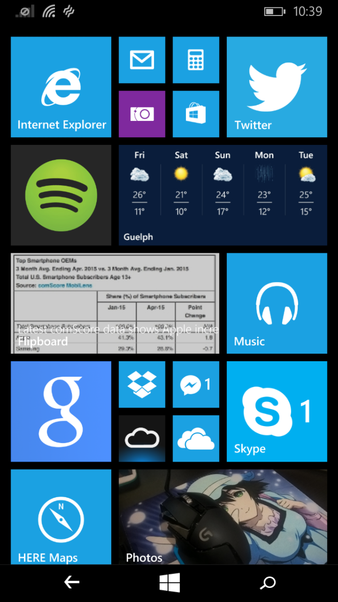
The first thing I noticed when I got through the setup of the Lumia 640 is that the basics of Windows Phone actually haven’t changed that much since Windows 7.5 / 7.8. This isn’t a bad thing at all, as the live tiles interface was a refreshing change from rows of icons then, and it’s still one today. Obviously Android has widgets, but they don’t integrate near as well with app icons because there’s no standard for size, shape, or design like there is with live tiles. Unfortunately, live tiles also tend to be less useful than Android widgets in my experience, as many of them just perform the same function as the tiny little red app badge does in the corner of icons on iOS by showing you how many missed messages you have.
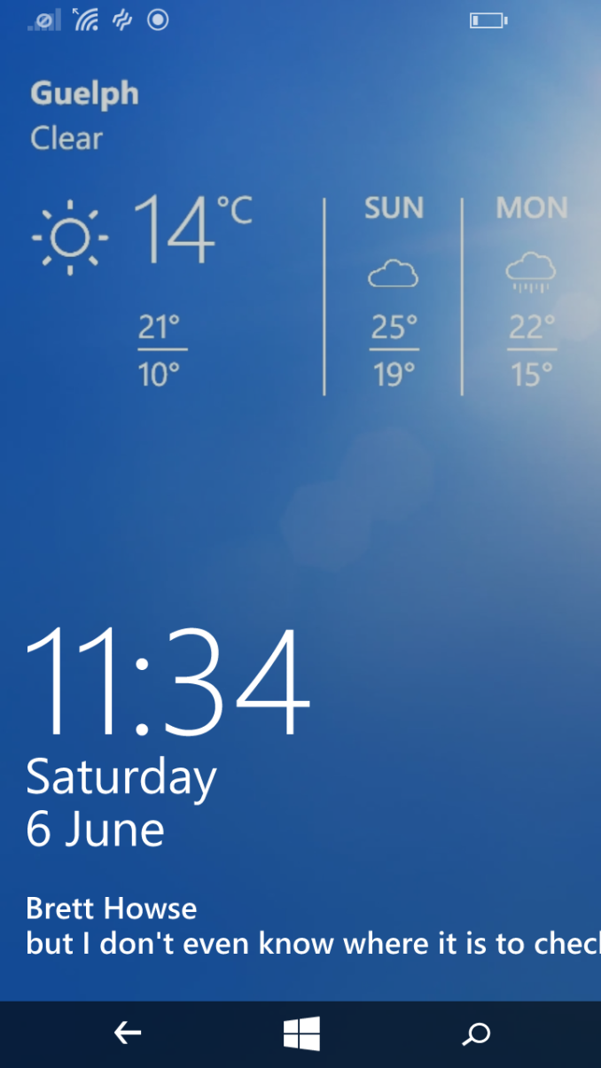
The ability to natively customize the lock screen is also something I enjoy. There’s no way to get weather info on the stock Android or iOS lock screens, but on Windows Phone it’s integrated with the native weather app, and even displays some pretty weather images as the lock screen wallpaper when you have it enabled. The notification capabilities of the lock screen are not as well developed as iOS and Android though. You can have counter notifications for five apps, and actual messages from a single app, but it pales in comparison to how Android and iOS both natively display notifications on the lock screen in the same manner as their respective notification drawers.
The Lumia 640 has Glance, the feature which continually displays a black screen with white text which you can look at to see notifications quickly. Unfortunately, Glance on the Lumia 640 seems to be more limited than on some other Windows Phones. You can’t set the weather or any other type of information beyond notification counters, so it basically acts as a low power lock screen that you can keep on for certain periods of time. Glance on Windows Phones with power sipping OLED displays and all the features enabled sounds pretty useful, but on the Lumia 640 I wouldn’t say it’s worth whatever battery drain is caused by keeping the LCD on all the time.
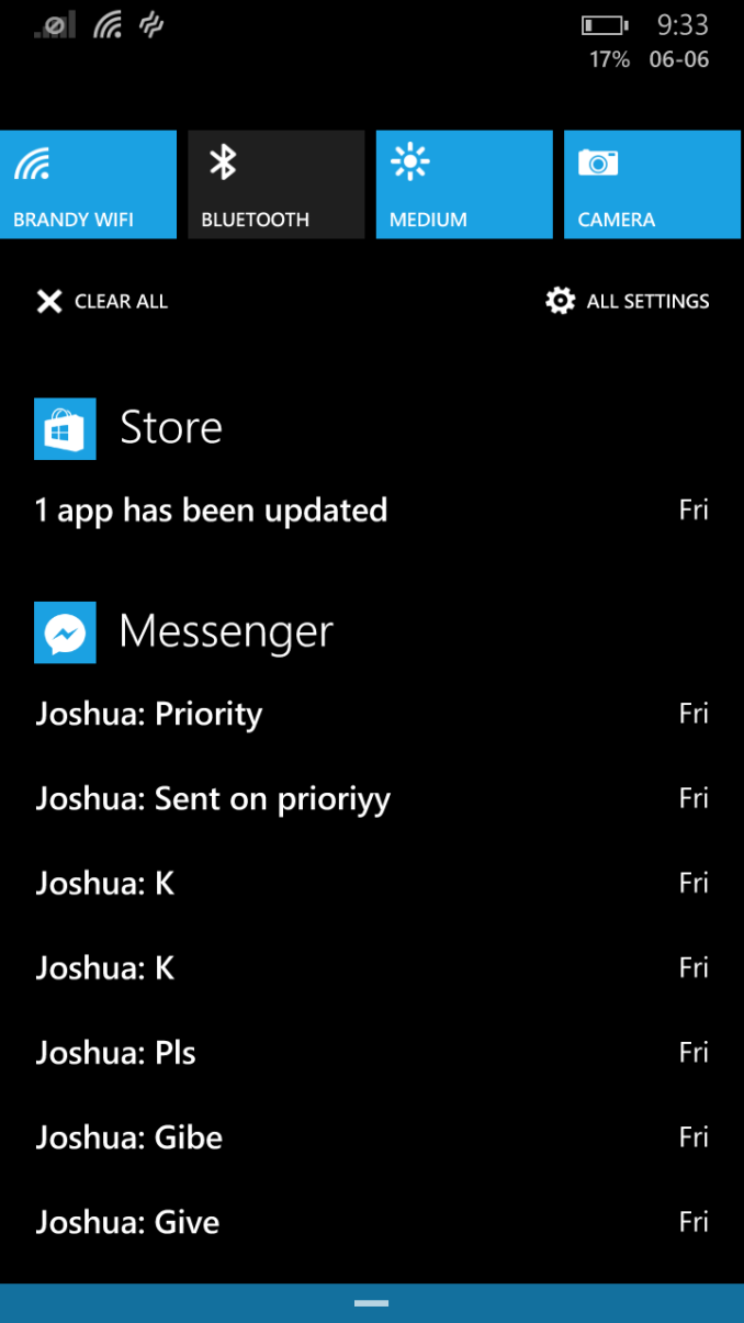
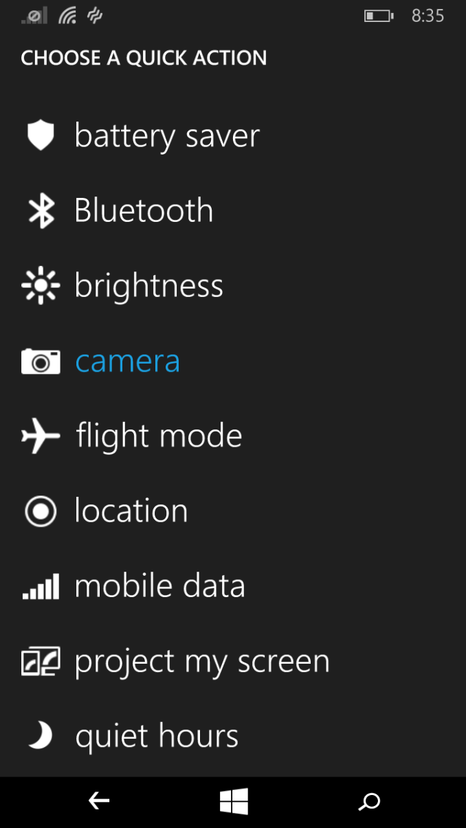
Action Center is a feature that solves the notification problems I had on Windows Phone. At this point it seems that every mobile OS has settled on an area for notifications which swipes down from the top. From a functional perspective, Action Center on Windows Phone is great. It integrates notifications and quick settings, and you can even change which settings it displays which puts it ahead of iOS and Android in terms of customization. There’s also a button to open the Settings app, and another button to clear all notifications which is helpful.
I do have a couple of issues with Action Center, although neither of them relate to functionality. My first issue is performance. At least on the Lumia 640, Action Center is incredibly stuttery when you’re opening and closing it, and it often freezes up in the middle of the animation for half a second or so as you’re opening it. Scrolling within it is also very sluggish and clearly sub 30fps. My second issue is with the animations themselves. The animations for opening and closing Action Center suffers from the same issue that pre-Lollipop Android did, which is that as you pulled down to open it the notifications were simply revealed from top to bottom as you pulled down. This doesn’t make any sense in the context of something that you are pulling. For example, when you open a drawer, the first contents you see will be those closest to the handle, not those that are farthest away at the back of the drawer. It’s just an oversight that misses the metaphor behind the design. What I find interesting is that this GIF from Microsoft’s support site shows how the animation actually should work, but on a real phone it’s completely different.
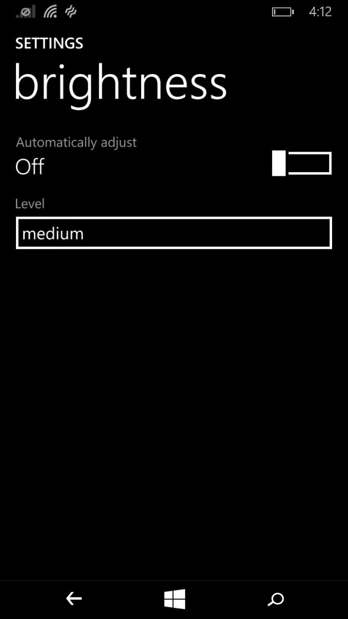
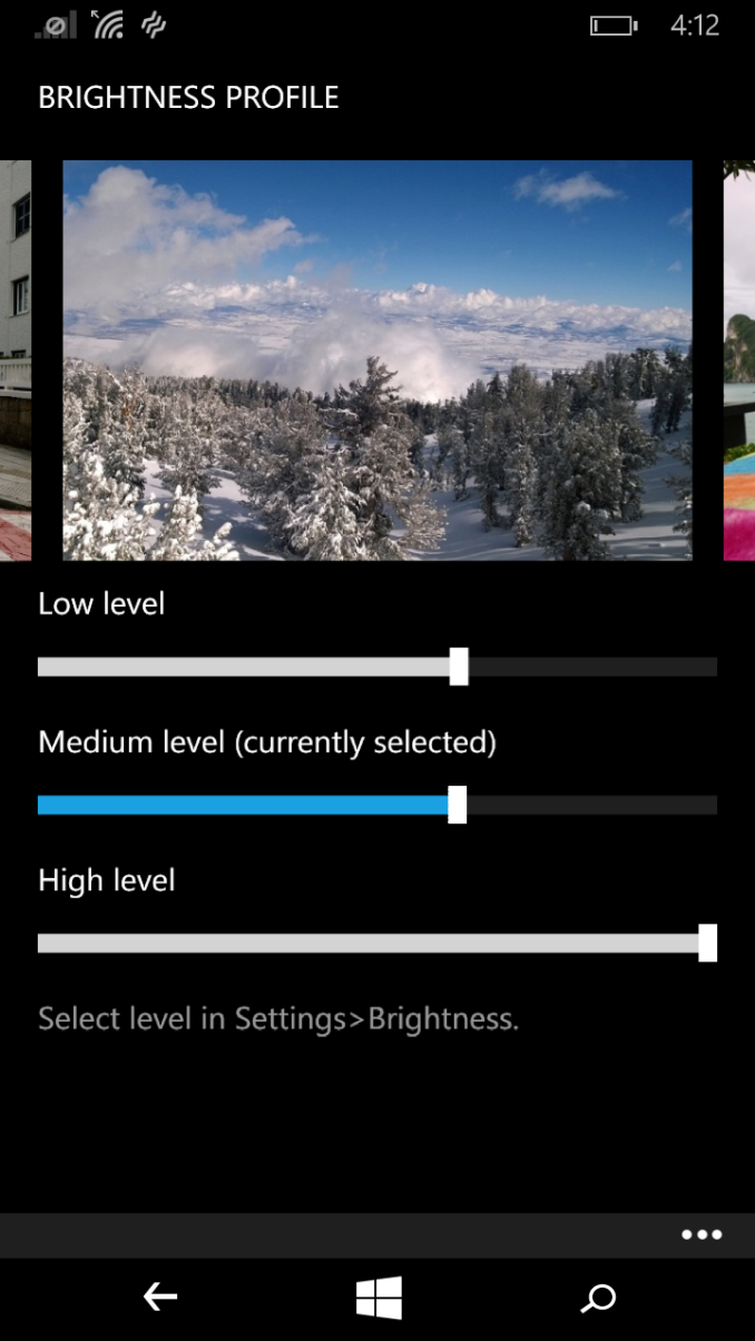
While Action Center fixes the issues with keeping track and keeping an eye on toast notifications, some of the other complaints I had about Windows Phone either haven’t been fixed or have been fixed in a less than optimal manner. I can think of no better example than the brightness settings. The availability of only three pre-defined brightness options has long been a criticism of Windows Phone. When Nokia was making Lumia phones and were making their own modifications to the OS they added their own brightness sliders in a separate section of the settings app. These have remained on Lumia devices to this day, but they don’t completely fix the problem of controlling brightness. While you can now set the value of the low, medium, and high brightness settings using individual sliders for each, those sliders do not each follow the same range of brightness values.
For example, if you set both the low and medium sliders to exactly the same spot, the brightness of the medium setting is not the same as the low setting. I understand why Microsoft is doing this, as you could otherwise have a situation where low was the brightest setting, and high was the lowest. However, I don’t understand why Microsoft cannot just put in a single brightness slider like every other operating system, including their own desktop operating system. It’s less confusing for the user to have a single brightness control, and it really has no disadvantages.
The one other thing that really bothers me about Windows Phone itself is the low cap that Microsoft has put on scrolling velocity. This has existed since Windows Phone 7, and from what I can tell it has not been changed at all despite the fact that modern SoCs are 10 to 20 times faster on the CPU side and have GPUs that are over 100 times faster than the Adreno 200 in the original generation of Windows Phones. While keeping the scrolling speed low allows Microsoft to make their OS look smooth even on lower end devices, it makes the entire operating system feel painfully slow. Whether you do a gentle swipe or a forceful one, your scrolling goes at the exact same rate, and when you’re scrolling through long music albums or webpages it feels like an eternity has gone by once you finally reach the bottom. The fact of the matter is that while Windows Phones still hold some smoothness advantages over Android devices in the low end part of the market, that gap is constantly decreasing, and while Android devices may have a bit of jank, they never feel slow.
While I have complaints about certain aspects of Windows Phone, I could name just as many things that don't make sense or have problems in Android and iOS. None of these mobile operating systems are even close to being perfect, and although I'd say the slow scrolling is a larger issue than anything on iOS or Android, I don't really have any issues with the core functionality of Windows Phone.
The App Situation
Moving beyond Windows Phone itself, there’s no way to discuss the platform without coming to the topic of third party app support. It is true that Windows Phone is not near as well supported as iOS or Android, but when it comes to popular services there are usually official or unofficial apps that you can make use of. The real issue that I’ve found is that the quality of apps is not as good as on Android, and not even remotely close to the quality of apps on iOS. I’ve found a lot of issues with poor performance, missing features, and just an overall lack of polish.
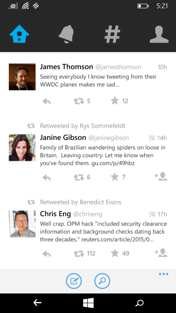
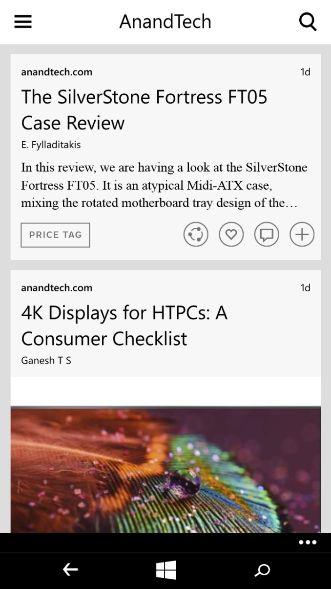
Two great examples of popular apps that do exist but have problems are Twitter and Flipboard. Both tend to have issues with animation and scrolling performance, and both have some interface oddities that I don’t understand. Twitter has those enormous buttons at the top, along with buttons at the bottom, and they eat up so much of the screen space that you can barely fit any tweets on the screen even after setting the font to the smallest setting. Flipboard is quite different from its Android and iOS counterparts, as it opts for an infinitely scrolling list instead of pages that flip. Both of the apps seem really mediocre, and it’s clear that they’re just an afterthought with little effort put into long-term support. Twitter hasn’t been updated since January, and it’s missing features like tweet quoting that have been introduced on other platforms since that time. This holds true for most of the official apps for popular companies and services that I've used. They're not given the same care and attention as Android and iOS apps.
When it comes to missing apps, there is one company who doesn’t make apps for Windows Phone, and it’s a deal breaker for me. That company is Google, and as of right now they only have one app on the Windows Store. That app is just their Google Search app for users who don’t want to be forced to use Bing in Internet Explorer, and it’s not very useful. Clearly Microsoft offers alternatives to Google services like Drive and Hangouts with apps like OneDrive and Skype, but that doesn’t do much to help users who already use the services within Google’s ecosystem. I get a lot of personal and work messages over Hangouts, and I have a lot of content stored on Google Drive. I’m even considering moving my photo collection to Google’s new Photos service, and that won’t be on Windows Phone either. There’s not much that Microsoft can do about this, and when they’ve tried to make apps themselves they’ve been blocked by Google. Company politics interfering with the user experience is a very sad thing, but the end result is that key apps I need are unavailable, and that ultimately makes the entire platform one I can’t use.
Windows Phone isn’t going anywhere, especially with Microsoft now being the producer of nearly every device. Unfortunately, that’s also part of the problem. I think Microsoft being the major Windows Phone manufacturer scares off other vendors, and Microsoft hasn’t iterated quickly enough on their own software and hardware. Windows Phone has no presence in the high end market, and Android has caught up in the low end market. I mentioned in my Moto E review that for a long time I recommended that users who wanted a cheaper smartphone go with Windows Phone over Android, because at the time the options on Android were janky, slow, and offered a poor experience. I can’t make that recommendation anymore, because the app gap is still here, while the experience gap in favor of Windows Phone is gone.




130 Comments
View All Comments
WinterCharm - Tuesday, June 9, 2015 - link
That's a really nice phone for the price! :DGreat look and design, too!
JohanAnandtech - Tuesday, June 9, 2015 - link
That kind of performance is going to get frustrating pretty quickly. Simply using some kind of navigation will quickly show the limits of using an A7 core.Wolfpup - Tuesday, June 9, 2015 - link
On Android an A9 is dirt slow, while it's not bad running real Windows, much less Windows Phone.I've got a 520 and a 635, and the A7 isn't an issue in the 635 at all...at least not for the stuff most people do (certainly including navigation software). This 640 looks like an awesome extension...2x the RAM and a larger screen. Naturally it's coming out not long after I bought a spare 635 lol
jospoortvliet - Thursday, June 11, 2015 - link
As the review makes clear - Windows Phone lost its advantages in terms of performance...jakoh - Thursday, June 11, 2015 - link
The review compares the 640 to a bunch of high spec'd android and IOS, it doesnt show that WP can run smoothly even on crappy specs.leexgx - Thursday, June 11, 2015 - link
i do agree i got a nokia 820 seems to work wellBut the Main problem with windows phones is lack of ram some times background tabs are deep suspended and take to long to restore i ignore any windows phone with 512mb of ram but would recommend 2GB as a minimum
darkich - Friday, June 12, 2015 - link
You clearly didn't even read the article.The author was specifically comparing this to low end Motorola moto E performance wise.
And he stated for several times that the whole OS and browser feel really slow in comparison.
SirPerro - Monday, June 15, 2015 - link
"I mentioned in my Moto E review that for a long time I recommended that users who wanted a cheaper smartphone go with Windows Phone over Android, because at the time the options on Android were janky, slow, and offered a poor experience. I can’t make that recommendation anymore, because the app gap is still here, while the experience gap in favor of Windows Phone is gone."Article is loud and clear
Murloc - Tuesday, June 9, 2015 - link
not really, I have a 635 and the experience is fluid.testbug00 - Tuesday, June 9, 2015 - link
Really? L520 running quite smoothly through everything I throw at it (web browsing, some music playing, few notes in OneNote) andf it's a dual core A7 chipset (SD200)./yawn