The Corsair Gaming K70 RGB RAPIDFIRE Mechanical Keyboard Review
by E. Fylladitakis on July 1, 2016 8:00 AM EST- Posted in
- Peripherals
- Corsair
- Keyboard
- Cherry MX
- Mechanical Keyboards
- RGB
The Corsair K70 RGB RAPIDFIRE Mechanical Gaming Keyboard
The new Corsair K70 RGB RAPIDFIRE is physically very similar to any previous variation of the K70 that we have reviewed in the previous years. As a matter of fact, the only actual difference that it has over the Corsair K70 RGB (now that the old Corsair Gaming logo has been changed) is the presence of a USB pass-through port at the rear of the keyboard.
It features an anodized brushed aluminum chassis, with the keys secured directly on its surface rather than being embedded into it. Aesthetics are a completely subjective matter, so we will let you decide what you think about the appearance of the K70 RGB RAPIDFIRE. From a purely practical point of view, the keyboard is extremely easy to clean, as a simple blow can remove most debris from the aluminum surface of the keyboard.
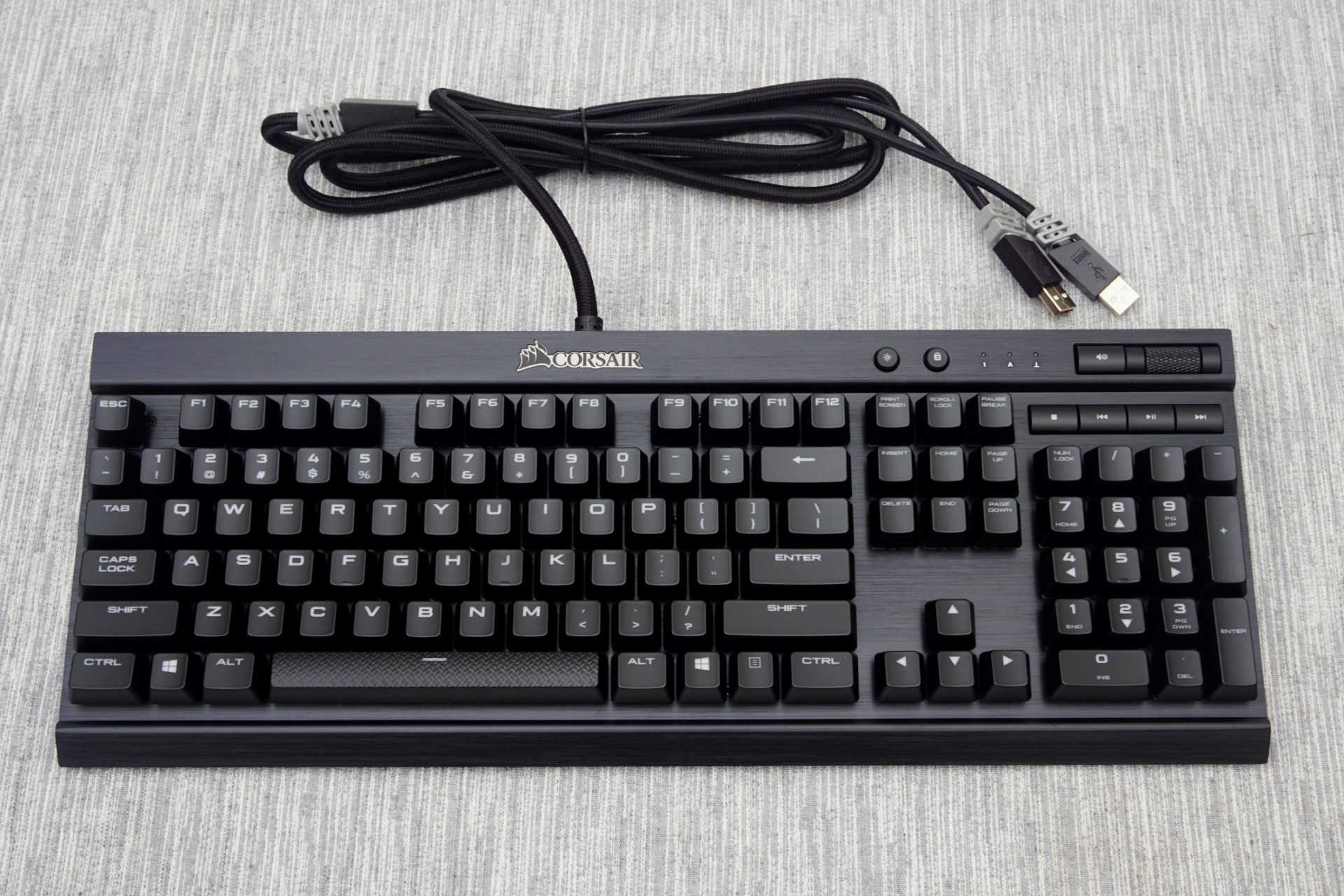
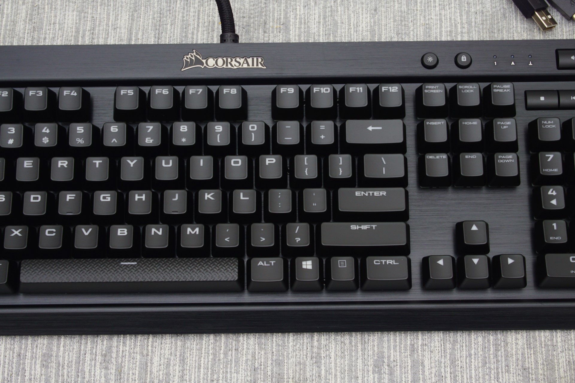
The K70 RGB RAPIDFIRE is a standard 104 keys keyboard, but it does not fully adhere to the ANSI layout, as the bottom row of the keyboard has a 6.5× Spacebar, two 1.25× ALT, two 1.5× CTRL and three 1× WIN/Menu bottom row keys. The standard ANSI layout has a 6.25× Spacebar and seven 1.25× bottom row keys. The keycaps are made from ABS plastic and have large, futuristic characters, while the Space Bar key is textured.
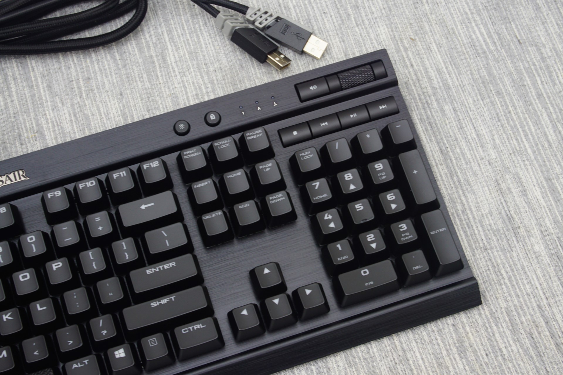
Besides the typical 104 keys of a full-sized keyboard, the K70 RGB RAPIDFIRE also has seven extra keys and a volume control knob. Four of them are media control keys (Play/Pause, Stop, Forward and Back), one is the volume mute button and the two smaller keys towards the center are the windows key lock and the backlighting brightness control. Three very small white LED lights serve as the three standard key lock indicators (Caps, Num and Scroll Lock). The LED lights of the three indicators are the only lights that are not customizable on the K70 RGB RAPIDFIRE.
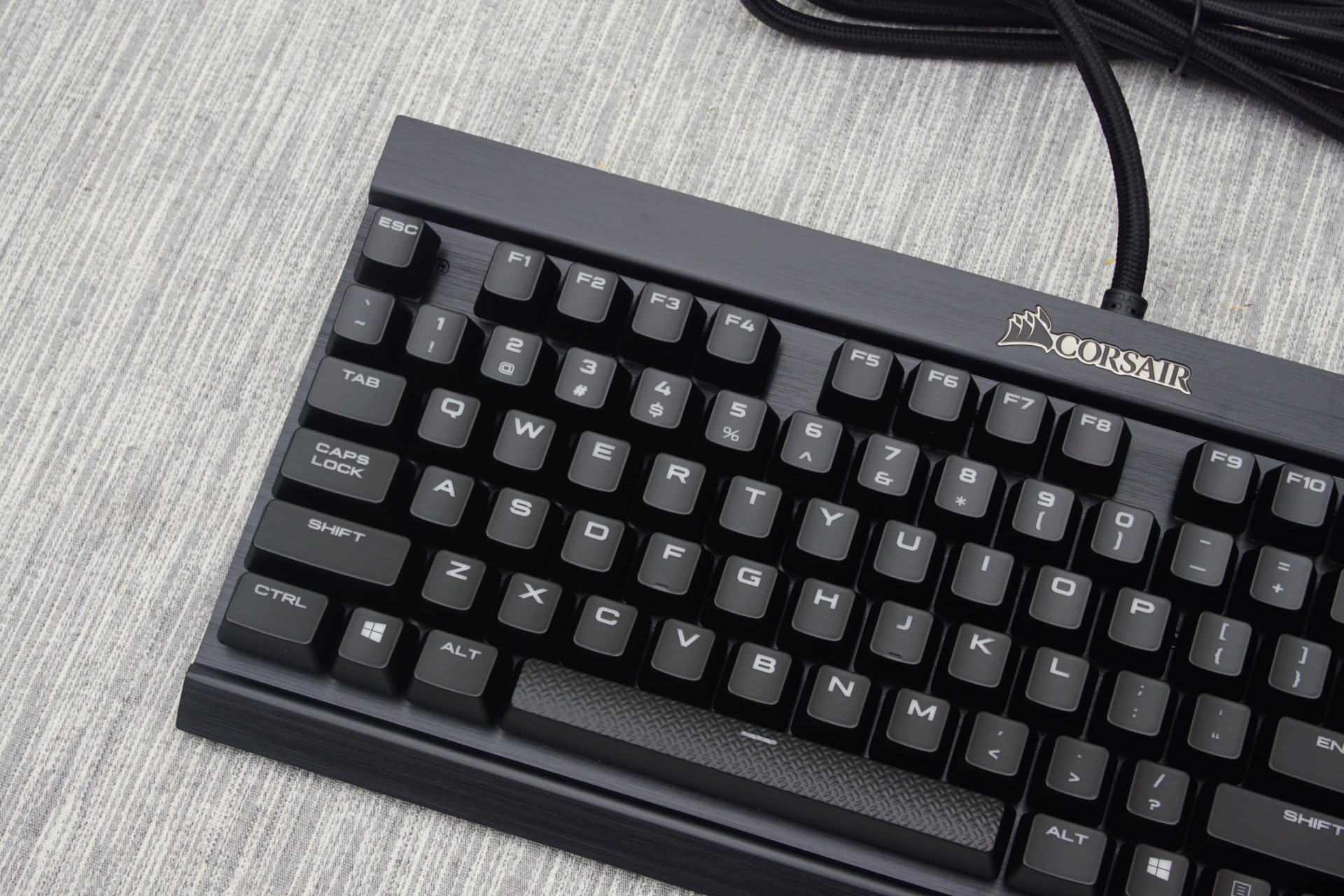
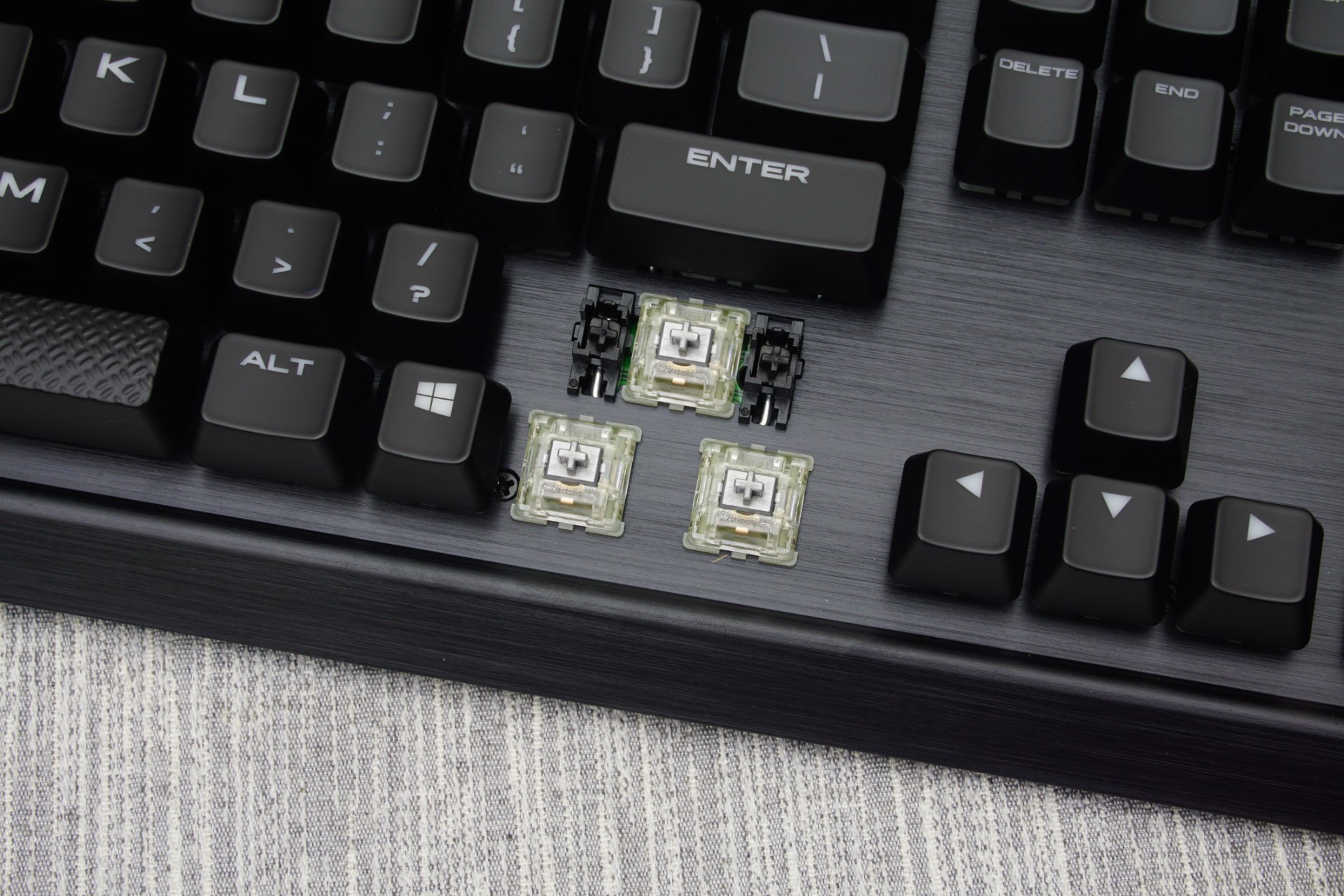
Beneath the keycaps we find Cherry’s new MX RAPIDFIRE switches. The RGB versions found on this keyboard have a clear plastic body and silver axles. The MX RAPIDFIRE switch is very similar in design to the MX Red switch, with the most significant change being that its travel distance has been reduced by 0.8 mm. This offers faster actuation (1.2 mm to the actuation point instead of 2 mm) but also shortens the full travel distance of the key as well. However, things are not technically quite as simple as that. The actuation force remains the same (45 Cn) while the distance is shortened by nearly 50%. While the travel of the key remains linear, the force per mm of travel increases at a much higher rate. As a result, the MX RAPIDFIRE switch feels significantly stiffer and stronger to the user, especially after the actuation point, and also resets faster than the classic MX Red switch.
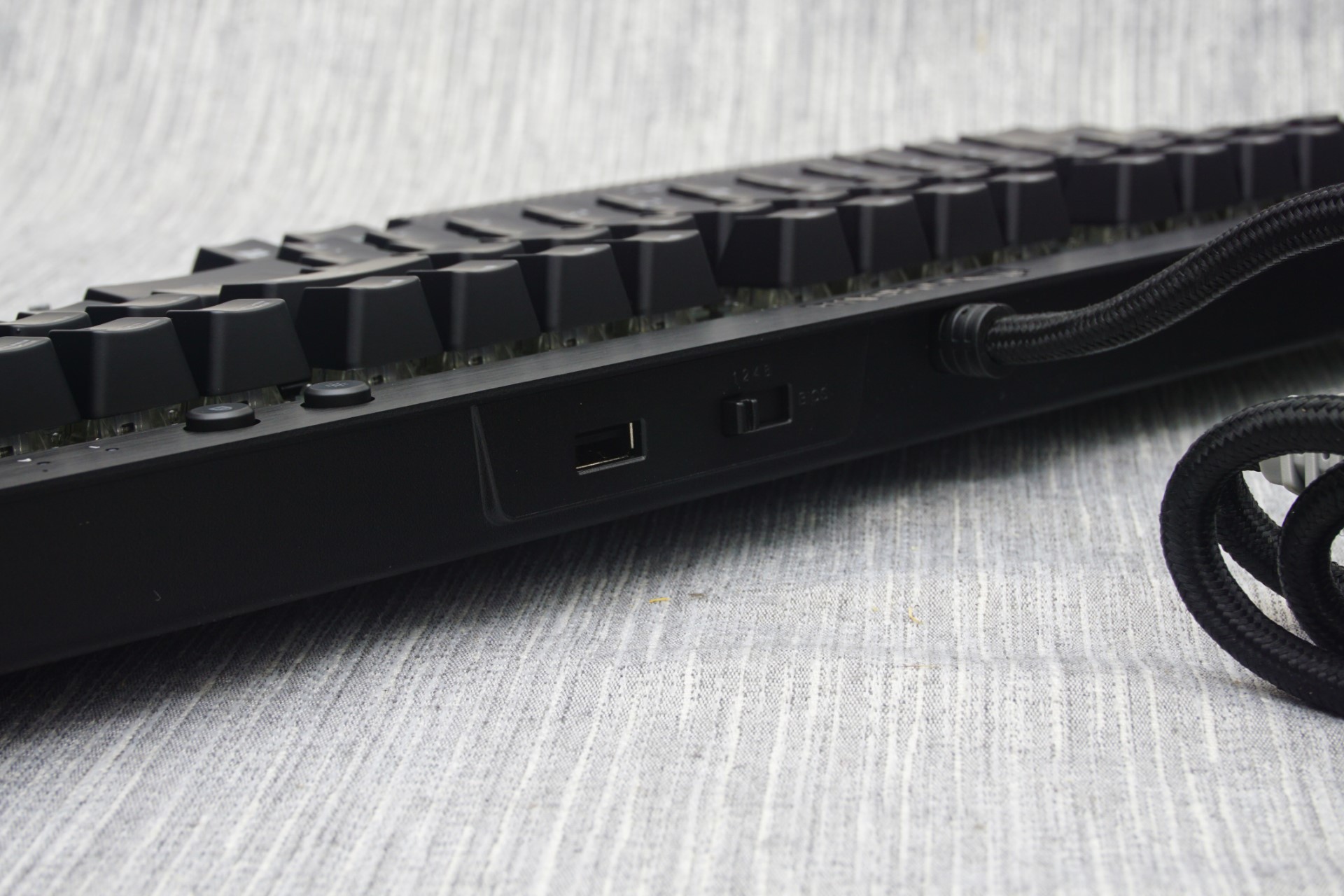
A USB pass-through port can be found at the rear of the K70 RGB RAPIDFIRE. Do note that both of the keyboard’s USB connectors need to be inserted for the pass-through port to function, even if the main connector is plugged into a USB 3.0 port. The second connector is not necessary for the keyboard itself to function properly if the main connector has been plugged into a USB 3.0 port, only the USB pass-through port will not function. If the main connector is plugged into a USB 2.0 port, the use of both connectors becomes a necessity, as the keyboard’s power requirements technically exceed the capacity of a USB 2.0 port. At the back of the keyboard there's a switch that can adjust the polling rate of the keyboard. This function will be useless with modern systems but may enhance the compatibility of the keyboard with older systems and certain devices, such as cheap KVM switches. The default polling rate is 1 ms and the user can reduce it to 2 ms, 4 ms, or 8 ms.
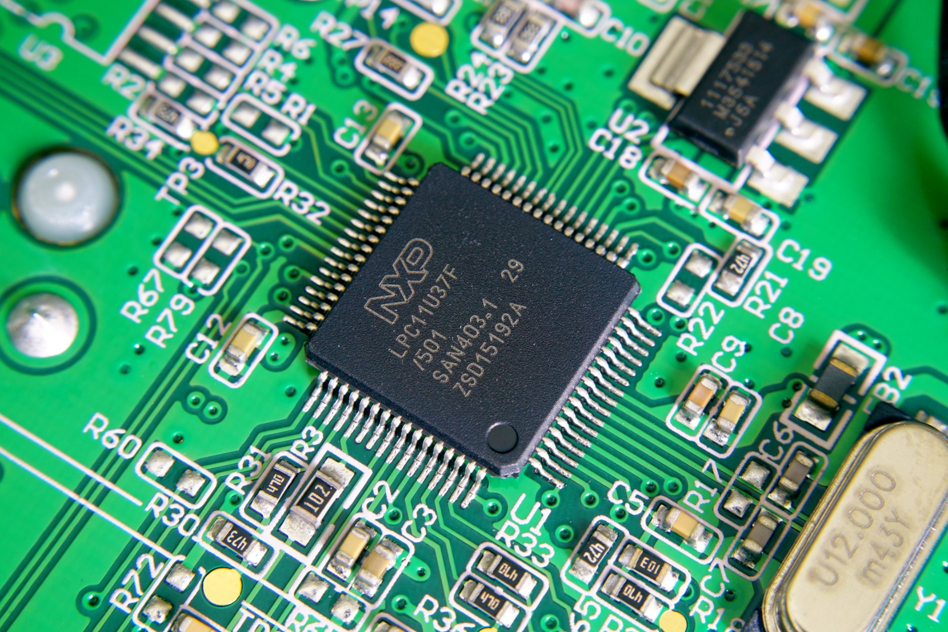
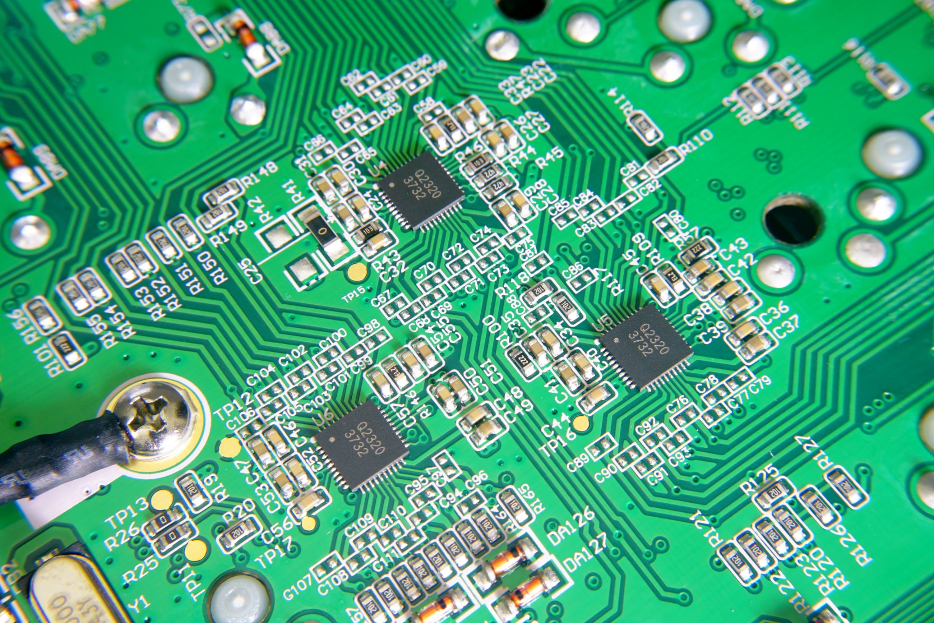
The removal of the keyboard’s covers revealed that the K70 RGB RAPIDFIRE is technically the same as the K70 RGB, with the exception of the new switches and the insertion of the USB pass-through port. The soldering job and overall quality of the assembly is textbook, without any flaws to be found.

A NXP LPC11U37F-501 microcontroller is the heart of the K70 RGB RAPIDFIRE. It has an ARM Cortex-M0 processor with a maximum frequency of 50 MHz, 128 kB Flash memory, 4 kB EEPROM and 12 kB SRAM. There are more impressive solutions for mechanical keyboards available nowadays but Corsair obviously (and rightfully) went for the tested and proven solution that has been working into several of their products during the past couple of years.


36 Comments
View All Comments
Omega215D - Friday, July 1, 2016 - link
This is why I felt the Romer G and SteelSeries low profile mechanical switches are quite good for quicker actuation and, for the Romer G, tactile feedback for typing purposes. The only thing that annoys me with Logitech's Romer G keyboards are the lack of on-board memory so that I can store settings without having to fire up LGS. The SteelSeries Apex m500 is just priced way out there to justify a purchase but it felt good to type on.JoeyJoJo123 - Friday, July 1, 2016 - link
Then use O-rings to prevent bottoming out your standard profile keys?wsjudd - Friday, July 1, 2016 - link
I agree, o-rings are a much cheaper solution than buying a new keyboard with new switches, and they work on every keyboard :)ddriver - Friday, July 1, 2016 - link
I guess they put a blind man in charge of selecting the font on this oneMargalus - Friday, July 1, 2016 - link
I wish more companies would use blind people then. That the best font I've seen on a keyboard in years.ddriver - Friday, July 1, 2016 - link
15 years of graphics and print experience say the font is mighty fugly and disproportionately stretched. You either haven't seen all that much keyboards or you have no notion of aesthetics.ddriver - Friday, July 1, 2016 - link
Font spacing on keys that have more than one character is very bad too.Margalus - Friday, July 1, 2016 - link
I've probably seen a lot more keyboards than you have, and I do have a notion of aesthetics. Just because my opinion is different than yours does not make it any less valid. The font is smooth, large, and easy on the eyes.inighthawki - Friday, July 1, 2016 - link
I'd have to side with ddriver on this one. The font looks pretty ugly to me -- The letters are way too wide and bold, and have a pretty nonstandard (almost "gamer") design to them. And while I personally don't mind it, ALL CAPS HAS BEEN KNOWN TO BE A FAIRLY BAD IDEA for labelling things.ddriver - Saturday, July 2, 2016 - link
It is not just "gamer" it is "shitty 80's game" written all over. The font is obviously stretched far beyond the intent of the designer. Spacing is too small. Zero design skill, I'd fire that guy... out of a cannon.