ASUS PQ321Q UltraHD Monitor Review: Living with a 31.5-inch 4K Desktop Display
by Chris Heinonen on July 23, 2013 9:01 AM ESTAfter I published the initial grayscale dE2000 results for the PQ321Q, there was a lot of feedback over the quality of the numbers. The simple fact in the end is that only two of the numbers rose above the visual threshold of a dE2000 of 3.0. Yes, I would really like to see an average dE2000 of 1.0 or less, but the point of dE2000 is to tell us if we can see an error or not. With the exception of pure white, and even then just barely, the PQ321Q should look incredibly neutral without any calibration done to the grayscale. The gamma also tracks the 2.2 target very well, which will help to make up for the lack of depth in the black level.
Of course we want to calibrate the PQ321Q to see what it can really do. If you are buying a $3,500 display, you can likely buy, or rent, calibration gear to get it dialed in if you really care about image quality. And if you do, you are in for a treat.
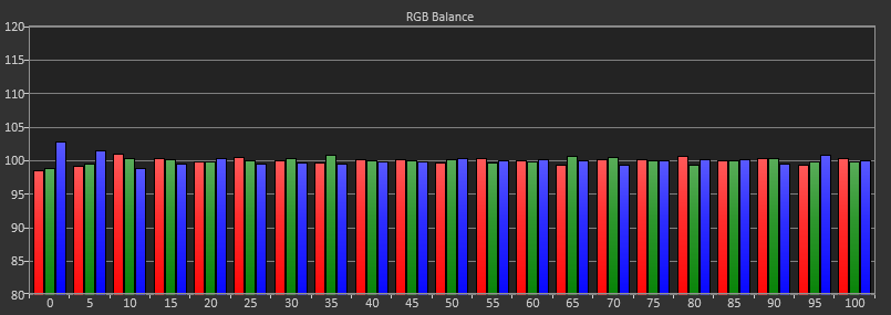

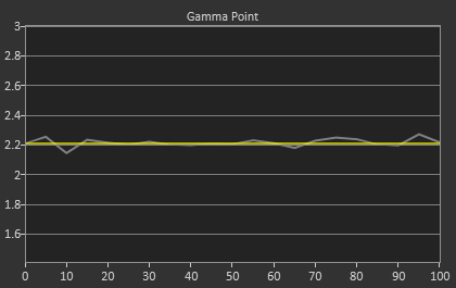
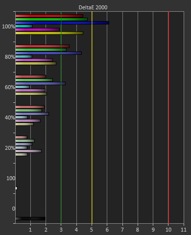
Post-calibration, our dE2000 average is now 0.56. We see every error below 2.0 except for 0, which really doesn’t matter anyway. There is no color shift, and the gamma tracks along 2.2 almost perfectly. Our contrast ratio has taken a small hit, down to 704:1 as it has to manipulate the peak white level to be more accurate. What we see now is a grayscale image that is basically flawless.
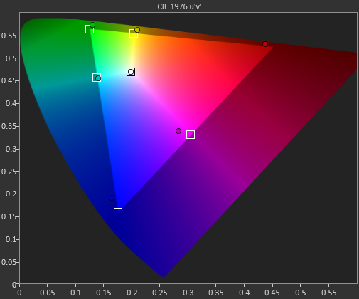
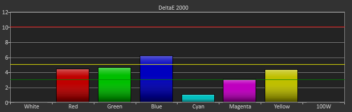
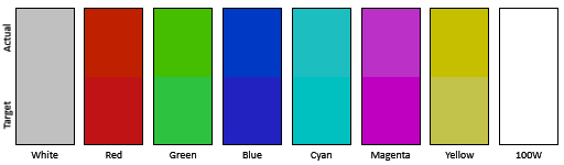
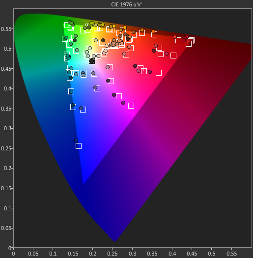
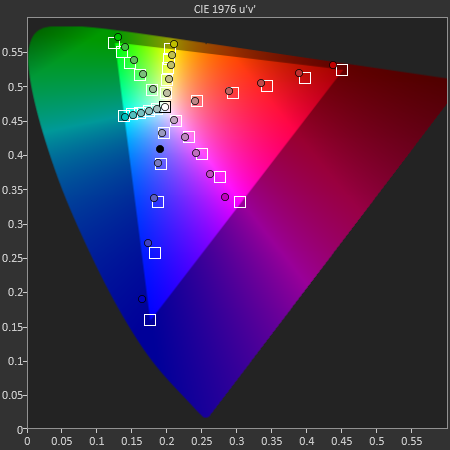
With color the PQ321Q has a pair of issues. The first issue is undersaturation in the gamut when it comes to red and blue. This also causes Magenta to be undersaturated, and brings out some high dE values for 100% saturations on those colors. We also see that green and red fall outside the sRGB gamut triangle. This too is unfortunate as it pushes yellows and oranges outside the gamut, and causes errors there. Our Cyan value is almost perfect, but every other color has some issue on the PQ321Q, at least at 100%.
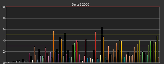
The reason we don’t just stop with the gamut charts is because they only represent 6 colors out of millions. They might have a large error, but it is rare to see 100% saturated colors in real content like photos or movies. To test this we use the Colorchecker chart in CalMAN. We’ve always used the Gretag Macbeth chart, which has 24 common colors on it. SpectraCal has added a 96-sample chart to the newest version of CalMAN. This adds more skin tones and other colors, and will provide a more accurate indication of monitor performance. The color samples for it are taken from an XRite chart. I’m going to run them both for a few reviews to see how it goes, but more samples leads to better accuracy, and lets us pinpoint exactly where things are going bad.
On the PQ321Q the issues all come back to Red/Orange/Yellow shades. Skin tones are good, blues and purples and cyans are all decent, and blue-greens are nice as well. Those tones that fall outside of the triangle cause the dE2000 average to rise way, way up and show us where the issues are. Reds certainly have a good amount of pop on the ASUS, and there really isn’t a good way to bring them back in. This issue is the largest one with the ASUS PQ321Q, as that extra gamut can’t really be addressed.
Traditionally if you look at the standard gamut dE2000 chart and see a large error in red, that indicates you will have issues with skin tones and people looking sunburned, With the larger Color Checker chart, we see that this is not the case, and that skin tones are, for the most part, under control while orange and yellows are not. This extra data helps us realize where the ASUS will look correct and where it will fall short.
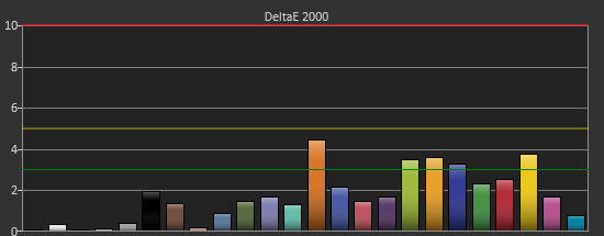
With the saturations charts, we see that the errors start small, like usual, and get larger as you move towards the edge of the gamut. Blue has the largest error, though we are less sensitive to blue than other colors. Cyan again remains great, and it would be nice if every color had the same performance as it does.
Post-calibration the ASUS is a bit of a mixed bag. We get great grayscale and gamma performance, but most people don’t just deal in black-and-white content. The color gamut provides a bit of an issue being both under-saturated and out-of-gamut at the same time. Looking through images the issue that pops out to me is the yellows. They really pop off the screen and look too bright. The color of reds looks slightly off, but yellow has the biggest issue that I can see with my eyes.


166 Comments
View All Comments
chewbyJ - Tuesday, July 23, 2013 - link
this is great news! i've been wanting to replace my ancient Dell 2009WFP's with something larger, feel like experimenting with that Seiki SE39UY04 for $700 that got announced last month. hopefully you guys can get your hands on one of those soon and have something to compare with this ASUS model.can't wait to do Photoshop and Lightroom work on a giant 4k display and use a more expensive/high quality uniformity display for color accuracy of prints and media.
Panzerknacker - Tuesday, July 23, 2013 - link
btw, why is everybody worrying so much about gaming and graphics cards not handling 4k? I mean when you have that many pixels available it should be no problem to upscale, run the game at 1080p and simply upscale to 4k. I doubt there will be quality loss due to this and it will probably still look better than on a native 1080p screen.How does this work btw? Is it possible to let the screen do this by itself like with a TV? So you input 1080p, 1024 x 768, whatever ress, will it be upscaled by the screen to 4k and display fullscreen? This is really important for me because I would use the screen for everything, also playing older games that do not support 4k.
sheh - Wednesday, July 24, 2013 - link
Of course, like any current monitor, monitors do scaling. Some do it better, some worse, some let you configure more scaling options, some don't. It's probably best to handle scaling with the graphics card (/drivers), because that gives you, at least potentially, the most control.pattycake0147 - Tuesday, July 23, 2013 - link
The paragraph describing the black levels is missing a zero after the decimal and before the seven. Confused me until I looked at the graph.pandemonium - Wednesday, July 24, 2013 - link
Nice spreadsheet you got there. Clearly shows the necessary amounts per distance and size of display. More people need to be aware of such things!LordSegan - Wednesday, July 24, 2013 - link
"The ASUS PQ321Q is pricey, and I can’t say that getting three or four 30” 2560x1600 panels isn’t a better deal, but it’s not the same as having one display that looks like this. "I don't mean to be harsh, but this story needs more careful copy editing. There are run on sentences and other pretty amateurish errors.
Mondozai - Wednesday, August 21, 2013 - link
I don't mean to be harsh, but your comment needs more careful copy editing. You should spell it run-on sentences, not run on sentences.It helps having correct grammar when trying to correct others.
Just a tip.
bill5 - Wednesday, July 24, 2013 - link
Heh, what a surprise the reviewer loved a $3,500 monitor...It's almost like you get what you pay for
Confusador - Wednesday, July 24, 2013 - link
So when can I get a 23" 2560x1600 display? 32 is a bit much for me, but I'd love the dpi.sheh - Wednesday, July 24, 2013 - link
2014, probably.