Samsung Galaxy S III Review - AT&T and T-Mobile USA Variants
by Brian Klug on June 20, 2012 12:01 AM ESTBefore we dive into the review of Samsung’s Galaxy S 3 variants for the USA (henceforth SGS3), it’s worth it to quickly talk about how much the SGS3 launch in the US differs from that of SGS2. Since announcing the international SGS3, it has been just under a month and a half, and here we are with finalized software and hardware and devices which will be on retail and carrier shelves within a week. When rumors of the SGS3 started circulating, one of the things that resonated the most for me was that Samsung was going to put a lot of emphasis on the USA launch, and dramatically narrow the gap between announcement and availability. When you look at that roughly month and half, and compare to the SGS2 launch, which started with its announcement at MWC and launch in the USA in September and October, it’s really obvious to see how much that ended up being true.
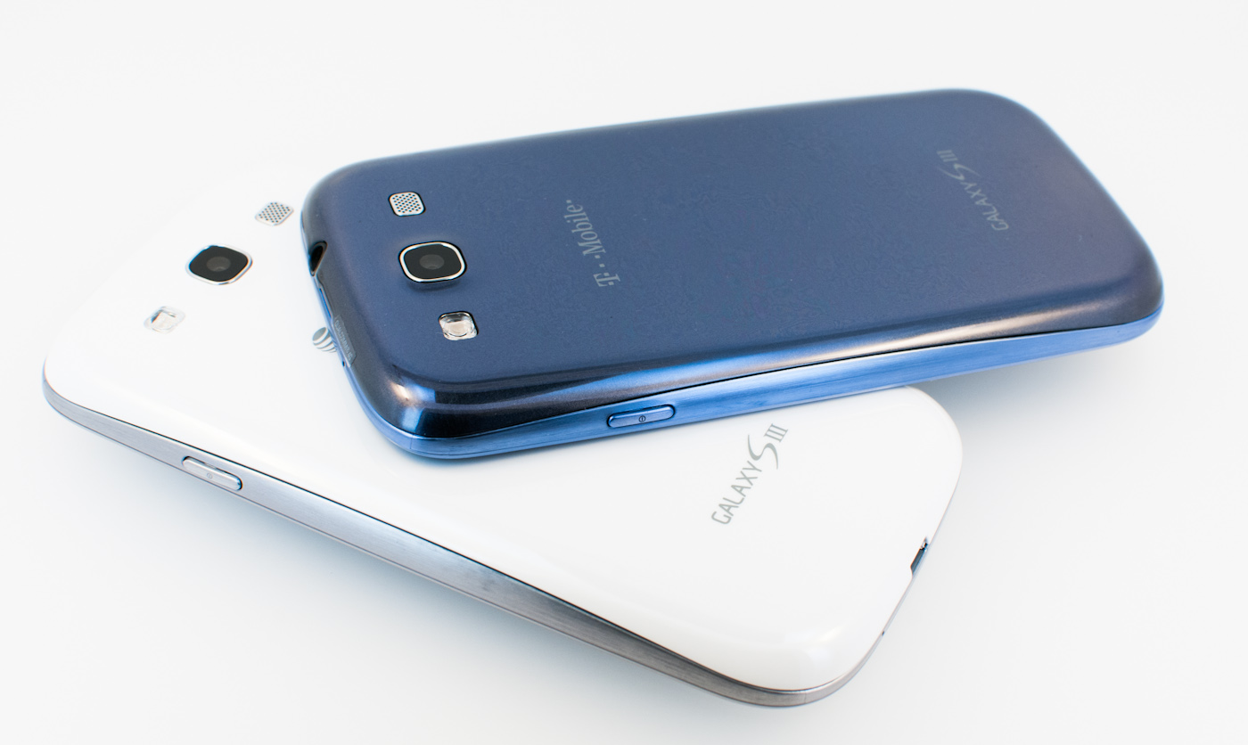
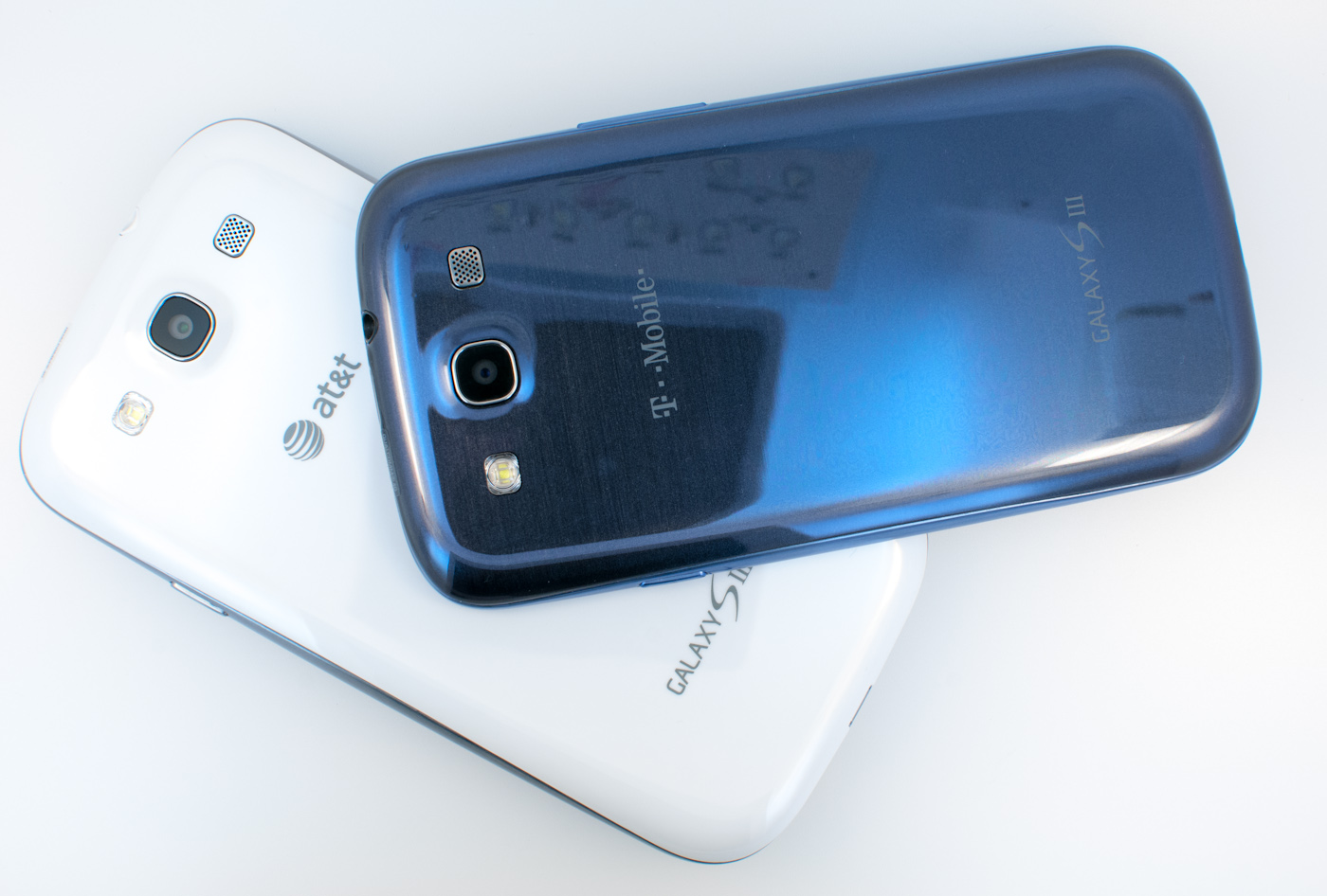
Reviewing the SGS3 USA variants is much easier this time, since all of the devices are basically identical, with the exception of air interfaces. They share the same exact exterior dimensions, display, battery, and accessories. With the exception of those air interfaces, all five variants ship with the same Snapdragon S4 MSM8960 SoC at 1.5 GHz, 2 GB of LPDDR2 RAM, 8 MP rear facing camera, dual band WiFi, Bluetooth 4.0, and a microSD card slot. The only difference is whether you get one with 16 or 32 GB of onboard storage, some software preloads, and the appropriate bands and cellular interfaces for the carrier.
I cannot state enough how huge that is for Samsung, as for the first time we have something other than the iPhone shipping in a nearly identical form on five different carriers. When you look at the evolution of Galaxy S, you can see how much Samsung has built upon this more and more each generation to get to this point. With Galaxy S, there was no consistent branding or naming in the USA - you had variants like the Vibrant, Captivate, Epic 4G, and Fascinate. With SGS2 Samsung nailed down the branding part way (all the variants were “Samsung Galaxy S 2” and then some carrier specific suffix) but ultimately had some differences in hardware platform (one was Exynos 4210, most were APQ8060). With SGS3 Samsung now has nailed down the exterior appearance and battery form factor (which will foster a big accessory ecosystem), the last part of the branding (all of the variants are just Samsung Galaxy S 3), and the hardware platform itself (same display, camera, SoC, etc). It’s obvious that Samsung understands the value of having a coherent message and launch spread across the carriers. A couple of weeks ago, I had the opportunity to play with basically all of the SGS3 variants in NYC, and get a first hand appreciation for how consistent things are across the lineup now. Without looking at the branding on the back of the phone (note that it isn’t on the front, for once), there literally is no dead giveaway that one SGS3 is a Verizon model, or a T-Mobile model, or an AT&T, or a Sprint model. That alone says quite a lot.
Anyhow, on to the devices themselves. I was sampled the T-Mobile and AT&T SGS3s by Samsung just a few days ago, and have been playing with them, benchmarking, and battery life testing them nonstop. Since seeing the SGS3 at the launch event in London, I have to admit that the design has grown on me considerably.
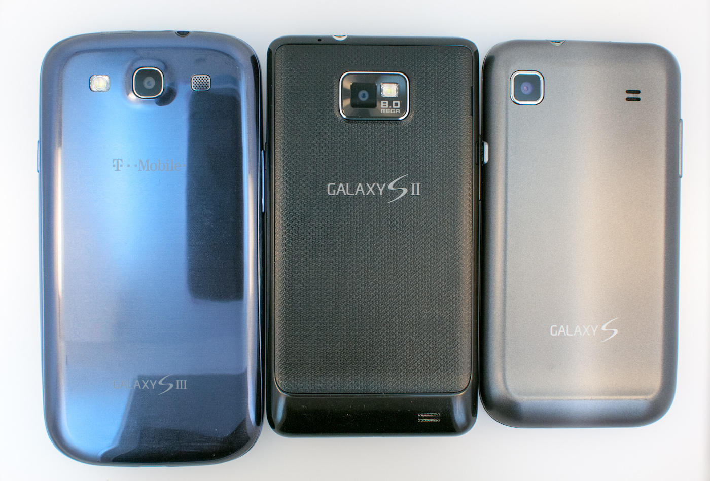
Samsung claims that its SGS3 design is derived from nature, and I guess you can somewhat see a connection between a device with a mostly spherical overall shape and large radii curves, and the spherical form that gravity induces orbital bodies into into being. Either way, it’s a clear evolution of the APQ8060 based SGS2 devices that we saw at the end of the SGS2 rollout - phones like the T-Mobile SGS2 or AT&T SGS2 Skyrocket - and thus shouldn’t have come as a huge surprise.
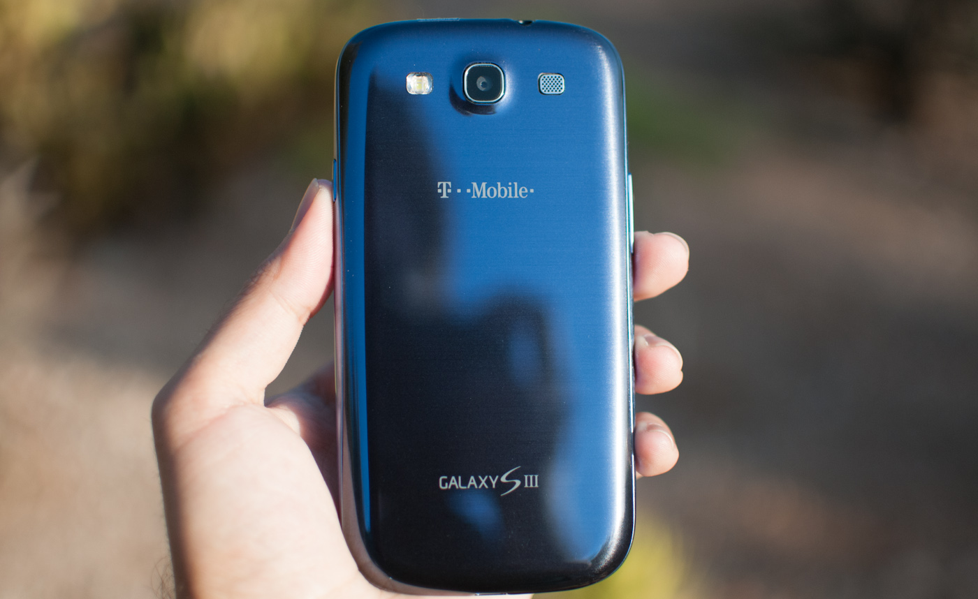
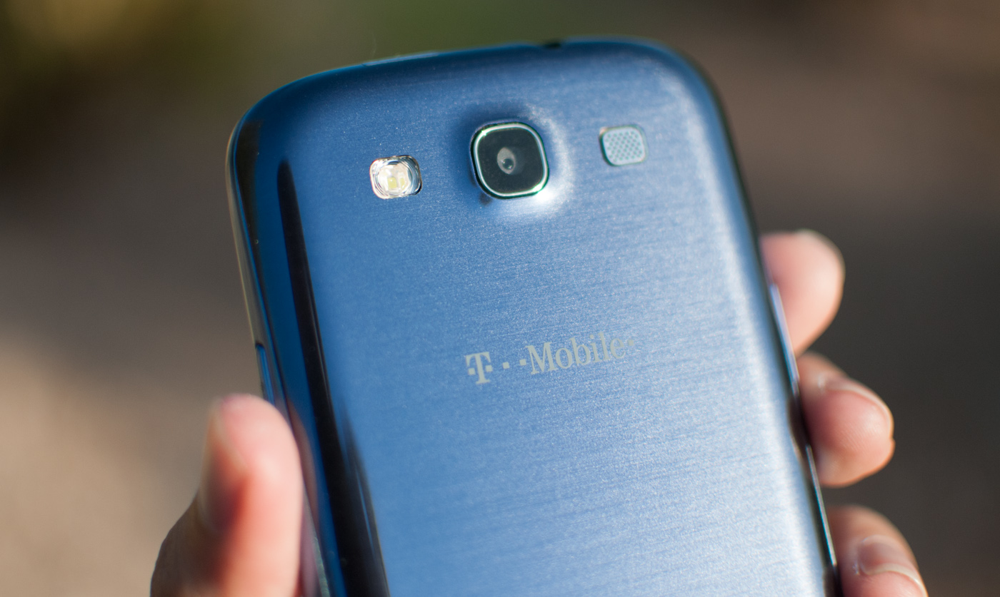
I played with a white model at the Unpacked 2012 event which was the first time I’d seen SGS3, and set my impressions about aesthetics based on that color. Samsung made sure to sample both colors for launch – pebble blue, and white. Oh, and the blue color is indeed the same across all 5 variants. After seeing both, I have to admit I prefer the pebble blue device, since it has a unique metallic appearance in the right light which definitely sets it apart.
The last differentiation is that AT&T will get a red color that I haven’t seen demonstrated yet, though that’s at some unknown point in the future this summer. For now, the white or pebble blue choice will be the one most customers will be forced to make. Just like other white devices, my main gripe is that although the color hides surface scratches (sleeks) and fingerprints better, dirt on the surface casts a shadow through the front glass onto the white below, and is easy to spot on the back plastic.
Samsung has largely made the same material choices with the SGS3 as it has other phones in the past, which means the exterior is entirely shiny, glossy plastic. The result is in-palm feel which really is a throwback to the initial Galaxy S or Nexus S. That choice is probably my only real gripe with the device overall, and it’s the result of a weight minimization design direction by Samsung’s design team more than anything else. The thought process is that customers value lighter weight devices over ones with beefier, metallic material choices. In addition, optimizing for lighter weight translates to less potential energy when dropped from a given height. I think it’s totally valid for Samsung to make that case, but I still find myself wishing that the SGS3 had used the textured surface that SGS2 did for the backside, which seemed to yield the best of both worlds. I wish even more that the device had a more unique feel like the bead-blasted polycarbonate or plasma-sputtered metal that other OEMs have gone with.
The other thing to talk about is how much bigger the SGS3 is compared to other phones, and the answer is really that it isn’t much larger than the Galaxy Nexus. In fact, if you look at the comparison table below, you’ll notice it’s both 2 mm wider and 1 mm taller than the Galaxy Nexus, but thinner and lighter. That’s not bad at all considering display size has gone up from 4.65“ to 4.8” diagonal, and I believe people just inspecting display size expected a dramatically larger device than the SGS3 ended up being.
| Physical Comparison | ||||
| Samsung Galaxy Nexus (LTE) | Apple iPhone 4S | Samsung Galaxy S 2 | Samsung Galaxy S 3 (USA) | |
| Height | 135.5 mm (5.33") | 115.2 mm (4.5") | 125.3 mm (4.93") | 136.6 mm (5.38" ) |
| Width | 67.94 mm (2.67) | 58.6 mm (2.31") | 66.1 mm (2.60") | 70.6 mm (2.78") |
| Depth | 9.47 mm (0.37") | 9.3 mm ( 0.37") | 8.49 mm (0.33") | 8.6 mm (0.34") |
| Weight | 150 g (5.3 oz) | 140 g (4.9 oz) | 115 g (4.06 oz) | 133g (4.7 oz) |
| CPU | 1.2 GHz Dual Core Cortex-A9 OMAP 4460 | Apple A5 @ ~800MHz Dual Core Cortex A9 | 1.2 GHz Exynos 4210 Dual Core Cortex A9 | 1.5 GHz MSM8960 Dual Core Krait |
| GPU | PowerVR SGX 540 | PowerVR SGX 543MP2 | ARM Mali-400 | Adreno 225 |
| RAM | 1 GB LPDDR2 | 512MB LPDDR2-800 | 1 GB LPDDR2 | 2 GB LPDDR2 |
| NAND | 32 GB NAND | 16GB, 32GB or 64GB integrated | 16 GB NAND with up to 32 GB microSD | 16/32 GB NAND with up to 64 GB microSDXC |
| Camera | 5 MP with AF/LED Flash, 1080p30 video recording, 1.3 MP front facing | 8 MP with LED Flash + Front Facing Camera | 8 MP AF/LED flash, 2 MP front facing | 8 MP with LED Flash + 1.9 MP front facing |
| Screen | 4.65" 1280x720 HD SAMOLED | 3.5" 640 x 960 LED backlit LCD | 4.27" 800 x 480 SAMOLED+ | 4.8" 1280x720 HD SAMOLED |
| Battery | Removable 6.85 Whr | Internal 5.3 Whr | Removable 6.11 Whr | Removable 7.98 Whr |
As an aside, I think far too much time has been spent debating the optimal display size. Clearly there are two factors at play here - a larger display is something immediately appealing to mass market shoppers, but at the same time there is an upper bound to overall device size for pocketability. The factor that often gets left out of most of these smartphone display size discussions that most shoppers aren’t my (or the AnandTech readership) demographic, male, 18–34, and obsessed with the latest and greatest tech. There’s an increasingly aging populace in the US with degrading eyesight, and for them, larger displays translate to a real value prospect. I find the Galaxy Note to be my personal upper bound for pocketable devices for a few reasons, and since the SGS3 is smaller, I have no issue.
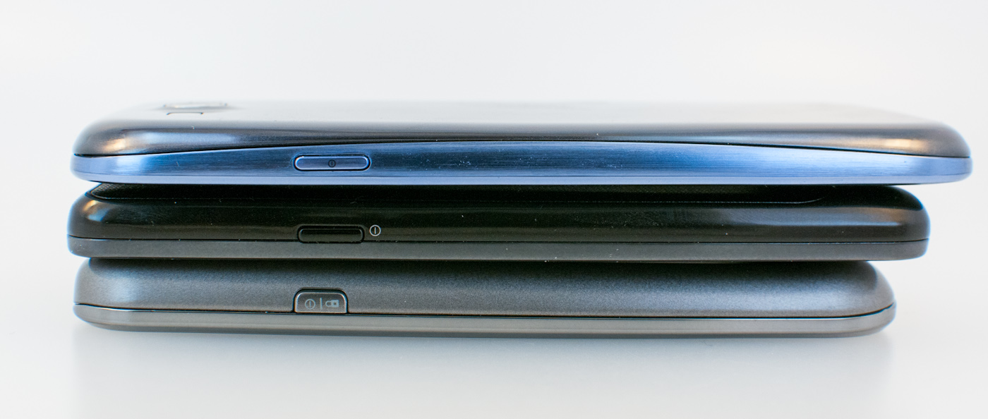
Button placement on the SGS3 is standard fare for a Samsung phone. The standby/lock button is on the top right side of the device, right where your thumb rests if held in the right hand, or index finger for the left hand.
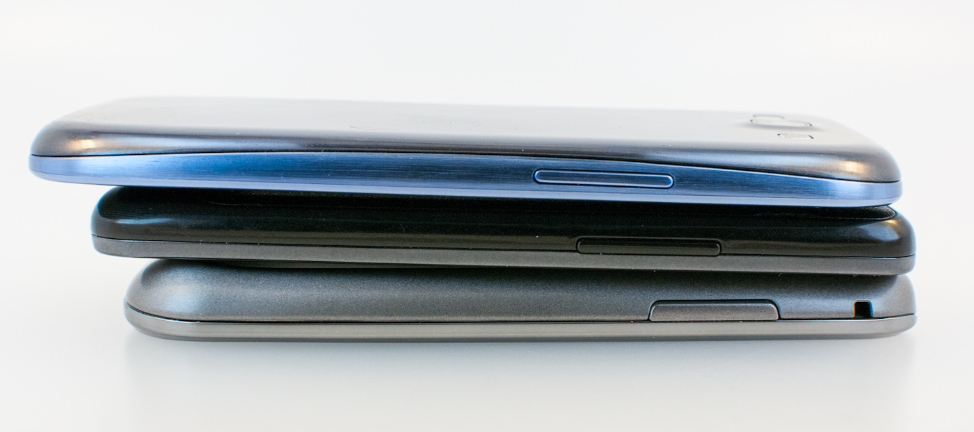
The volume rocker is on the left side the same place on the device, and the headphone jack is up top. MicroUSB gets located at the bottom, just like the SGS2.
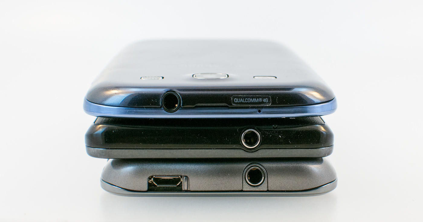
There are two microphones on the SGS3, one up top just right of the thumb groove for the battery cover, one at the bottom just to the right of microUSB. These are used for ambient noise cancelation on calls and stereo audio recording for video just like so many other phones now.
Peeling the battery cover off it’s immediately apparent how much space the SGS3 dedicates to battery, which is now a relatively gargantuan 7.98 watt-hours.
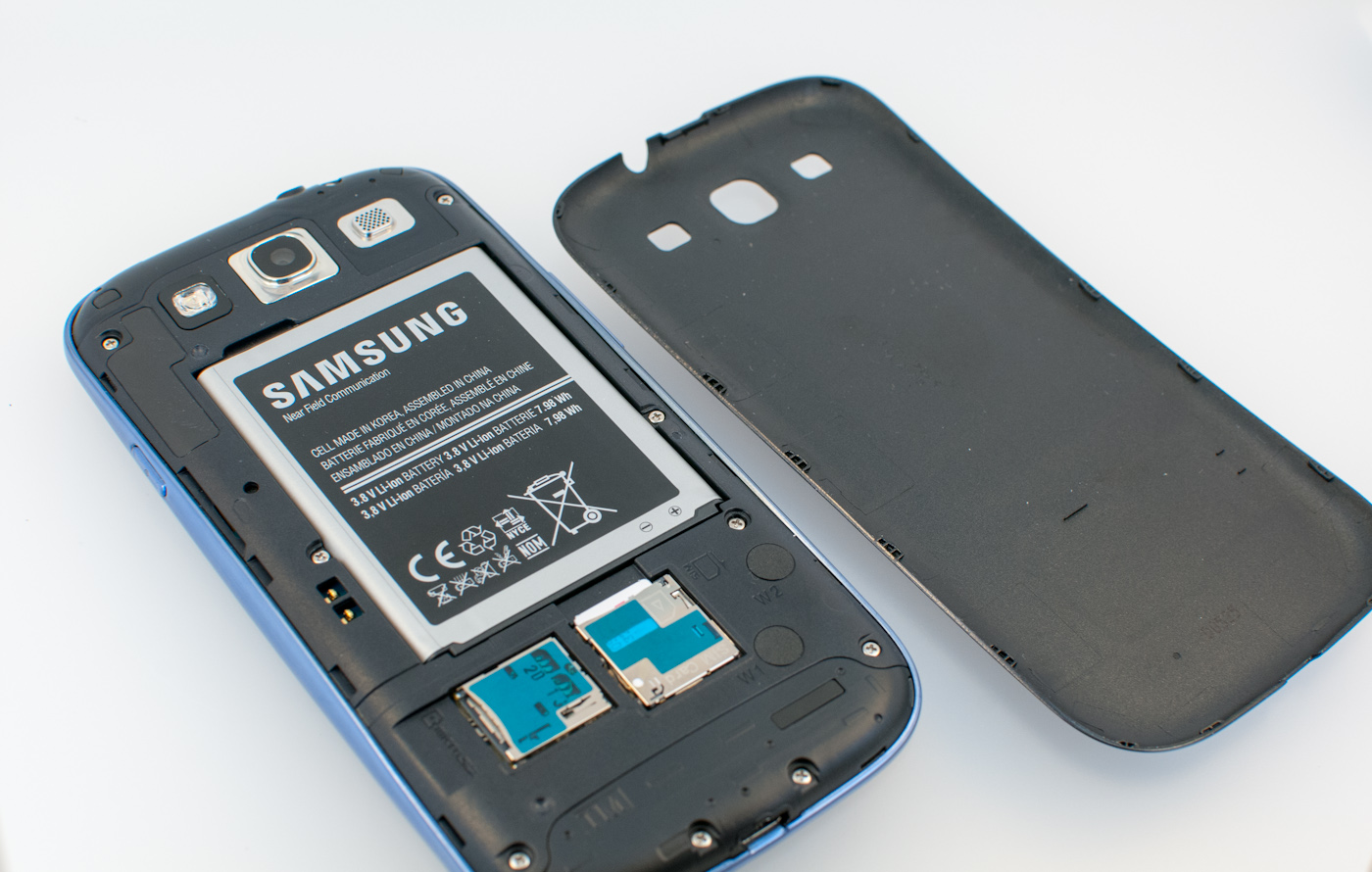
Samsung has also gone to a 3.8V nominal (as opposed to 3.7V) Lithium-ion battery chemistry, joining the ranks of Motorola who was first to adopt this higher voltage. Samsung continues to use the battery surface as the place to locate the NFC coil antenna. Interestingly enough just left of that are two pogo pins ostensibly for using a wireless charger back (which Samsung has shown), so I’m assuming Samsung’s hardware will disable NFC while you have that inductive charger attached. Below the battery is the microSIM port, and microSD port which now accommodates up to 64 GB microSDXC cards. At the very top is the speakerphone grille, 8 MP camera, and LED flash.

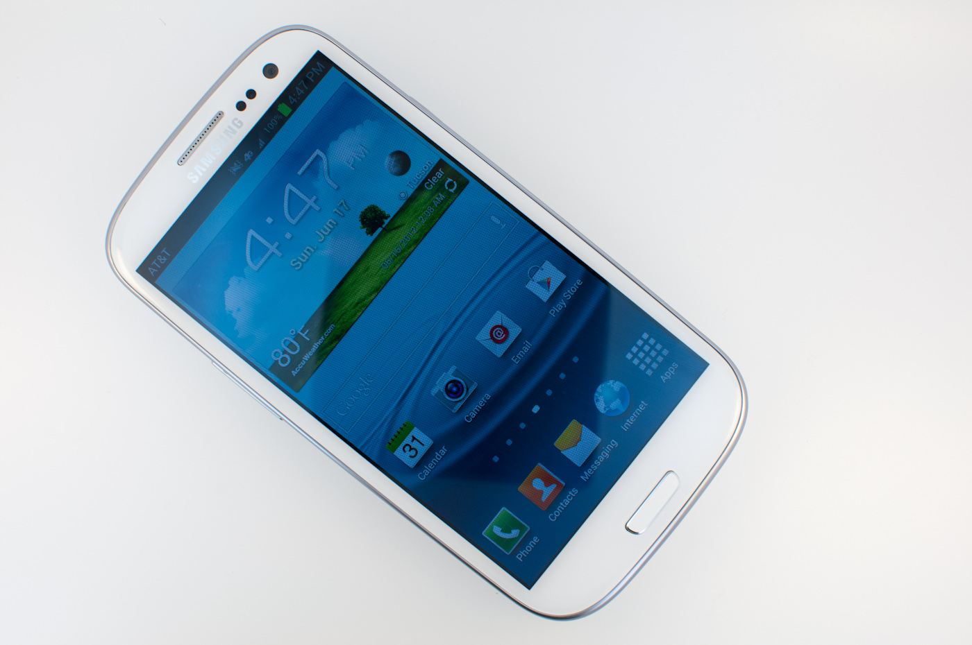
On the front up top are (from left to right) the RGB notification LED, earpiece grille, proximity and ambient light sensor, and 1.9 MP front facing camera. At bottom is the other interesting design consolidation for SGS3 - all five USA variants include the three button scheme that was previously basically only used in international phones. At left is menu, middle is home, and right is back. This is different from the three button scheme that HTC has adopted (back, home, and task switcher) and means that Samsung doesn’t need to use an on-screen menu button for applications which haven’t fully depreciated its use. These buttons disappear completely when they’re not backlit, which is awesome but can be initially confusing for users getting used to the three button scheme. Personally, I appreciate how they completely disappear on both the white and pebble blue variants.
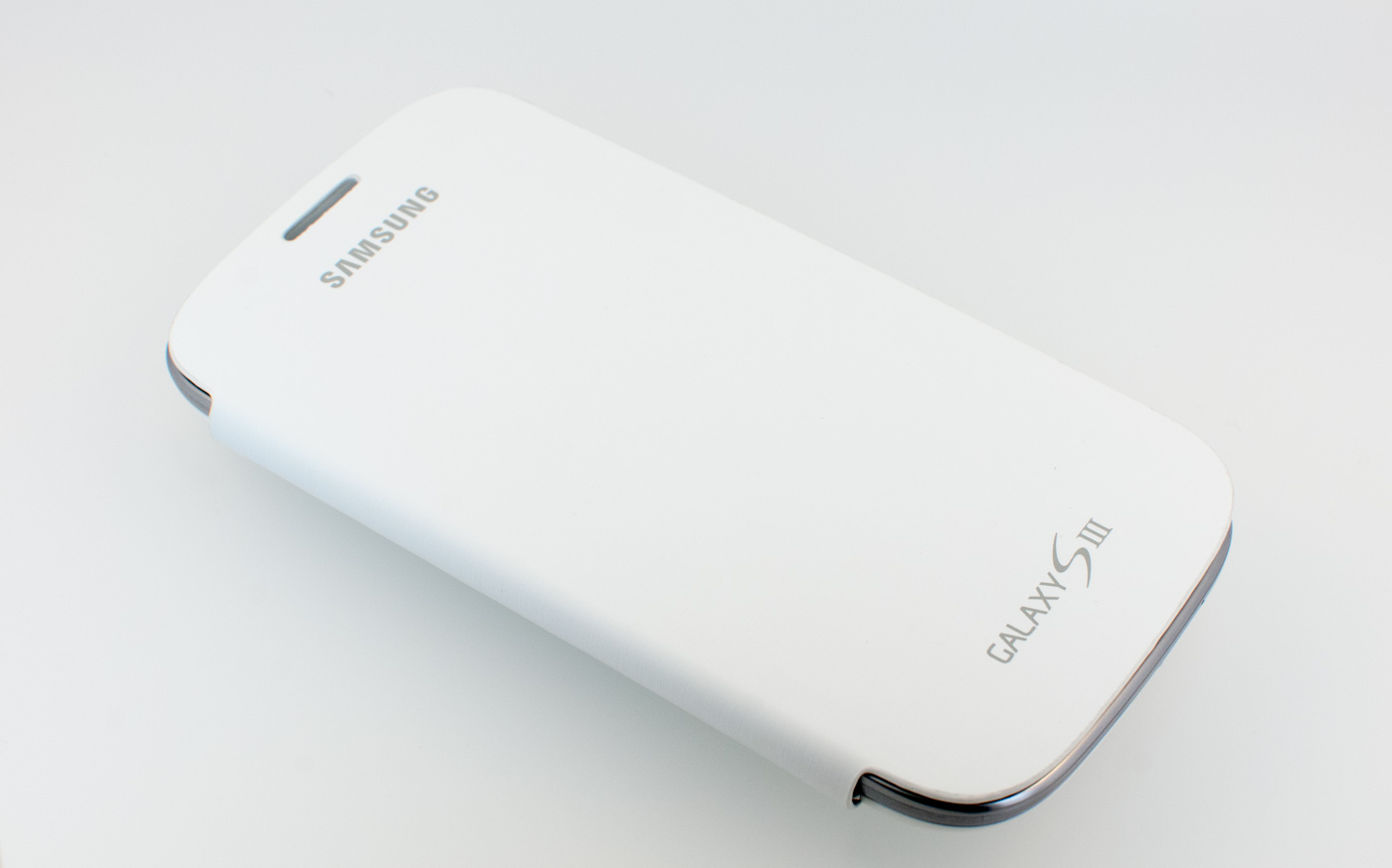
Like Samsung did with the Galaxy Note, they’re also making a battery cover with an attached folding front cover. The inside material is soft felt, the outside is a lightly ribbed pleather. I liked the cover when I saw it the Galaxy Note, and like it on the SGS3 a whole lot. I hate screen protectors, but at the same time protecting the display against dirt (or other phones…) scratching it by using something makes sense when it’s in your pocket.


That pretty much wraps up my thoughts on the aesthetics of the SGS3, and the USA variants completely mimic the international version. It’s a design which has grown on me in the month and a half since I saw it officially unveiled and will no doubt be wildly successful in spite of not mapping 1:1 to the enthusiast wish list.


107 Comments
View All Comments
OCedHrt - Wednesday, June 20, 2012 - link
I wish we would get AWS on AT&T's S3 for WCDMA in addition to LTE.richworks - Wednesday, June 20, 2012 - link
Why isn't the International version of SGS3 not included in the benchmark tests? Am I to understand you haven't reviewed it yet?minhajmsd - Wednesday, June 20, 2012 - link
He did mention in the article that his unit hasn't arrived yet.richworks - Wednesday, June 20, 2012 - link
Ah.. thank you. I might have overlooked that part. I apologize for that :)antef - Wednesday, June 20, 2012 - link
Brian, you mention that by Samsung including a menu button that they don't have to include the full-row on-screen menu button that HTC does, but what you didn't mention is how this is still not ideal because it breaks Google's design goals for ICS completely. Google very plainly stated that the Menu key with its hidden functionalities (and sometimes no functionality) was not good design and encourages all developers to move away from it. Yet Samsung decides to include it on a new device built for ICS (probably because TouchWiz is carried over from Gingerbread).This means a few things. First, some app devs might not move to ICS design standards because they think they don't have to with new devices still coming out with Menu keys. Second, even if an app does use the new standards/action bar, the 3-dot overflow button will be HIDDEN because a Menu button is present. This is confusing and hides functionality that should be grouped with the other actions at the top. Finally, it necessitates a long-press of Home for task switching, which is slow and cumbersome compared to a dedicated button.
All around a bad decision on Samsung's part. The full-row menu key necessary for legacy apps on the One X is not ideal either, which is why on-screen buttons like on the Galaxy Nexus are the way to go.
Impulses - Wednesday, June 20, 2012 - link
I agree with you (and Google) on the menu button overall, it needs to go... I was never particularly bothered by it but it was a pretty sloppy design crutch and it confused new users of the platform... I agree that Samsung's implementation now only makes it worse by encouraging devs to continue using it and by messing with the way current ICS UI layouts are presented.I'm not sure I necessarily agree on screen buttons are better tho... IF you can make the device smaller by using them I'd say you have a case, but the Galaxy Nexus is no smaller than the One X so the latter ends up with more screen real estate the majority of the time (only sacrificing space to menu for legacy apps, which seems to be your main argument for on screen buttons).
I really hope Moto doesn't follow Samsung's lead, cause I believe LG has, and this is worse than the old game of musical chairs that manufacturers played with the four classic buttons. I think we've already had some leaks that showed them going with on screen buttons tho, fortunately.
It's gonna definitely gonna take longer than Google would like to deprecate menu...
hat being said, I've always liked Samsung's side power buttons (much easier to reach) so much do that I mod my HTC phones to wake on volume press... And I also kinda dig the physical home button (even tho it's ugly and another point of failure) because it makes it much easier to wake the phone while it's laying flat.
Most of that is subjective tho, Google moving away from menu is not... Not only was it a design crutch, multi tasking feels so much quicker without long press. I know realistically it's not that much slower to long press home, but subjectively it feels slow. I think Duartesaid in an interview that was one of the reasons they were moving away from long presses and towards the use of more swipes etc.
antef - Wednesday, June 20, 2012 - link
I definitely agree with you about Menu being a design crutch and long-pressing Home feeling slow. People might think Menu is no big deal, but they have to consider the broader audience. Why do people think an iPhone is so much easier to use for most people - because everything is right there and easy to explain. Try explaining Menu and long-press to a new user: "You press this button to show more actions - sometimes it will show things, sometimes it won't, you just have to press it and see. And there's no indication of whether an app uses it or not, you just have to remember it's there. And then you press and hold this to switch apps...no, you didn't press it long enough, try again." versus "Press this button to switch apps. Here at the top of the screen are icons for things you can do. If you there are more things you can do you can access them by pressing the 3-dot button right next to it." It's a night and day difference, and like you said this will stall Google's efforts to deprecate it, now a whole new generation of Android users will get accustomed to a Menu key on the SGS III.You are correct that the Galaxy Nexus loses some screen real estate with the on-screen buttons, but I don't see that being much of an issue when you have a 1280x720 resolution screen. The thing is, with 3 physical buttons, you are going to have one of these problems either way, and the on-screen button eliminates that. In addition I think the on-screen buttons are just preferable anyway. They are bold, easy to see, give you feedback when you press them, and appear coherently part of the UI. It looks like a complete package. Versus the off-screen, backlight-lit keys, which appear "separate" from the UI and are typically smaller. I never realized this from pictures, but after actually using a Galaxy Nexus, I much prefer the look and feel of the on-screen buttons.
Definitely also like the side power button, it's practically necessary for large devices like these.
themossie - Wednesday, June 20, 2012 - link
Yes, it does ignore Google's design goals. It also makes most applications far more usable. Why are contextual menus bad? (I understand the inconsistency problem where the menu button on ICS will not pop up on screen depending on the phone, but still...)Seems like many phone manufacturers agree with me here.
Since I'm complaining anyway... :-)
Does anyone else find ICS task switching far less useful than 2.x's "Recent Apps"? With "Recent Apps", I never had to scroll to find the app I wanted - and never had to worry about closing applications to keep the Task Switcher bar reasonably short.
(For reference, I have a Gingerbread phone and a ICS tablet)
Impulses - Wednesday, June 20, 2012 - link
Contextual menus aren't bad per se, forcing people to guess when they exist at all is. Very few applications are better off with a hidden menu than ICS' action bar + overflow menu plainly visible on screen. Many manufacturers = 2 out 5 or so major Android OEMs? Sony, HTC, and Motor have conformed to the new button scheme.Not sure why you're complaining about scrolling on ICS, are you using a 7" tablet? On my 10" the recent app menu shows 9 apps in portrait and 5 in landscape. Previous versions of Android showed either 6 or 8 icons depending on manufafturer, and had no preview of the app.
You couldn't kick apps out of the recent apps pop up either... ICS multi tasking seems like an improvement in every possible way except maybe landscape use or smaller lower res phones, and even then tap + swipe + tap is no slower than long press + tap.
themossie - Wednesday, June 20, 2012 - link
Re: Contextual menus - I do agree that it's bad to force people to guess when they exist. (That wasn't a problem before ICS, when you could safely assume a program has one!) I don't find the ICS icon to be a useful contextual clue to new users - 3 dots does not a menu suggest.Now, for scrolling: (forgive the rant)
That said, from memory:
* CM9 on HP Touchpad (1024x768) - shows 1 app in landscape.
* ICS on Galaxy Nexus - shows only 3 apps in portrait. (images.google "task switcher galaxy nexus")
* ICS on HTC Evo 4G - shows only 1 app in landscape. This may be a Sense issue, experienced other landscape issues.
You have to scroll to do anything!
Compare this with Gingerbread on my Droid 2 (the not-Motoblur), where "Recent Apps" shows 18 apps. With 18 apps in Recent Apps, I no longer need the homescreen to load applications.
I'd still find the stock "Recent Apps" (I believe it's 8 in Froyo, 10 in Gingerbread?) more usable than ICS.