The HP TouchPad Review: webOS on the Big Screen
by Anand Lal Shimpi on July 17, 2011 11:11 PM ESTwebOS Vernacular: Cards, Stacks and a Whole lot of Awesome
Two years ago I was still having webOS withdrawals. No one had even come close to duplicating the webOS multitasking experience and at least with iOS, you couldn't even multitask. I also missed Synergy and the unified messaging I got with my Pre. Every now and then I'd wish I was using webOS.
Since then I'd moved on. While the HP announcements earlier this year were interesting to me, they just didn't spark the same sort of excitement that I got from webOS in the early days. Perhaps it was just that I had gone too long without using a Palm device.
When I first picked up the TouchPad it started to come back to me. The webOS UI hasn't aged terribly well. It does feel a little bland compared to the effects you get in Android or iOS but the functionality is definitely still there.
There are three basic elements to webOS: the home screen, the launcher and the card. The home screen is unlike Android or iOS, there's just one single home screen. You also can't put icons on the aforementioned home screen, it's just there to act as a background.
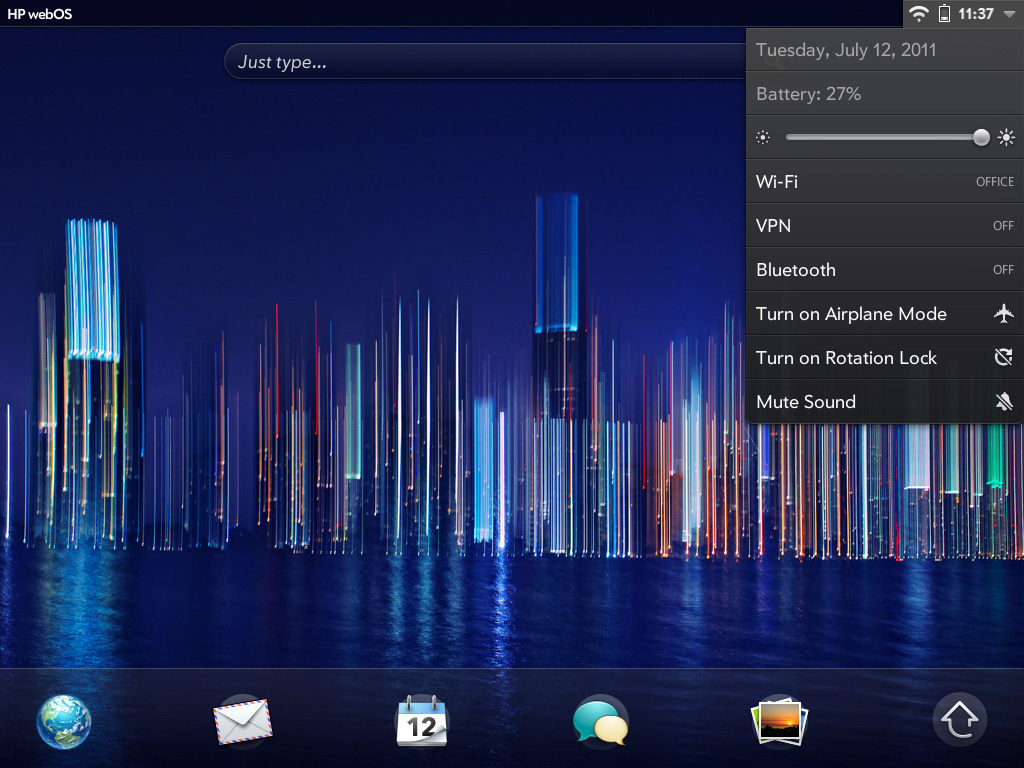
Along the bottom of the screen are five quick launch icons. You can customize these but you can't add any more than five. Next to those icons is an up arrow, tap it and you'll bring up the launcher.
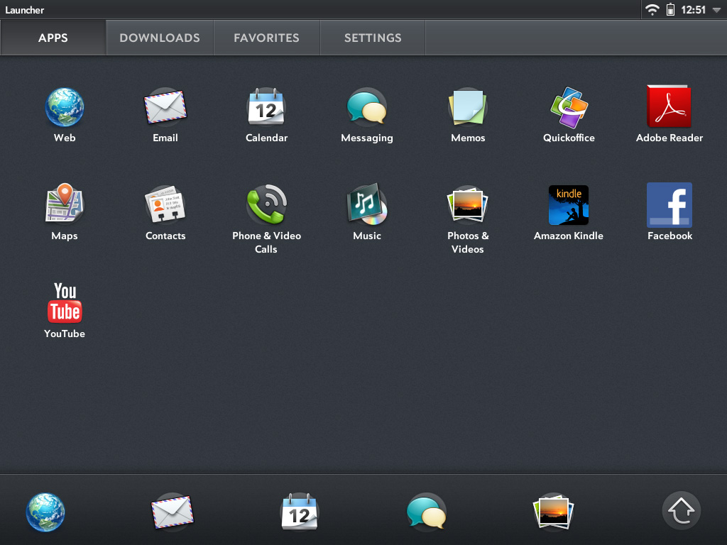
The launcher is the webOS equivalent of the iOS home screen or the Android all apps list. Like Honeycomb, the webOS launcher is divided into multiple tabs: apps, downloads, favorites and settings. You can move apps between any of these tabs, you don't have to actually obey their categories (e.g. you can put Pandora on the settings page, or move Print Manager to downloads). App icons can't exist in two tabs at the same time so once you move one it's no longer exists in its original location.
You can tap the category names to switch between tabs or simply swipe left/right to flip between them. Each category can hold more than a screen full of apps, you just scroll down to reveal more.
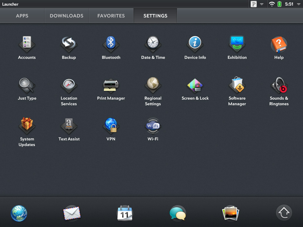
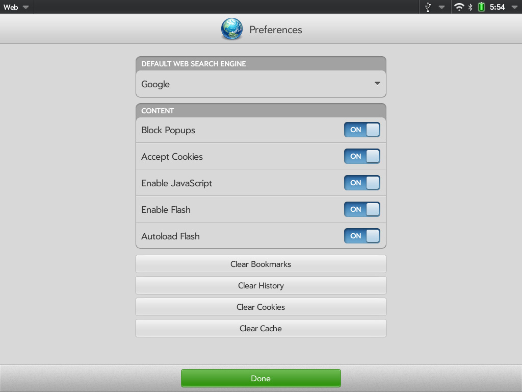
Settings in webOS take on more of a Mac/PC-like role. General system settings are accessed via the appropriate icon on the settings tab, but you also get per-app settings through each application's own app menu. I personally believe this is a more scalable setup to the iOS approach which puts all settings in one centralized location.
Having a really long page of settings just doesn't seem to be as good of an idea for scalability when you start adding a lot of apps, not to mention it slows you down when you want to change a setting within an app you're currently using.
So far everything seems pretty standard, albeit well executed. No bad decisions here. Now this where webOS gets awesome.
Apps launch as cards. Go to launch an app and it'll actually first start out as a small card before going full screen. Launch another app and it will appear as a card next to the first. Launch another and it gets tacked on to the end of the list, and so on and so forth.
You switch between apps in card view. To get to card view either hit the home button to zoom out of your currently active app or just swipe up from the bottom bezel. Unlike webOS based phones, swiping up from the bottom bezel is the only bezel gesture supported by the TouchPad.
Apps will continue to execute even when you've switched focus to another card, and they'll even continue to update if you're in card view and swiping around. To quit an app just flick the card up off the screen. No tablet OS does a better job of quitting apps than webOS. As soon as you throw a card off the screen, its memory is freed and available for use by other apps.
If you don't like flicking up, you can always drag a card all the way down to the bottom of the screen and let it go to rubberband shoot it off the screen. You'll even get a bad rubberband stretching sound while you do it.
The webOS card concept is the closest thing you can get on these mobile devices to having multiple windows on a desktop. They remain active when you switch away from them and it's super quick to switch between them. The webOS UI is really key in making this all happen. While Android and iOS both rely on icons or a thumbnail of the app for their task switching, the webOS approach gives you much more information about the current state of each app as well as a more intuitive UI for switching between them. Decades of innovation in GUI based desktop OSes have taught us that we can be more productive with multiple windows on a desktop and the webOS card system is the best approximation of that among mobile devices.
How do cards scale up to the big screen on the TouchPad? Very well indeed. One of my biggest complaints about tablet usage today is that multitasking is still a pain. Honeycomb addressed this with its task switcher but I honestly don't believe anyone does it quite as well as HP on the TouchPad. I'm both more likely to multitask on the TouchPad and get less frustrated (at least with the UI) while doing it. I'll get to this later but although the UI is the best I've seen on a tablet, the performance issues with webOS really keep it from reaching its potential - at least with this current iteration of webOS on the TouchPad.
While cards have been around since webOS 1.0, the concept of stacks was introduced with webOS 2.0 late last year. The idea here is simple. Whereas webOS originally just let you lay cards side by side, with webOS 2.0 and later you can actually stack cards on top of each other. The idea here is that when you have a lot going on at once your horizontal list of cards can get pretty long. It defeats the purpose of having a great multitasking UI if you have to spend several seconds scrolling just to find the card you're looking for. By stacking related cards on top of one another you cut down on the amount of scrolling and ideally keep UI efficiency high.
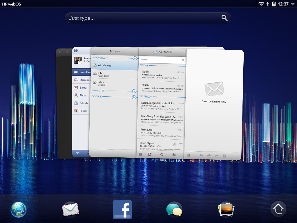
Stacks are created either by manually dragging a card on top of another one, or when an app spawns a new card which then appears on top. Cards in a stack fan out so you can still see a bit of what's behind the topmost card, you can also manually reorder cards within a stack or even move them out of the stack entirely.
While stacks definitely address the problem of dealing with long lists of cards, they don't solve it. Not everything makes sense to put in a stack and you don't always take the time to neatly organize your cards while you're off using your tablet, at least I don't. The one aid I believe webOS desperately needs is an Exposé like feature where you can get a look at all of your cards when you need to quick switch between the current app and one that's 10 cards away.


67 Comments
View All Comments
Conner_36 - Monday, July 18, 2011 - link
because its a free marketkmmatney - Monday, July 18, 2011 - link
I agree - at this price there isn't much incentive. At this time, it seems like the iPad 2 is still the better device. I don't think WebOS gives you any more "freedom" than iOS.bpgd - Monday, July 18, 2011 - link
This is the review I have been waiting for. As always Anand's review is gold standard. He goes into details and really tells how the thing works.NeoReaper - Monday, July 18, 2011 - link
I feel bad writing this comment because this is actually the first time I've ever posted anything on Anandtech and I've been coming to this site since its inception. I have a lot of respect for virtually every article I have ever read on this site written by Anand with the exception of this one. This is only an opinion but I feel like this review isn't nearly as critical as it should be. Based on what I've read in regards to performance, battery life, bugs, etc.. this device doesn't deserve the pass that you gave (at least that's the impression I get from reading this) This device has too many underlying flaws that haven't been addressed, mainly being the OS performance issues that have existed since the original Pre. Why criticize Skype performance when the screenshot you have cleaerly shows a large number of system services sapping CPU usage for no good reason? I mean, really? Pulseaudio is using almost 27% CPU usage. Maybe I'm interpreting this review incorrectly... I just feel that you were hoping for this device to deliver but reality it doesn't and you're simply hoping that OS updates will resolve the performance issues. If you want to believe that, why not expect the competition to make an update to the OS which boasts features that will make it better for office productivity? Hope is for fanboyism, a reviewer should be deliver facts without twisting it with what could be. Your final words are completely contradictory to itself. I hope you re-examine your review. As I've said already, I have great respect for you, Anand, and I've praised virtually every article you have ever written, but this article I cannot.lunarx3dfx - Tuesday, July 19, 2011 - link
One thing you might want to keep in mind though, is that while pulseaudio was using 27% of CPU resources, is that necessarily HP's fault? I would be more inclined to believe that the fault lies with the developers of pulseaudio for not making a well optimized app.Now, I'm not excusing the glaring flaws with the Touchpad, however I have not noticed the majority of the performance issues reviewers have seen with my personal TP. That's why in an earlier comment I wanted to know what build of the OS Anand's unit is running. I think reviewers got an earlier build that may not be as optimized as the release build.
I was in Staples the other day, and the demo unit was running build 16 whereas the release models are running build 41.
NeoReaper - Tuesday, July 19, 2011 - link
i see your comment regarding the build number now, it would be very interesting to hear back from Anand regarding the build he was running and whether or not any performance issues have really been fixed. as for the pulseaudio thing, pulseaudio is a linux audio service so the state of its optimization would be HP's fault. It is not a third party application. As I said, my main gripe with the review is that even in the final words portion of his article, many statements are contradictory. How productive can it be when he states that the unit is runs slower than its main competitors in virtually every aspect? How can you justify weight and size with such poor battery life and performance? Maybe I'm being a bit too harsh but the problem is, all the underlying "performance" issues that he states are in the Touchpad are the same problems that plagued the Pre, Pixi, and Pre2. I would love for HP to "fix" the performance issue, but maybe its not really that easy to "fix".lunarx3dfx - Tuesday, July 19, 2011 - link
I forgot about pulse being a linux service. Whoops. lol. I can expplain the extra weight and thickness of the device though. Well, HP did. The reason it is so much thicker and heavier according to them, which makes sense to me, is the inclusion of the inductive charging coils.NeoReaper - Tuesday, July 19, 2011 - link
ahh, ok ok, that makes sense.Leonick - Monday, July 18, 2011 - link
The keyboard is actually pretty impressive compared to the competitors, having both a numbers row with special characters and a tab key.I also like how it handles the settings compared to iOS, having settings in the individual apps make a lot more sense in my mind that a centralized app, still iOS apps can do this if the developers choose to and when there are any settings you might want to change more than once or while running the app the generally do so.
Seems they got notifications pretty right for a tablet too. Pretty similar to how honeycomb does it it looks like. I think the system coming with iOS 5 will do fine for the iPad but it's still not perfect, it seem to be lacking statusbar icons to show that you have notifications and it would be neat if it could display upcoming calendar events and not just events with reminders (like the cydia app Lockinfo does).
Also, it was mentioned how the system was similar to notifications on a PC, well that's understandable, they do have plans to put WebOS on PCs.
Belard - Tuesday, July 19, 2011 - link
I agree with you on the keyboard. When I played with the Playbook, I noticed the keyboard right away and LOVE it... iOS and Android should COPY this onto their own devices... ah, let the lawsuits fly.When you have passwords that are combos of numbers and letters, going back and forth can through you off (it does me).
I'd give HP/WebOS a 10 for the keyboard. I'd give Android and iOS a 6 in comparison.
The Settings Icons for WebOS are a pain.... You have to open one after the other, and if you DON'T close the, they'll stay in memory - constantly running.