The iPhone 7 and iPhone 7 Plus Review: Iterating on a Flagship
by Joshua Ho & Brandon Chester on October 10, 2016 8:00 AM EST- Posted in
- Smartphones
- Apple
- Mobile
- iOS
- iOS 10
- iPhone 7
- iPhone 7 Plus
Display Analysis
Section by Brandon Chester
It's hard to deny the importance of having a great smartphone display. Almost every interaction done with a smartphone involves the display, and we've seen the quality of smartphone displays improve greatly with each year. When looking at the iPhone 7 and 7 Plus at a high level, they appear to use the same displays as the previous two generations of iPhones. The iPhone 7 uses a 1334x750 IPS LCD panel with a pixel density of 326ppi, while the iPhone 7 Plus uses a 1920x1080 IPS LCD panel with a pixel density of 401ppi. However, when you take a deeper look, it's clear that these are not the same displays as those in the iPhone 6 and 6s.
The most obvious improvement that Apple advertises is a substantial increase in peak brightness. Previously both models of the iPhone were rated at 500 nits, while the iPhone 7 and 7 Plus are rated at 625 nits, a 25% increase. Both displays now support the Display P3 color space as well, which makes them the first wide gamut iPhones, and with the color management built into iOS they are also the first smartphones to correctly make the transition to a wider gamut than sRGB. I covered this topics in my review of the 9.7" iPad Pro which was the first wide gamut iOS device, and with the iPhones moving to wide gamut alongside the iPads and iMacs it looks like Apple wants to have it standardized across their entire product line very soon.
iPhone 7 Plus Display Assembly (Image Courtesy iFixit)
Both the improved brightness and wide gamut trace back to a change in the display's LED backlight. A standard blue LED with a yellow phosphor cannot produce the intense green and red wavelengths needed to cover a gamut wider than sRGB, and Apple has most likely used the same system of blue LEDs with green and red phosphors from the iMacs to expand the iPhone's color gamut, with the new LEDs also allowing for a higher peak brightness.
While the color gamut and brightness levels of the displays on this year's iPhones have changed, the resolutions have not. In the case of the iPhone 7, I think this presents an issue. There's something to be said about inexpensive Android phones shipping with sharper displays than Apple's flagship $649 smartphone. Of course, resolution is only one of the metrics that are applicable to a display, but it's an important one. I'll touch on the issue of resolution again later, but for now I'd like to get into the accuracy analysis of the displays on the iPhone 7 and 7 Plus.
Our display testing workflow has changed slightly for this review, with the addition of the Display P3 saturation test. I've used this once before in the iPad Pro 9.7" review, and as more devices adopt the P3 gamut it will continue to show up. In the interest of openness, I also thought it would be worth mentioning that the measurements for these tests were performed by both Josh and I. Josh measured the iPhone 7 Plus using the review unit that we received, and the iPhone 7 results are actually from a unit that I purchased myself in order to assist with testing and analysis for this review.
As always, measurements are performed with an X-Rite i1Pro 2 spectrophotometer, with the exception of black levels which are measured with an i1Display Pro colorimeter to achieve the most accurate results possible in an area where the i1Pro 2 can be somewhat unreliable. Data is collected and examined using SpectraCal's CalMAN software.
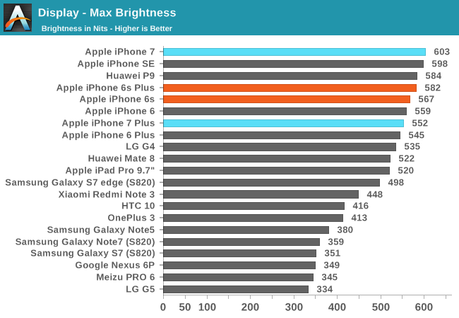
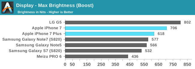
Apple advertises that the iPhone 7 and 7 Plus both have a typical brightness of 625 nits. From one point of view, they've oversold their display in this regard. From another point of view, they've actually undersold it. On the iPhone 7 the maximum brightness by setting the slider manually is just over 600 nits. This isn't that far off of Apple's claimed 625, although falling short by 4% is not insignificant even if it's not a huge gap. The 7 Plus doesn't fare as well, coming in at just over 550 nits, around twelve percent lower than what Apple advertises. At this point one would assume that the displays don't get as bright as claimed, but there's actually something else going on.
Boosting brightness for short period of time when auto brightness is enabled is not a new feature. OLED displays have done it for some time, and modern LCDs like those on LG's flagship smartphones can do it as well. It turns out that Apple has added the same sort of boost mode on the iPhone 7 and 7 Plus. When the phone's brightness is set to automatic and there's bright ambient lighting the display will push above the maximum brightness in manual mode. On the iPhone 7 Plus it reaches 618 nits, which is right around Apple's claimed 625 nits. The iPhone 7 goes above and beyond, hitting 706 nits in the boost mode, which is 13% higher than what is advertised.
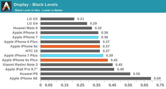
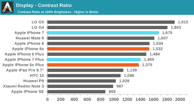
As for black levels, they're in line with the previous generation iPhones, but the fact that the maximum brightness has increased significantly while black levels remain constant means that the contrast ratio has increased. In the case of the 7 Plus the increase isn't very large since the 6s Plus unit we reviewed actually exceeded Apple's rated contrast of 1300:1. For the iPhone 7 the increase is more significant, even though our 6s also exceeded Apple's rating of 1400:1 for the 4.7" iPhone. While neither phone's black levels or contrast are at the level of an AMOLED display, they do quite well among LCDs.
The displays on the iPhone 7 and 7 Plus offer an appreciable improvement in brightness and contrast compared to their predecessors. It's worth noting that previous iPhones had a considerable amount of backlight variance, with Apple rating them for a typical brightness of 500 nits even though some units actually reached as high as 600 nits. Even when compared against the best iPhone 6s and 6s Plus units, the iPhone 7 and 7 Plus will have improved usability outdoors, and in any other circumstance where there's harsh ambient lighting. I do feel somewhat uneasy about Apple advertising the boost brightness as their typical peak brightness, as in the case of the 7 Plus the manual brightness is significantly lower. However, I would imagine that most users keep auto brightness enabled, so while I don't necessarily agree with it from a marketing standpoint, it's probably true that the marketing reflects what most users will experience.
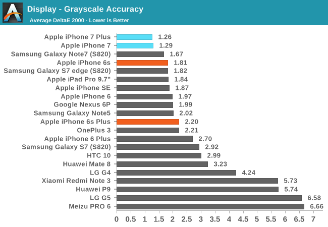
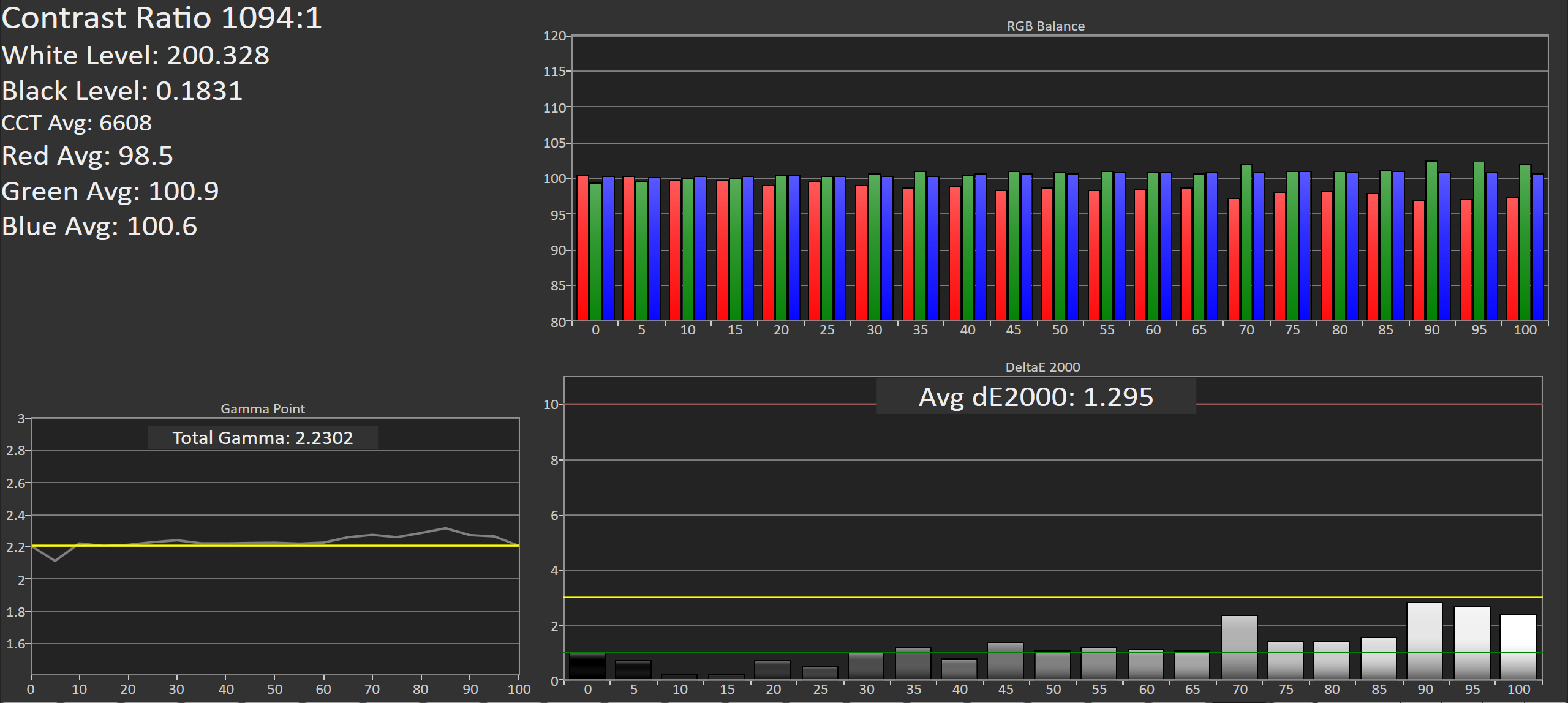
Moving on from brightness and black levels, we now come to our standard greyscale accuracy test. This test measures 21 points from 0 to 100% white. As you can see in the image above, the performance of both the iPhone 7 and 7 Plus in this test is remarkable. The RGB balance for each shade is very stable, with only the slightest shift toward blue, leading to a CCT average of 6608K. Like the iPad Pro 9.7", this much closer to sRGB's target white point than older iOS devices, likely owing to the new LED backlight not providing significantly improved efficiency when the display is skewed toward blue. The gamma is quite straight, with only some minor variation past 80% white. Even with that, no error value for an individual shade of grey hits three, and many are close to one, making them essentially indistinguishable from the reference shade.
Receiving a unit with this level of accuracy could lead one to suspect that it's an extraordinarily good sample. However, as I mentioned before, the iPhone 7 I measured was one that I bought on my own, and it would be quite a coincidence if both review units and a purchased unit had the same incredibly high accuracy if that was not typical of all units in general.
With this level of accuracy, it is almost certain that Apple is doing individual calibration of each iPhone 7 display. This is actually not hard to imagine, given that the iPad Pro 9.7" was advertised as being individually calibrated, and engineers at this year's WWDC also claimed that individual calibration is now standard across Apple's product line. This makes sense when you consider the implications of wide gamut and color management. If you apply a single profile to a batch of units, it will not perfectly represent the output characteristics of each display. That would lead to errors when applying a transform to render sRGB content properly on the wide gamut display, as you would be translating values based on output values that were only close to those of the actual display. I actually ran into this exact issue in my recent review of Lenovo's X1 Yoga OLED, which has a wide gamut display without per-unit calibration. To properly pull off wide color and color management you need to individually calibrate each display, and the incredibly high accuracy is just a bonus.
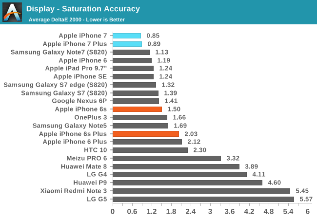
The next test examines the accuracy of primary and secondary colors on a display. Measurements for each color are done in 20% steps from 0 to 100% saturation. This first saturation test targets the sRGB color gamut, with a gamma target of 2.2 and a white point of D65. In this case I really don't have anything to say about the iPhone 7 and 7 Plus because they are the most accurate displays on record in this test. For all but three or four colors the human eye would not be able to distinguish the colors on the display from the true reference shade, even if they were put side by side.
The interesting thing about this test is that the accuracy is guaranteed to be high when a vendor ships an individually calibrated wide gamut display on a color managed OS. When individually calibrating a display, your profile is essentially a perfect characterization of the display's output. This means that even if your standards for calibration are relatively relaxed, such as targeting a DeltaE of 3, your sRGB accuracy won't be affected because the transform performed to converted sRGB content to the display's gamut will take into account any differences between the display's output and the true values of the gamut it targets. The two limitations of this are the accuracy of your profiling device when calibrating, and the bit depth of the display, which forces you to map onto a set of values that is likely not as precise as the optimal output value unless you have some theoretical 16bit per channel display. As you can see from the results, neither of these are a truly significant issue.
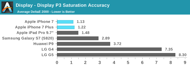

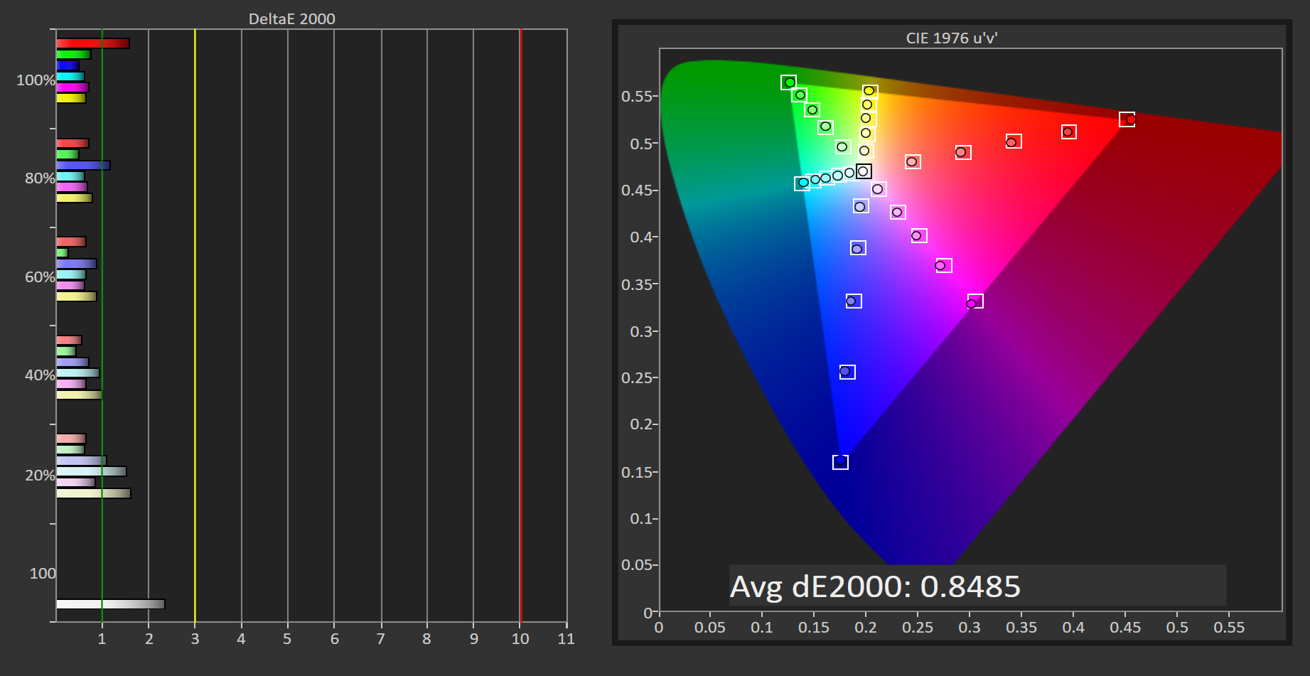
This saturation test uses the same methodology as the previous one, but it targets the DCI-P3 color gamut with a gamma of 2.2 and a white point of D65. These values deviate from the DCI-P3 standard for digital cinema, but a gamma of 2.2 is most appropriate for a mobile device's viewing conditions, and D65 is the standard white point for all gamuts that users will be used to, with the 2.6 gamma and non-standard "D63" white point for DCI-P3 being chosen for the viewing conditions of a dark theatre. Apple describes this adaptation of the DCI-P3 standard Display P3, and it appears to be what other vendors have also settled on in order to expand on the tonal range of the sRGB color space without changing the white point or gamma.
In this test the iPhone 7 and 7 Plus lead the pack once again. There are some minor errors in low green saturations, but neither are truly significant. The 9.7" iPad Pro is right behind them, and the best comparable Android device is the Galaxy S7 with a DeltaE of 2.89. It's worth mentioning that Samsung doesn't actually advertise P3 gamut support, so the fact that their wide gamut mode is close is impressive and suggests that they had it in mind but didn't attempt to provide incredibly high levels of accuracy in that mode. Meanwhile, LG explicitly advertises DCI-P3 gamut support, but regardless of which gamma you use it fails miserably because the green and red primaries aren't even close to the DCI-P3 primaries.
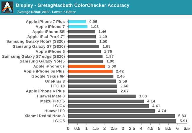
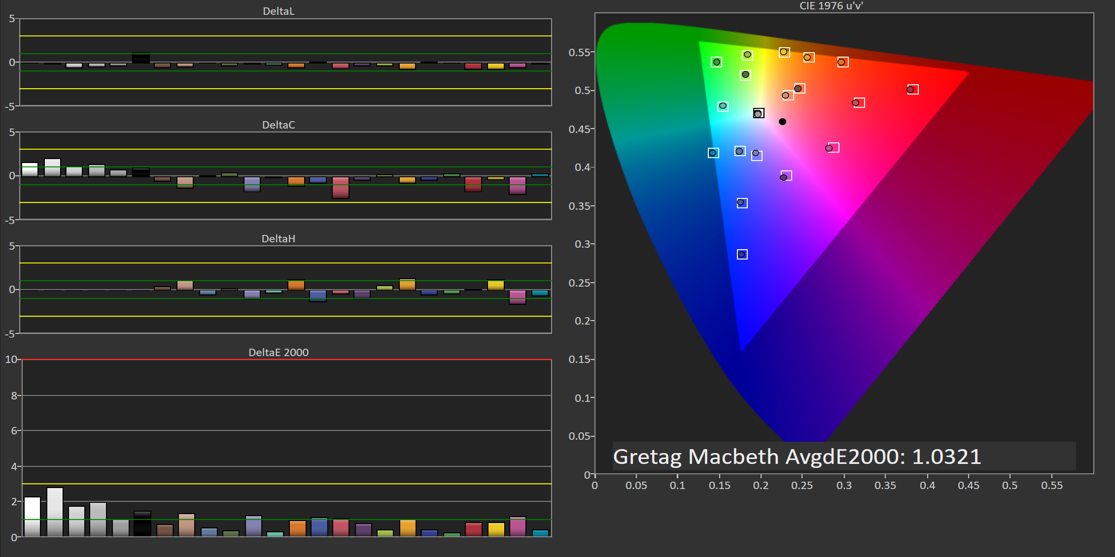
Last is the GretagMacbeth ColorChecker test. This test examines the accuracy of 24 colors that are commonly found in nature, which makes it a good metric for how accurately a display can render color mixtures that have red, green, and blue color components. Like all the other tests, the iPhone 7 and 7 Plus have industry-leading accuracy. Most colors are so close to the reference shade that it's not possible to tell the difference, and the largest errors in are the bright shades of grey which are still below the general target of three, but not quite as low as the rest of the patterns.
I find it very difficult to come to a single verdict on the iPhone 7's display. In the case of the 7 Plus I don't have any hesitation when describing it as a great mobile display, and certainly the most accurate on record. Whether or not it's the best mobile display is debatable, as Samsung provides serious competition with their AMOLED displays which benefit from perfect blacks. However, I think AMOLED's color shifting off angle puts it at a disadvantage, and Samsung is in the unfortunate situation of having to deal with Android not having any form of color management, which means that the wide color modes that their AMOLED displays have available are not truly useful. Apple's control over the hardware and software stack allows them to provide tools for creating wide color content without compromising the visual integrity of existing sRGB content, and that makes the display decidedly more future-proof.
All of the above statements apply to the iPhone 7's display, except for the one about being future-proof. That statement is true as far as color is concerned, but it's definitely not true of the display's sharpness. Apple's smartphones have remained at a pixel density of 326ppi for over six years. At the time, that pixel density was much greater than anything the competition could put out, and it wasn't matched until around eighteen months after release. Nowadays, nearly every Android device has moved far past Apple in this regard, including mid-range devices that cost $200.
The resolution of the iPhone 6 seemed reasonable at a time where technologies like Auto Layout had not been embraced by the development community, and existing bitmaps were designed for a 2x rendering scale. With the iPhone 6s it seemed suspect, but the phone brought many other substantial upgrades that made it possible to overlook the relatively low-resolution display. With the iPhone 7 releasing in late 2016, I really don't know what Apple's excuse is. It's entirely possible that they would not have been able to meet their brightness target if they moved the 4.7" iPhone to a higher resolution, but I am confident that it would not have posed an issue for the move to wide gamut, which is just related to the spectral output of the LED backlight. HTC showed that a 4.7" 1080p panel was possible back in early 2013 with the One M7, and anyone who owned it can attest to how much sharper the rendering is than on Apple's 1334x750 displays.
The 4.7" iPhone 7's display is definitely an improvement over its predecessor. The significant increase to brightness, and subsequent increase to contrast are both appreciated. The move to wide color is setting the foundation for future wide color content, as well as existing content that will be shot on the iPhone 7's own camera. The improved calibration makes it the most accurate smartphone display on the market. Even so, I think the area that really needed improvement was the sharpness of the display, and that remains the same as it was in 2010.


377 Comments
View All Comments
solipsism - Monday, October 10, 2016 - link
The 3" adapter has a very firm fit on your 3.5mm headphones; more so than your typical headphone jack on a smartphone. I'm sure this is intentional to help keep it in place.As mentioned in the article, wireless is the future, and while I've been using BT headphones for years now, my current ones (Bluez Aftershockz 2) finally broke so I'm using wired headphones until I the other headphones with Apple's W1 chip hit the market. I'm leaning toward the BeatsX as I prefer in-ear, and the connected cable, but I'm willing to give the AirPods a chance since so many are saying they are more comfortable than their included EarPods, which I find to be uncomfortable.
I've noticed that my wired headphone cable doesn't get tangled as easily and is easier to plug into my iPhone. I attribute this to both the slightly extra weight and thickness of the connector. I'd rather not be wired at all, but the adapter certainly hasn't been an issue. Since I only charge my phone once a day or every other day, this repeated claim that everyone needs to charge and listen to wired headphones as the same time escapes me. I'm guessing it's one of those invented problems only a few people actually need
greyhulk - Monday, October 10, 2016 - link
I hope you address thermal throttling in the deep dive. That's what I'm most interested in with the new A10.SydneyBlue120d - Monday, October 10, 2016 - link
While I really hope to see AV1 2160p60 with multichannel audio encoding with iPhone 8, I'd like to read a test comparison between Intel and Qualcomm modem, especially with Europe networks :) Thanks a lot.i4mt3hwin - Monday, October 10, 2016 - link
"Overall, the iPhone 7 and 7 Plus remain the best phones on the market for video capture. Strange issues with Snapdragon 820 video encode blocks mean that all Snapdragon 820 devices are just barely passable for video capture."I don't recall seeing this anywhere? I Know the OP3 article mentioned that the video was blocky - but I don't remember it linking that to the 820 - just a OP3 implementation issue? Does this mean the Pixel is going to experience similar issues?
grayson_carr - Monday, October 10, 2016 - link
I can confirm that my S7 Edge has this issue, and it's bad. When I first got it, I recorded a couple 4k videos while hiking along an oceanside trail and the blocky artifacts in the water and sky looked so crappy that I just never recorded videos with it again. It was technically 4k video, but it looked more like a 360p YouTube stream with the amount of blockiness, especially when panning up and down.lolipopman - Tuesday, October 11, 2016 - link
Why was this issue not explored by Samsung? I'm pretty sure it's not common or else it would've been known.lilmoe - Monday, October 10, 2016 - link
You do realize that the shutter speed on the iPhone's night images is twice as long as the others using lower ISO values, right?You call this "impressive"? I highly recommend a primer in photography.
JoshHo - Monday, October 10, 2016 - link
The exposure time of 1/4s is not indicative of all exposures. I would reference the iPhone 6s and 6s Plus reviews to better understand how Apple handles low light to avoid motion blur despite long exposures.lilmoe - Monday, October 10, 2016 - link
Yea, I've seen that review.Might I also suggest a primer in videography. Here's how a the video review portion should look like, and what it should include/test:
https://www.youtube.com/watch?v=4YCvLW2ySr0
Listen, I don't mean to insult you or anything, but you need to know that your criteria is fundamentally flawed. In addition to the objective truth that Samsung, and others, have the superior video (and audio), their image processing is what PEOPLE WANT. You give customers what they want, not what you think is best, especially for a mainstream product (ie: non-professional). If you want to compare sensor/lens quality, you compare RAW images using the same settings (but you didn't, for reasons).
Smartphone photography is about USABLE images/footage. You just don't apply the same criteria you do when reviewing a DSLR/DSLM.
Stop marketing "true colors" (which aren't exactly true, btw) for a crowd of users that apply filters to everything they post online.
Admit, correct and move on.
grayson_carr - Tuesday, October 11, 2016 - link
Samsung? Superior video? LMAO. Go home. You're drunk. I almost took you seriously until you said that out loud. -Galaxy S7 Edge owner