Google Begins Rollout of New Google Drive and Docs Home screens For the Web
by Brandon Chester on July 29, 2014 5:18 PM EST- Posted in
- Google Docs
- Google Drive
_678x452.png)
While Google has successfully moved its suite of productivity apps away from Google Drive and into their own Docs, Sheets, and Slides app on mobile, the separation hasn't always felt as clear on the web. The portion of the separate websites for each app that allowed users to view their files was essentially the same interface for Google Drive and they had a feel more similar to a Google Drive extension than separate applications with Google Drive integration. As of today this is no longer the case, as Google is rolling out new home screens for each web application which are similar in look and feel to Google's mobile apps for the same services. Each interface is similar apart from the different color scheme for each application, and below we have the new interface for Google Docs on the web.
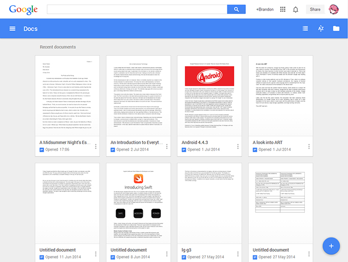
As you can see, it's very similar to the interface on Google's mobile Docs application, particularly when the application is used on a tablet. The top bar features a menu that slides in from the left and gives the user links to navigate to the other productivity apps that Google offers, as well as a link to Google Drive and settings for language and offline editing. On the right side there is a button to change between a list view or a preview view, a button to change the method of file sorting, and a button to upload files to Google Drive for editing. At the bottom there is an ever-present circular button which creates a new document and brings the user to the editing interface. Google Drive receives similar design changes but with appropriate alterations due to its functionality as a storage tool rather than a productivity tool.
This is a particularly important update for Google. It allows for Docs, Sheets, and Slides to be better separated from Google Drive but it also works toward accomplishing something Google focused on at Google IO which is creating an interface that looks the same and works the same across every sort of device. It will be very interesting to see where Google goes from here with making changes to both their mobile and web based applications and trying to keep them visually and functionally the same.
The update is rolling out now, and users will be prompted to switch to the new interface when they visit any of the websites for Google's productivity applications.
Source: Google Drive Google+


8 Comments
View All Comments
Dug - Tuesday, July 29, 2014 - link
Google can be clear as mud with their direction. Nothing stays consistent. Hopefully they will accomplish what they claim to be doing so we don't have to keep guessing where to go and what interface we have to deal with.xaueious - Wednesday, July 30, 2014 - link
This has been one of the most exciting updates to Google web services for a while. You have to own a touchscreen to appreciate that this design is a joy to use compared to before. I have been using a touchscreen Chromebook, and this is the exact type of thing that was missing from being the Chromebook a hit with touch for the modern web.Looking forward to material design becoming the standard across all Google properties.
Klug4Pres - Wednesday, July 30, 2014 - link
"it also works toward accomplishing something Google focused on at Google IO which is creating an interface that looks the same and works the same across every sort of device"Maybe one day they will allow people to disable conversation view on Mobile Gmail, but probably they will just remove that ability in their webmail offering.
JBVertexx - Wednesday, July 30, 2014 - link
I don't really see a need to do this... IMO the mobile experience is the one that needs the tweaking. I'm not sure why a separate docs home page from drive would be a better experience....iniudan - Wednesday, July 30, 2014 - link
That layout got a very GNOME's Document look to it.crimson117 - Wednesday, July 30, 2014 - link
I wish they would improve their print quality. If I don't download as .docx and then print form MS Word, the kerning is all weird.DrApop - Thursday, July 31, 2014 - link
In regards to using a computer for google products (so I'm not talking about phone/tablet function):Now when I go to Gdrive I have to select my file with a click and then double click it in order to open it up.....same thing with a folder. And opening a folder is now slow. Never had to triple click before and the folders opened faster.
And if I have 30-40 word processor documents/speadsheet/etc in a folder for example, when i now open the Gdoc app, I have to sift through basically four big tiles showing 4 documents, then scroll down, scroll down, scroll down to find my document and then triple click to select/open it up. Yes, I know I can set it as a "list" vs the tile feature. Regardless, it is slow and takes up way too much screen real estate. What was wrong with just leaving it as a list!
I just prefer it the way it was...it worked, it was faster, fewer clicks.
I wish Google would spend more time enhancing the function of their office suite rather than dicking around with inconsequential changes.
SolangeMetz - Tuesday, August 11, 2020 - link
Hello! Very interesting post, I want to share it on my https://www.blogger.com/about/. What do you think about it?