iPad mini Review
by Anand Lal Shimpi & Vivek Gowri on November 20, 2012 6:10 PM ESTDesign & Smart Cover
The smaller screen of the mini is joined by the super-slim industrial design from the fifth generation iPod touch that debuted a couple of months ago. I’m actually a pretty big fan of the direction Apple’s mobile design teams have taken recently, the overall visual style is much cleaner and focused now, with less pronounced radiusing and more rectangular profiles across the board. The edges are rounded enough for a very smooth in-hand feel, but the front edge has the same highly polished, chamfered ring around the bezel as the iPhone 5.
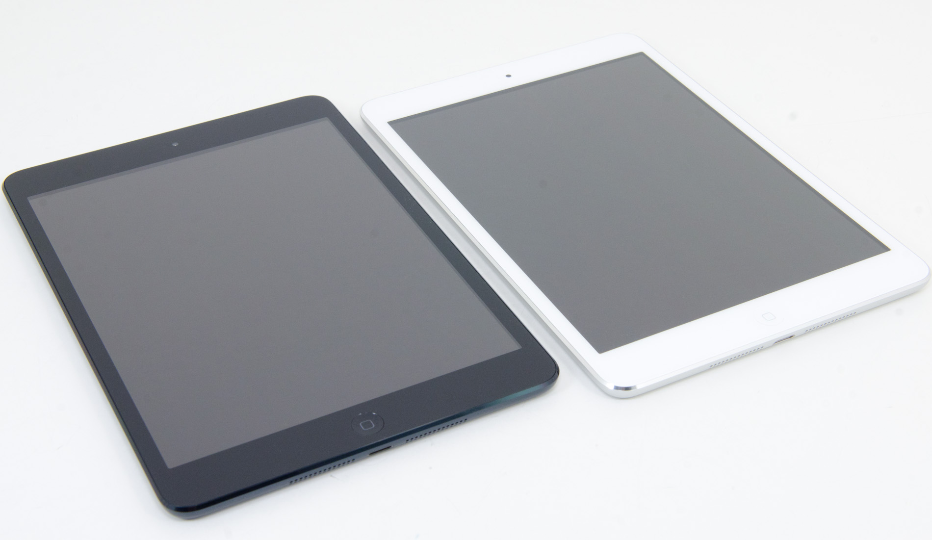
The dark monochromatic look is very sleek; combined with a brightly colored Smart Cover like the red one, the effect is pretty striking. The white/silver colour scheme, as on the iPhone 5, is elegant, but nowhere near as visually striking as the uniformly dark mini.
The face should be very familiar to iDevice users - a front facing camera centered at the top, an ambient light sensor to the left of it, and a home button at the bottom. The home button has been shrunk, though it’s set far enough away from the screen that I feel like they could have easily kept the same home button that is used in the other iDevices. I’m assuming there’s a reason for the downsizing, probably relating to the placement of the hardware around the display, because this isn’t the type of thing typically overlooked by Jony Ive and Co.
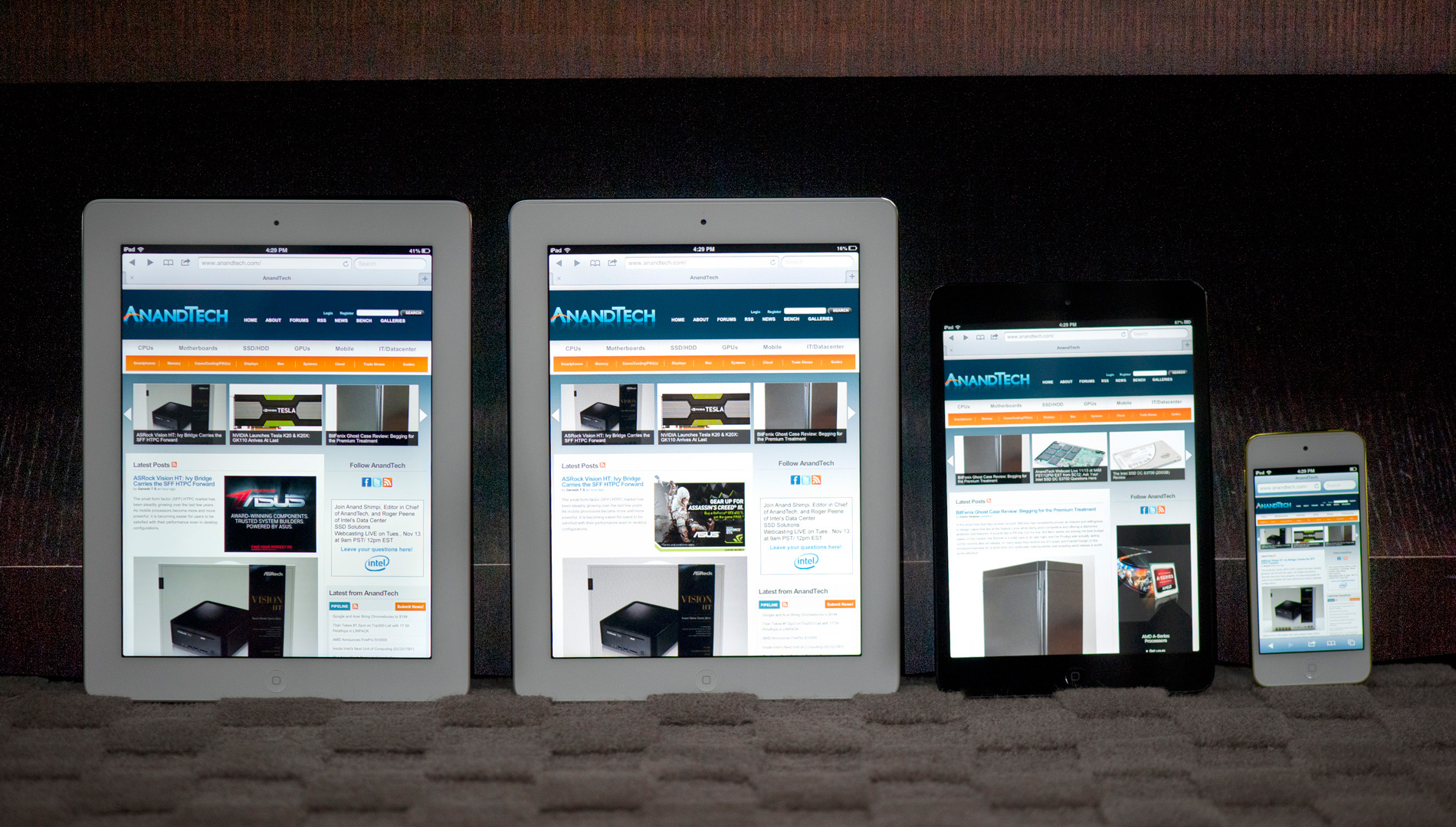
From left to right: iPad 4, iPad 2, iPad mini, iPod Touch (5th gen)
The bezel has been reduced considerably in size in all four directions, but more so on the sides than to the top and bottom. The result is a device with a slightly different physical aspect ratio than the 9.7” iPad - 4.45:3 instead of 3.90:3 (where, in both cases, the display has an aspect ratio of 4:3). The narrower bezel looks good - cleaner and more modern, and I think the iPad mini is better proportioned aesthetically. Of course, the smaller footprint is also one of the main factors in the awesome in-hand feel, so it’s a functional decision as much as an aesthetic one. Surprisingly enough, the lack of bezel on the sides of the mini doesn't impact normal use. Apple tweaked iOS a bit to improve touch rejection along the edges of the mini.
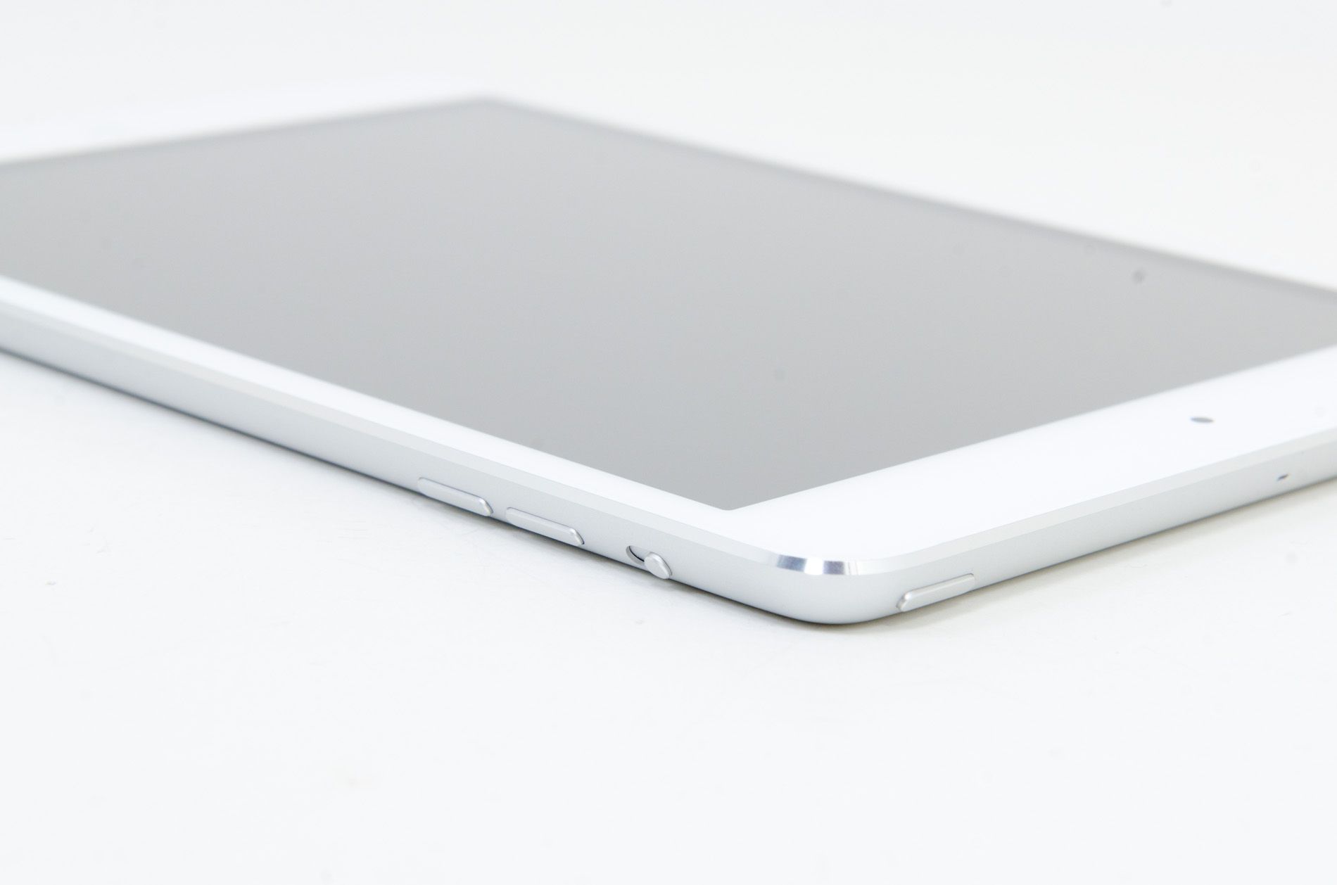
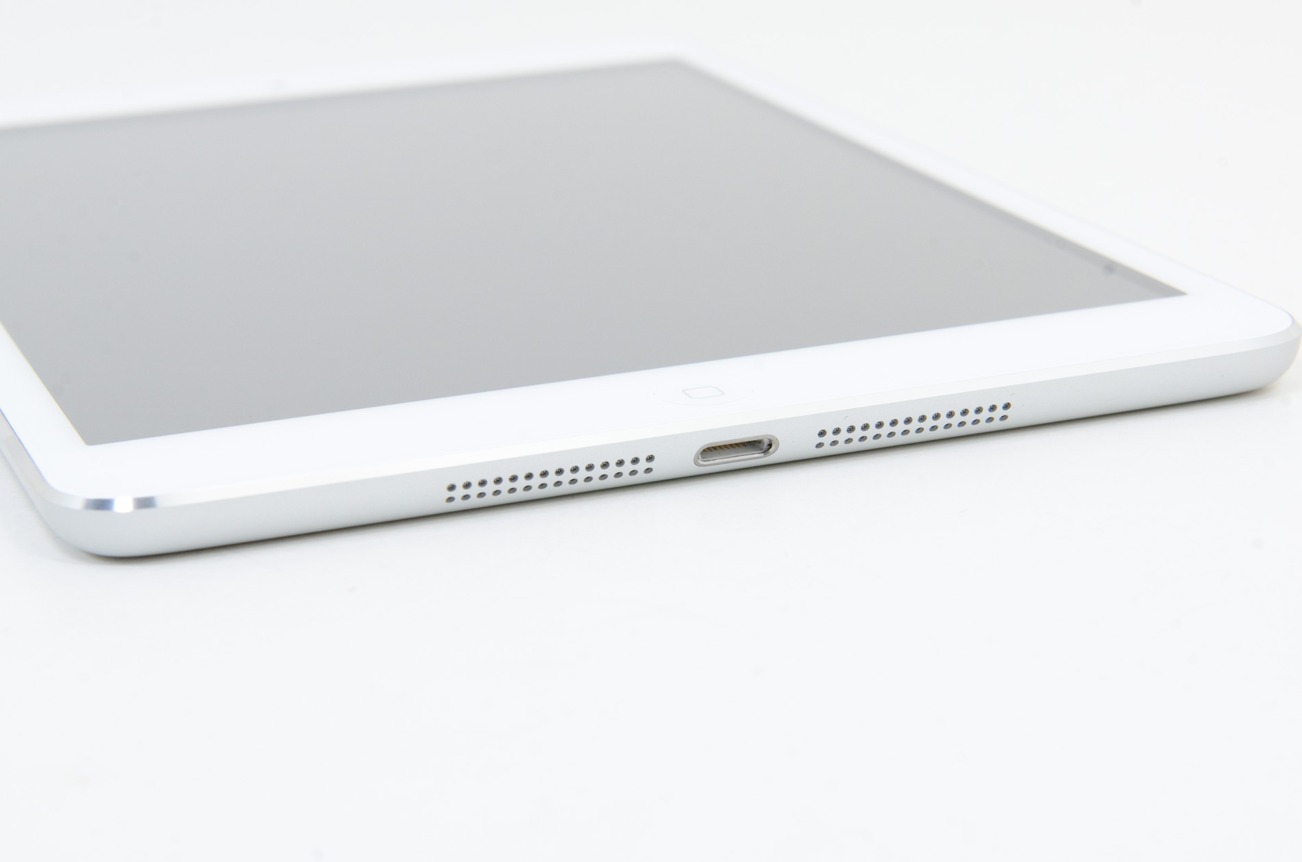
Button and port placement is identical to the preceding iPads, with a few minor but important changes. The silence/rotation lock slider in particular feels much more robust than in previous editions. The top edge has the power button on the right and headphone jack on the left, with volume buttons on the right edge, next to the camera. The buttons themselves are now metal, and offer better feel and feedback than the plastic buttons of the 9.7” iPad.
Coming around the edge to the bottom, we see that the 30-pin dock connector has been replaced by the new Lightning port, centered as always. The mono speaker in the right corner of the back is now gone, superceded by a pair of speakers set on either side of the Lightning port. That’s right - the iPad finally has stereo speakers, and they’re actually pretty decent. Clean sound output, and loud enough to fill a 400 sq ft room without distorting at high volumes. As with most mobile devices, the sound is a bit thin, but a decent improvement over my admittedly low expectations.
Given that the iPad mini shares the same colors and materials as the iPhone 5, I was curious to see whether the paint would be as fragile and whether we’d see a repeat of the quality control issues Apple had with it at launch. Thankfully, the anodization seems far more robust and significantly more resistant to scratching, even on the polished aluminum band at the front. I didn’t see any material or paint defects when I unboxed it, even after a thorough going over, and through two weeks of not particularly gentle use, I haven’t seen any scratching. It’s a very different experience than my iPhone 5, which came out of the box with the front panel not properly clipped into the aluminum frame and scratched whenever I looked at it wrong. This isn’t a device that needs any other kind of case unless you plan on abusing it, and I feel like a larger case would undo some of the benefit of the ultralight chassis.
Apple does built a custom Smart Cover for the mini, available in a number of colors. Unlike the bigger Smart Cover, the mini's cover integrates the magnetic hinge into the same material as the rest of the cover, resulting in a very cohesive design:

The big benefit of the Smart Cover is the ability to use it as a stand:
The angle of the folded Smart Cover is considerably larger than on the standard iPad, making the iPad mini lean back more vs. standing upright on the bigger model:
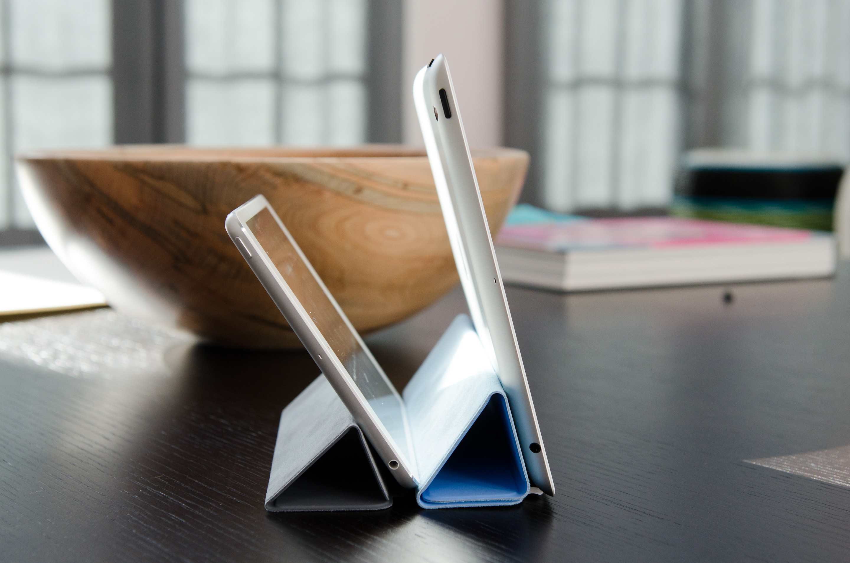
I would recommend getting a Smart Cover for the versatility of the stand and to have some form of protection for the screen. Plus, the black iPad mini + red Smart Cover combination just looks awesome.


140 Comments
View All Comments
daar - Wednesday, November 21, 2012 - link
Who manufactures the display? I recall in reviews of old this was mentioned, would be nice to see in future reviews of anything with displays this info, thanks.zepi - Tuesday, November 20, 2012 - link
Since the current-gen ipad-retina-displays are pretty abysmal in terms of power usage (see displaymate's measurements for example), would it be unreasonable to expect LTPS or IGZO panels to make things considerably better?Apple uses Low-Temperature polysilicon IPS in iphone for a reason and it's said that the forthcoming IGZO's would help in power consumption as well.
I think that Ipad 4 is a "failure" as it doesn't address any of the shortcomings of the 3rd Gen ipad. Namely weight, thickness and reasonably poor visibility in direct sunlight. Though Apple just decided it's not worth the tradeoff to use A6 instead of A6x to reduce the battery weight by a tiny margin.
doobydoo - Wednesday, November 21, 2012 - link
Firstly - the iPad 4 isn't a 'new iPad' as much as the iPad 3 was - it's an upgrade a partial way through the year, so it shouldn't be expected to address all 'the shortcomings'.Secondly - the iPad 4 doubles the GPU power which addresses the single biggest issue with the iPad 3 - the underpowered GPU. It's significantly faster than any other tablet (as is the iPad 3).
Also it was important to get all the devices using the lightning connector.
Alucard291 - Wednesday, November 21, 2012 - link
Yeah its the newer new ipad >.>Also known as the biggest ripoff apple has yet produced. Lightning connector (differently shaped usb 2.0), not-really-upgraded soc which brought nothing for the end user. Right? Because iOS is always super smooth? Or is it not?
Wait wait wait and you're also saying that having even more unused gpu power is a shortcoming that was addressed? Well no point arguing with such logic.
Especially since the cpu is already outdated. A9's (even with a custom memory controller) are so 2011.
Man you are a MASTER of facepalms. You initiate a wave of them with every post of yours.
NCM - Wednesday, November 21, 2012 - link
Alucard291 writes: "Lightning connector (differently shaped usb 2.0)"Bzzt! Wrong.
Thanks for playing, come back when you've done your research properly.
Jorange - Tuesday, November 20, 2012 - link
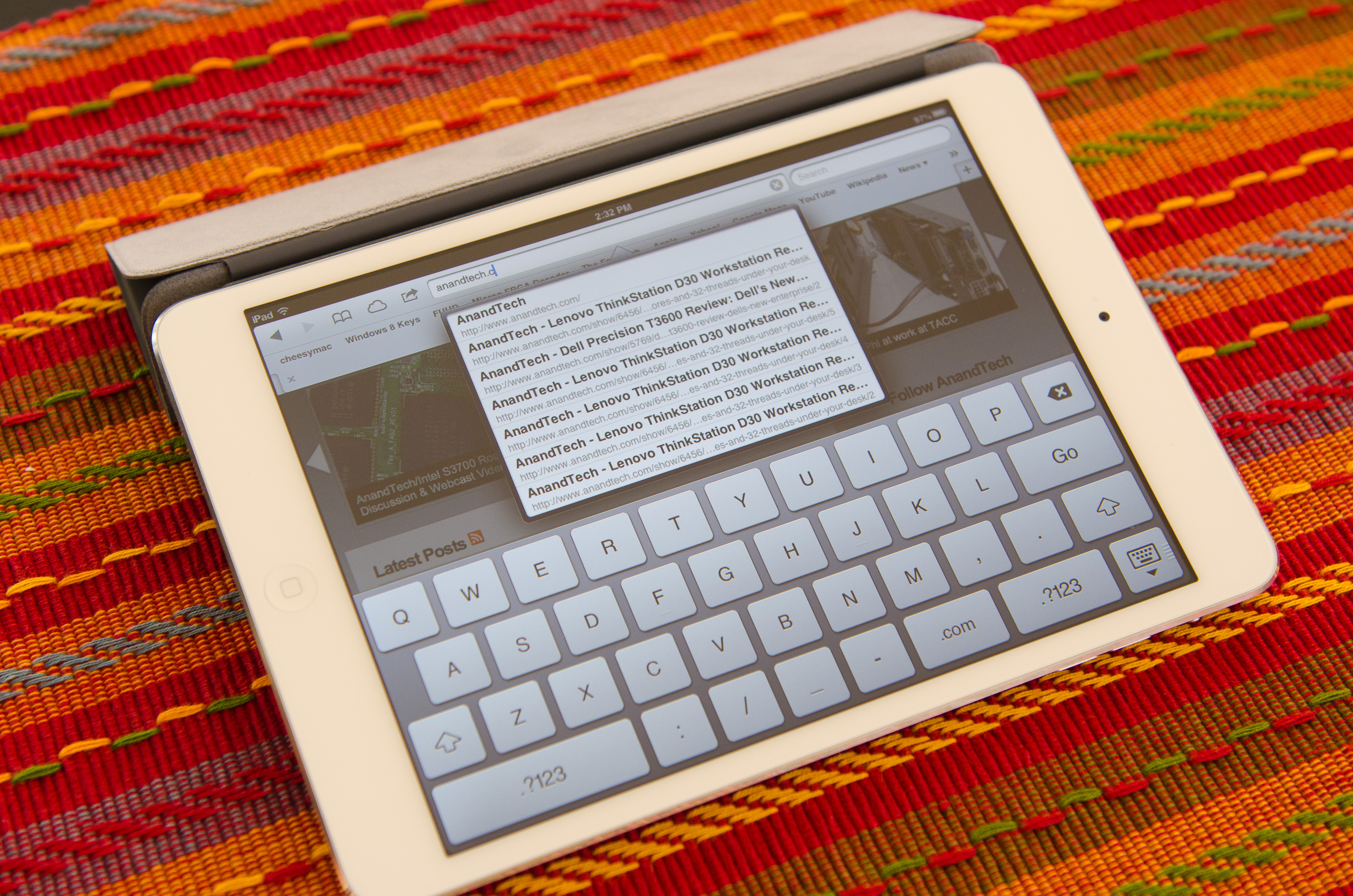
Why did you zoom in on the Anandtech website on the Nexus 7, whilst the iPad mini is zoomed out, it makes the Nexus look like it can't display a full webpage which it can!! Subtle Anti-Android bias strikes again.ChronoReverse - Tuesday, November 20, 2012 - link
I don't know about bias (I like to attribute ignorance over malice) but it seems particularly bad that not only is the N7 zoomed in compared to the Mini, but it's zoomed in so much that the N7's image is larger than the Mini's.I can see zooming so that they're physically the same size (but then the N7 would be using more pixels to render the same thing) but it's not even at that level.
michal1980 - Tuesday, November 20, 2012 - link
because Anand's bias is showing.Still waiting for this rumored 'Anandtech' windows 8 review. But OMG look a small ipad, the site owner himself reviews.
Might as well start renaming the website 'appletech'
Ryan Smith - Tuesday, November 20, 2012 - link
Our Win8 performance guide will be done this week. We're not doing a massive review (that would mostly be rehashing our significant DevPrev and ConPrev articles) will hit all the high points.And note that what Anand does has no bearing on Win8. AnandTech is more than one person, and in this case since I'm the OS guru it's my article.
michal1980 - Tuesday, November 20, 2012 - link
I'm just disapponted that a site I've trusted and visted for years, is changing focus.if its an apple thing, there are tons of in depth reviews done right away, product, os, accessories etc etc.
windows is now becoming the abandoned step child.
look at this, pages of writing, that could be summed up in 2 words:
smaller ipad.