Samsung Galaxy S III Review - AT&T and T-Mobile USA Variants
by Brian Klug on June 20, 2012 12:01 AM ESTThe SGS3s all ship running Android 4.0.4 (IMM76D), which is just a few builds short of the current latest version of Android. Atop that is the latest version of Samsung’s controversial TouchWiz theme. Like almost all skins, that means a different lock screen, tweaked notifications shade, main launcher, and settings pane.
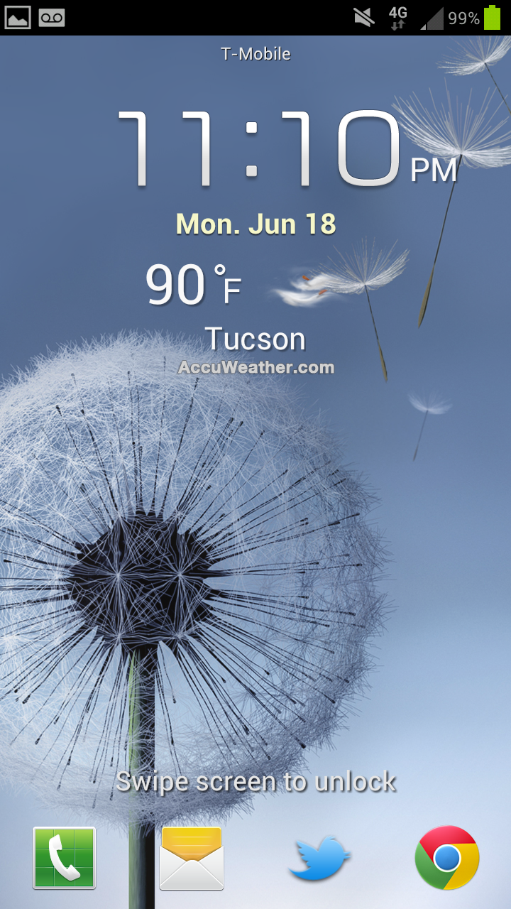
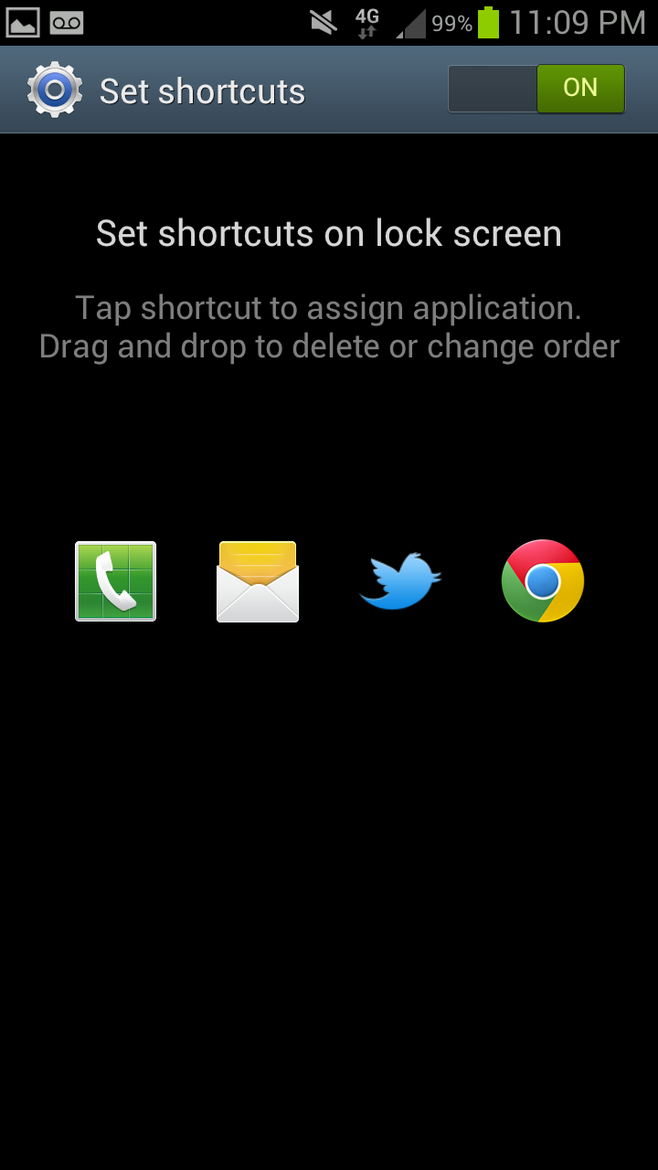
On the lock screen, there are application shortcuts which can be customized, along with a few other options. Weather, stock tickers, and an optional gestural camera shortcut are all TouchWiz enhancements. Like SGS2, missed calls or SMSes can also be directly addressed by swiping on their respective icons.
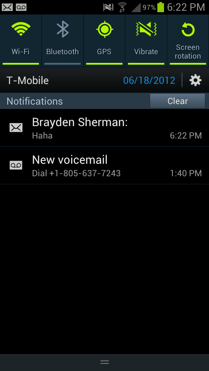

In the notifications shade, Samsung has added more power toggles. The bar slides right or left to expose those additional toggles. There’s also the date now printed alongside carrier, just left of the shortcut into the settings app which is standard in ICS. Speaking of the top status bar, TouchWiz also adds an optional battery percentage report - it blows my mind that this has been something you’ve needed to use a custom ROM to get for so long.
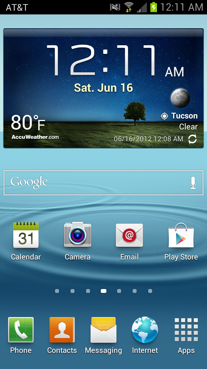
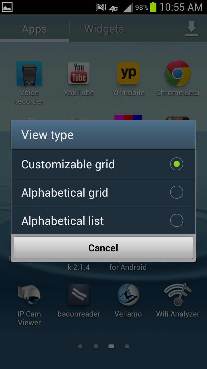
Samsung’s TouchWiz home screen goes with a 3D box left/right transition rather than the ICS stock planar swipe. For the most part however, the flow isn’t really changed from ICS. Widgets are added from a separate tab in the applications launcher, and Samsung hasn’t overwhelmed with way too many custom ones. The launcher is likewise a horizontally paginated application grid just like ICS. This can be sorted alphabetically or in a customized arrangement where newly downloaded apps get placed at the end of the list.
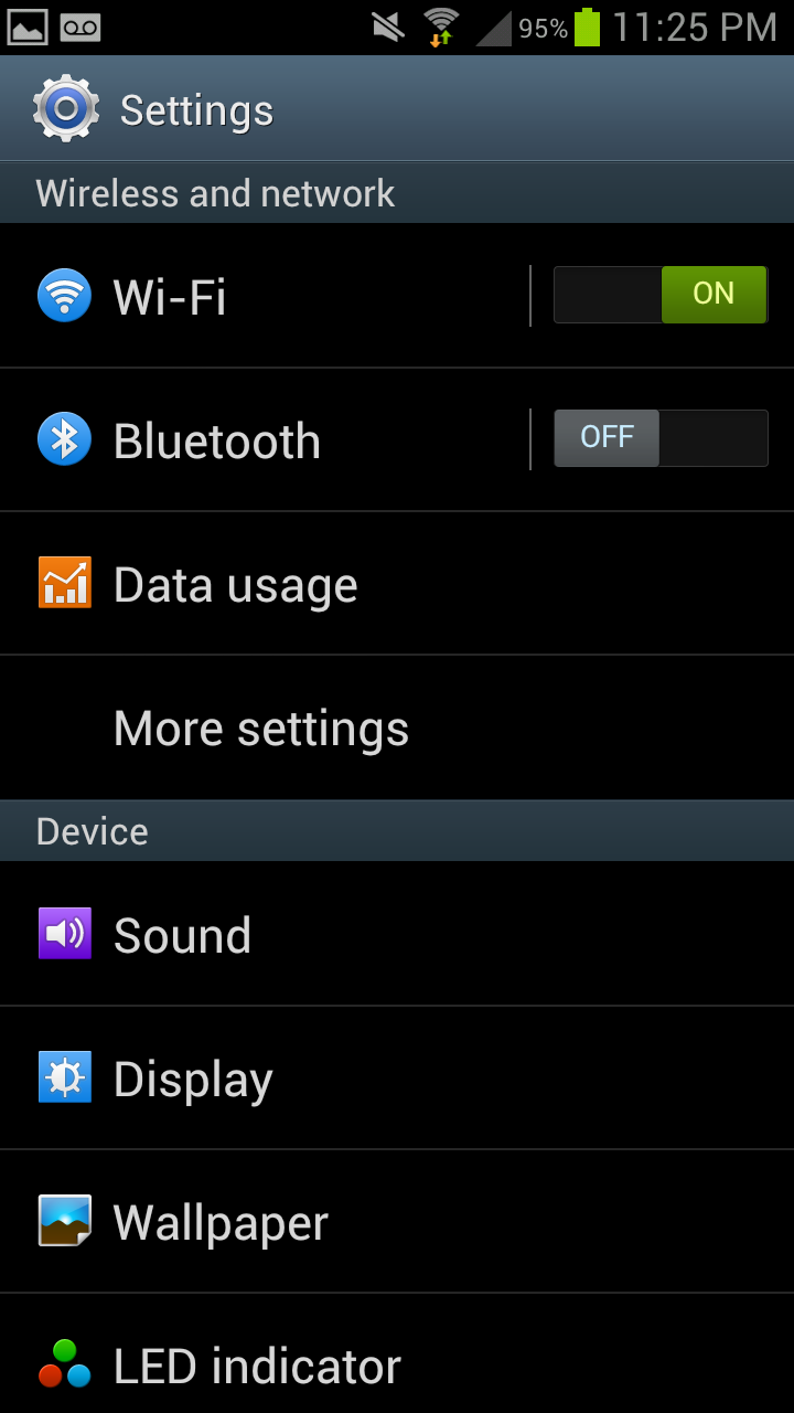
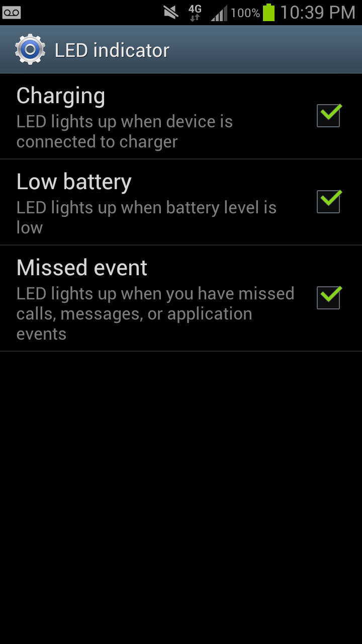
Settings gets a few new options that I think are worth going over. First is the obvious visual change which includes colorful icons that seem a bit corny but aren’t surprising. First is an option to customize the notification LED, but is pretty basic and probably will be supplanted with Lightflow for power users. Under Display is the option to enable “smart stay” which uses the front facing camera and keeps the display on when you’re looking at it, beyond the timeout length. I found that this does indeed work well, as long as there’s sufficient illumination for the front facing camera to see your face.
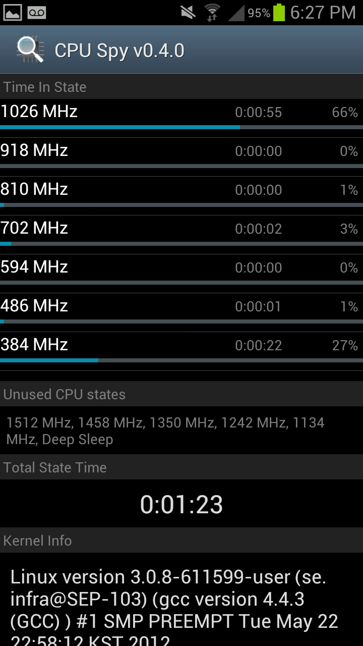
Right - CPU Spy with Power Save "CPU Power Saving" ticked
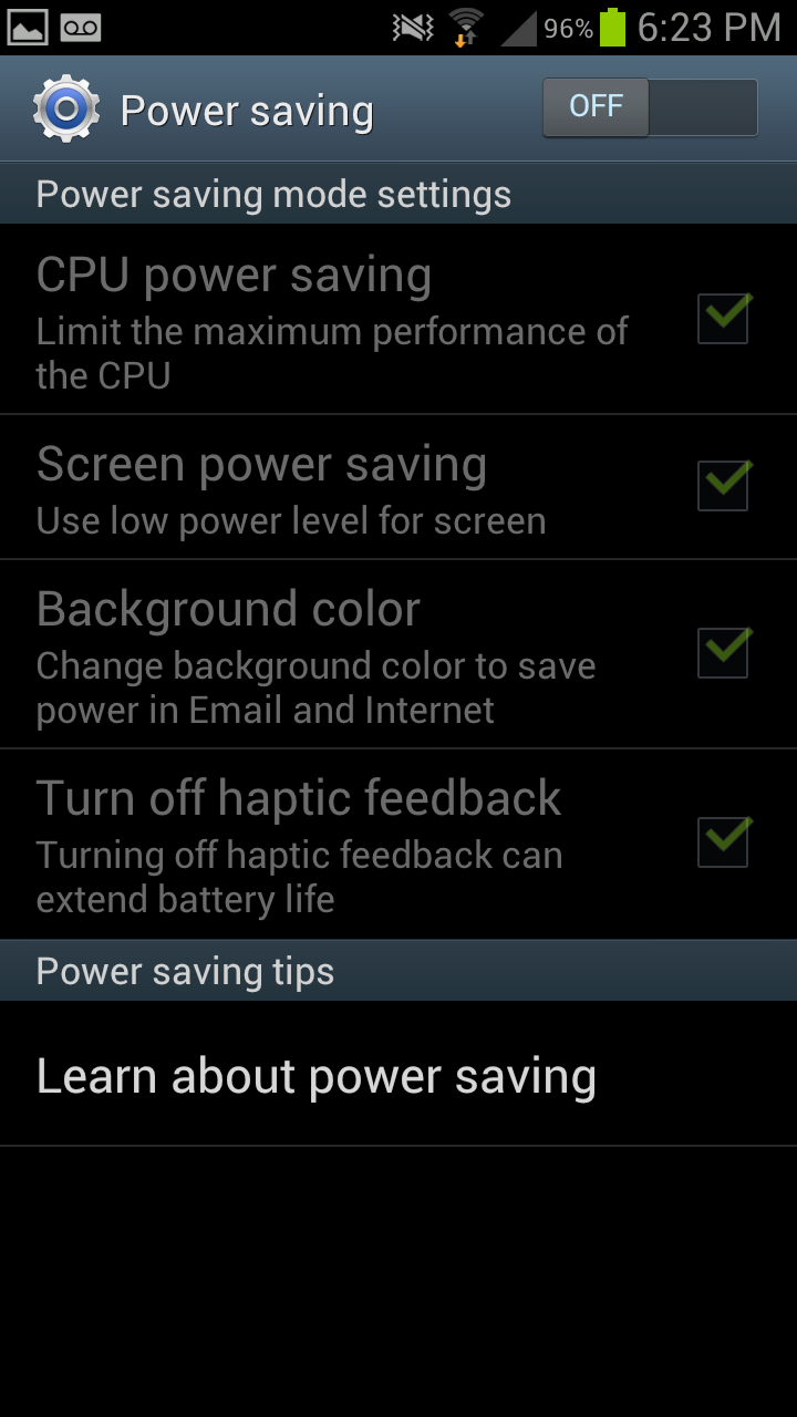
The next is more interesting - Power Saving. Under here is an option which enables you to change the SoC governor. Tick “CPU power saving” and the maximum MSM8960 CPU clock gets changed to 1.0 GHz instead of 1.5 GHz, giving you a nice savings if you’re willing to sacrifice some performance in turn for running with lower active power draw. I believe GPU clock also gets clamped as well, but can’t pull those directly. Outside of rooting and messing with the governor yourself, and a governor option pane on some ASUS products, this is the first time I’ve seen direct user access to CPU frequency since PocketPC days.

Also present are motion gestures, a lot of which I’ve seen before but never really fully utilized. Under security is that options pane I was talking about earlier for customizing the shortcuts on the lock screen, and enabling that camera launch gesture. Samsung also goes with its own browser customizations for Android 4.0.4’s stock browser, but it doesn’t deviate too much beyond just UI changes from what I can tell. Just like previous Samsung devices, I find the browser super smooth - gone are the days where browsing using the stock browser was a shuddery mess, though I still prefer Chrome Beta.
Messaging also looks very similar to how I recall it looking on the SGS2. Dialer also gets a change up and still includes a smart dial functionality.
Other than software preloads, which will differ between each carrier device, is Dropbox. Both Verizon and AT&T have opted out of the 50 GB for 2 years promotion, however the other carriers continue to enable this. I was told that the carriers who have opted out have done so because they view Dropbox as a competitor to services they’re backing or selling. I’m now up to 131.2 GB on my personal Dropbox account between free quests, the One series promotion, and SGS3 promotion.
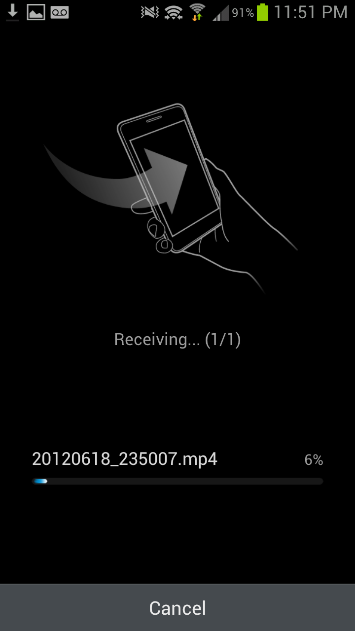
The last part are two S - features. S Beam, and S Voice. S Beam is essentially a WiFi Direct augmented version of Android Beam to enable sharing more content than just what can be sent over NFC’s limited bandwidth. The gist of it is that you can send photos or files (even large video files) using S Beam over the WiFi direct link which gets setup using NFC. For example, from gallery, one can open a video, then put two phones together, tap and hold on the prompt, and NFC takes care of both setting up the WiFi direct connection and file transfer. In practice it works surprisingly well, even for large video files. I played around and saw a rate around 40 Mbps for transfers, which is pretty close to Samsung’s cited “1 GB in 3 minutes” (45 Mbps) speed.

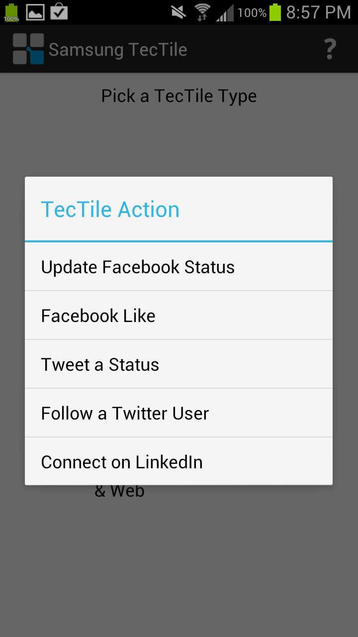
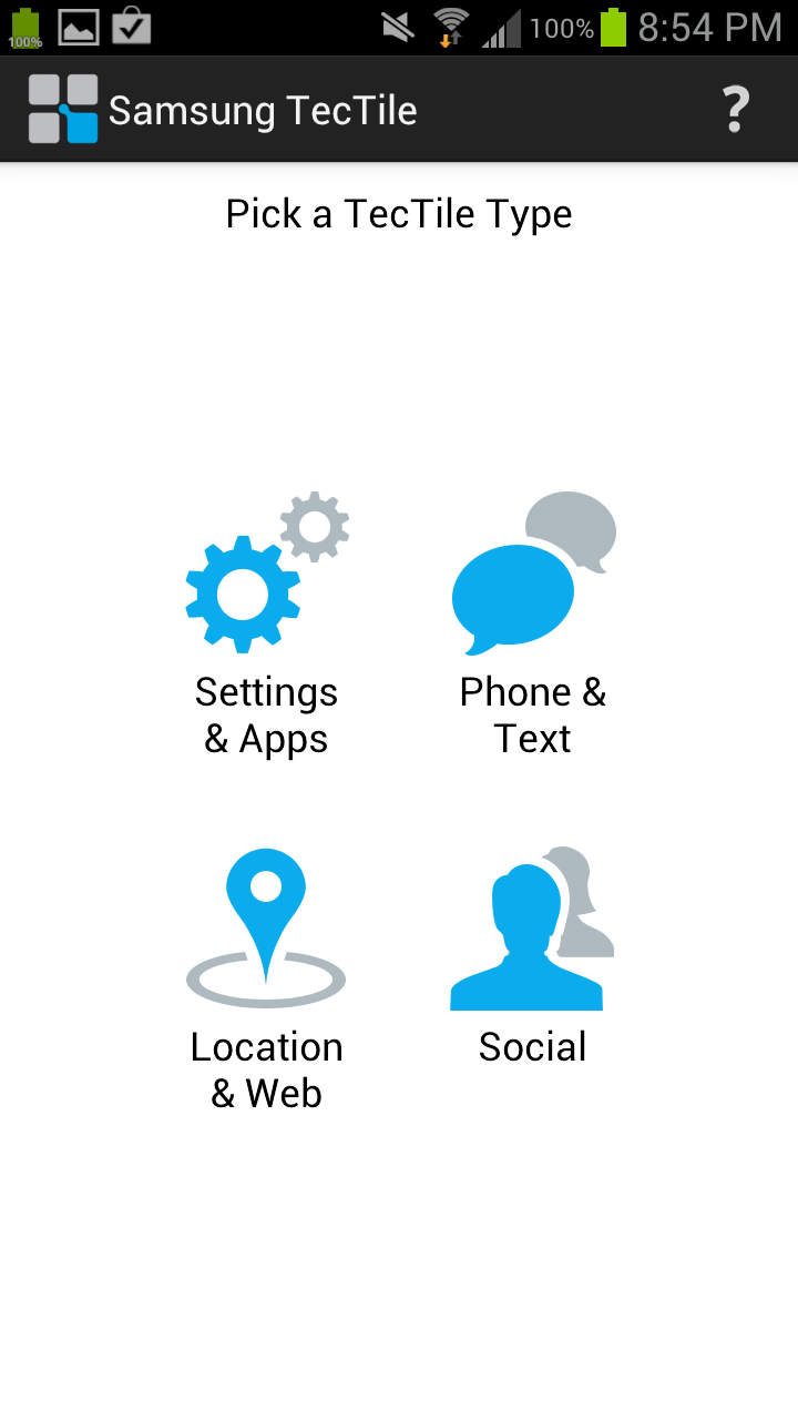
Part of S Beam is the TecTiles initiative, which is a combination of the TecTiles programmer application, and Samsung branded programmable 1KB MIFARE tags available in a set of 5 from carrier stores and online. Even though there are other NFC tags available for cheaper, and similar applications on the market, getting this in a prepackaged format into customers hands will go a long way to driving NFC adoption, which until now has been glacially slow. I programmed both my contact data and my WiFi network (hooray, no longer will I type my 20+ character PSK into new phones, at least those with NFC) into tags.
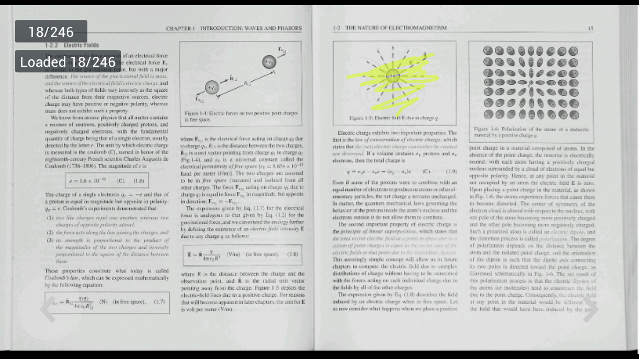
There’s also AllShare Play, which allows you to broadcast either a document, files, or photos to up to 6 devices on the same WiFi network. Trying out sharing features was partially why Samsung sampled two SGS3s, so I gave AllShare a shot with my 100+ MB electromagnetics textbook PDF scan from my ECE381 days. Sure enough, it was possible to jointly browse slides and annotate on the two SGS3s - each member of the AllShare session gets their own colored pen for annotating. I could see this being useful if you managed to round up a number of friends with SGS3s. I wish that the resolution was higher, but if I had paginated this book to be single pages instead of spreads it likely would be sufficient to read the body copy and equations.
Last but not least is S Voice. There’s no putting this lightly - S Voice is definitely a Samsung approximation of Apple’s Siri. The promise is a similar level of conversational interaction with S Voice going off and fetching data from appropriate pre-programmed sources and reporting back. A double tap on the home button fires up S Voice, and a familiar tappable microphone interface guides you through voice prompts.
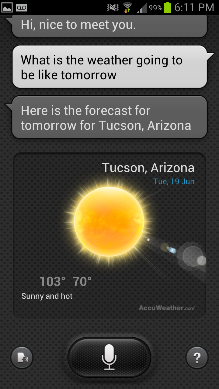
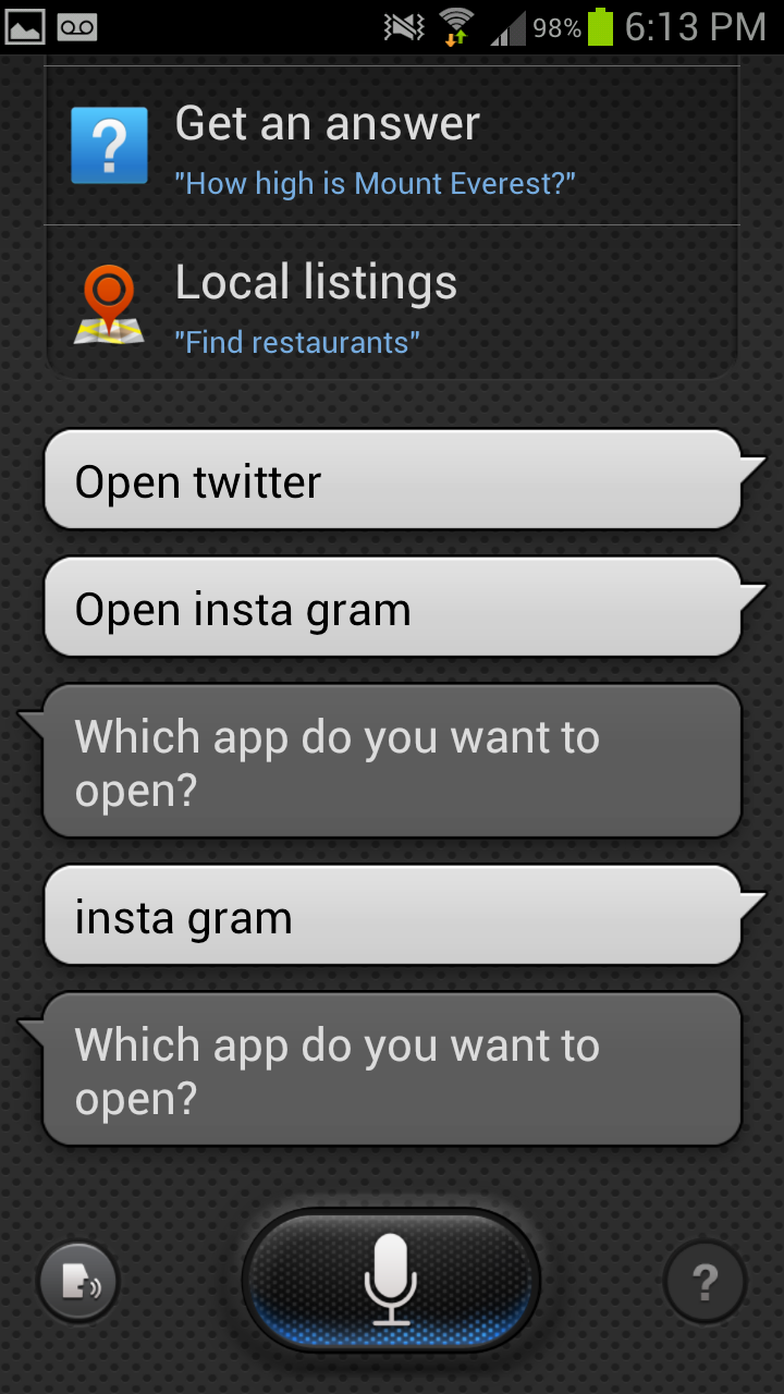
You can do a similar list of things with S Voice as you can with Siri, including asking for the weather, calling people, adding tasks, and setting alarms. A few S Voice features that were previously above and beyond Siri (such as launching apps) are now part of iOS 6, but in theory the level of functionality is pretty close. I’m actually fairly surprised about how much the functionality matches, and wonder if this is the new thing that Apple will attack aggressively with litigation. In practice, I found S Voice a lot less conversational than Siri. I still think voice navigation is kind of a trendy feature that ultimately is slower than just using my hands, unless you’re driving and can’t use the phone.


107 Comments
View All Comments
antef - Wednesday, June 20, 2012 - link
I don't believe "context menu" is the right term here. We're not discussing context menus - that would be something related to your *exact* context, such as long-pressing a row in a list and getting some options. What we're discussing is the app's "primary" menu that holds whatever could not fit on the main UI surface. In that sense, both the legacy menu and the action bar "overflow" are going to hold similar things, so what they contain is not really an item of debate. The main problem with the fixed Menu key, as Impulses said, is that it's "hidden" - since it's always present, there is really no indication that an app needs it or not, and it's also off-screen and thus doesn't feel cohesively tied to the rest of the app's UI. Action overflow, meanwhile, only appears when needed and right alongside other related functions.HTC switched to the new layout but unfortunately their use of physical buttons necessitates the nasty "full row menu button" for legacy apps. And I bet you that Samsung only stuck with the Menu key because they were too lazy to rethink parts of TouchWiz's UI - it clearly is a carryover from Gingerbread and they've shown before they don't put a lot of polish into their software. In that sense, this device is just stuck with that button because Samsung did not try to design a better user experience, not because they genuinely think this is the better way to go.
themossie - Thursday, June 21, 2012 - link
I understand what you mean, and "primary" menu is definitely a better term! However, the "action overflow" on-screen button which Google wants to replace the older "primary" menu (menu button) is not an improvement."Action Overflow" is not intended to be an actual settings menu. With "Action Overflow", Google basically says "Hey guys, you don't need 'settings' any more - just 'buttons you won't press that often." They then allow developers to put the action bar in 3 different places (http://developer.android.com/design/patterns/actio... so there's no longer consistent button placement.
The biggest problem with the menu button (for new users) was the lack of contextual cues. ICS ironically manages to fix this even as it deprecates the menu.
At this point, I'm way outside the scope of a phone review's comment sections, so I'll leave some food for though (discussion, not favoring a particular approach)
http://www.reddit.com/r/Android/comments/uda99/dea...
http://stackoverflow.com/questions/9286822/how-to-...
antef - Thursday, June 21, 2012 - link
Action Overflow is not intended to be an actual settings menu, but neither is legacy menu! it was never intended as a "settings" or "options" menu...literally just a menu to put anything you want. In this sense Action Overflow is exactly the same, only commonly used items don't have to be in the menu and instead can be directly on the action bar. It completely fixes the discoverability issue since the 3-dots are right there next to other icons you're already using. It leads you to it and it appears part of the app's UI.Thanks for the links. :)
synaesthetic - Wednesday, June 20, 2012 - link
Google was smoking crack when they got rid of the menu button. I installed a custom ROM onto my Nexus to make the menu button come back.I have never used a real serious app that didn't have a contextual menu. Never. And the "ICS friendly" apps that use the dotdotdot in-app menu like to put them in really obnoxious places... like the TOP OF THE SCREEN.
Holy carp Google, this phone is already huge, you want me to drop it trying to hit that menu key with my thumb?
The SGS3 having a menu button makes me want it EVEN MORE.
antef - Thursday, June 21, 2012 - link
I do have to tilt my Nexus forward a bit to reach up there with my thumb, but this is no different than having to reach up there for anything else, including the main action icons which are going to be up there no matter what.It is true that most apps used legacy menu, but still, nothing has to. That makes the very idea of an always present button silly. The nav bar should stick to system-wide navigation as it does on the Nexus and leave things pertaining to an app to be on the app's UI surface. The OP of the Stack Overflow link said it best:
"This [the overflow button] seems much more intuitive for users than throwing them into a separate menu list that requires the user to jump from a touch(screen) interaction to a button based interaction simply because the layout of the ActionBar can't fit them on the bar."
What he's saying is the on-screen controls and off-screen controls are different UI "sections" that shouldn't intermingle during the course of using an app. An app's controls should all be available within the app's UI. It's more cohesive and straightforward. In practice, it only ever really appears in the top right or bottom right, and most of the time the top right. It's not jumping all over from app to app like some people like to suggest.
8er - Friday, June 22, 2012 - link
Menu button is good.Physical home button, even better. It is huge selling point for me.
Side bar. I do not comprehend how anyone can say 'insert button name here' is bad. It looks like a search button and it searches or a menu buttons bring up menus, or a home buttons brings you home, and someone is confused?
If the above is true then that person is helpless. I will not apologize for sounding crass, but that person gets left behind. You are not left starving on an island kind of crass. If you do not understand what selecting an icon might do then a smart phone is too much for you.
robinthakur - Friday, June 22, 2012 - link
Yes, this totallyl! Coming from an iPhone, the long press to access multitasking is really slow and rubbish, I wasn't sure whether this is the same across all Android handsets. It doesn't help that on iOS, the commands are flipped and long press is Siri with double tap or four finger upwards swipe being multitask! The use of the Menu button seems haphazard as it isn't obvious which apps use it (or even which parts of the apps) and which ones don't.THX - Wednesday, June 20, 2012 - link
Folks on Head Fi are worried that the S4 chipset will strip out the Wolfson DAC. Any word what sound chip is inside the US Galaxy S3?Impulses - Wednesday, June 20, 2012 - link
Does the international version still have a Wolfson DAC? I know the SGS2 and many Tegra 2 devices did, haven't really kept up with that aspect of phones but I know a lot of people really liked that DAC because of the untapped potential in it (and the Voodoo app that it). Have they found anything particularly alarming about the One X's DAC or sound tho? (gimmicky Beats EQ aside) HF to ride their FOtM choices pretty hard and in the process anything else is deemed simply incomparable.Impulses - Wednesday, June 20, 2012 - link
that should've read "HF tends to ride"