The HP TouchPad Review: webOS on the Big Screen
by Anand Lal Shimpi on July 17, 2011 11:11 PM ESTwebOS Vernacular: Cards, Stacks and a Whole lot of Awesome
Two years ago I was still having webOS withdrawals. No one had even come close to duplicating the webOS multitasking experience and at least with iOS, you couldn't even multitask. I also missed Synergy and the unified messaging I got with my Pre. Every now and then I'd wish I was using webOS.
Since then I'd moved on. While the HP announcements earlier this year were interesting to me, they just didn't spark the same sort of excitement that I got from webOS in the early days. Perhaps it was just that I had gone too long without using a Palm device.
When I first picked up the TouchPad it started to come back to me. The webOS UI hasn't aged terribly well. It does feel a little bland compared to the effects you get in Android or iOS but the functionality is definitely still there.
There are three basic elements to webOS: the home screen, the launcher and the card. The home screen is unlike Android or iOS, there's just one single home screen. You also can't put icons on the aforementioned home screen, it's just there to act as a background.
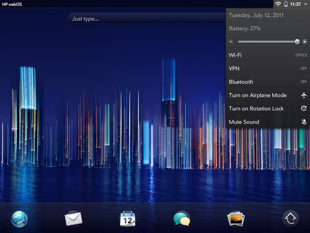
Along the bottom of the screen are five quick launch icons. You can customize these but you can't add any more than five. Next to those icons is an up arrow, tap it and you'll bring up the launcher.
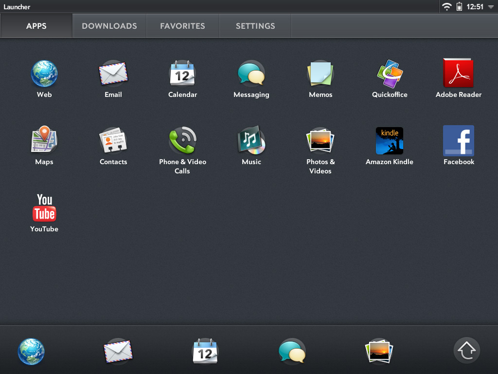
The launcher is the webOS equivalent of the iOS home screen or the Android all apps list. Like Honeycomb, the webOS launcher is divided into multiple tabs: apps, downloads, favorites and settings. You can move apps between any of these tabs, you don't have to actually obey their categories (e.g. you can put Pandora on the settings page, or move Print Manager to downloads). App icons can't exist in two tabs at the same time so once you move one it's no longer exists in its original location.
You can tap the category names to switch between tabs or simply swipe left/right to flip between them. Each category can hold more than a screen full of apps, you just scroll down to reveal more.
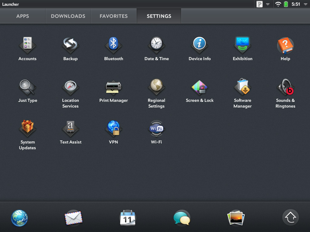
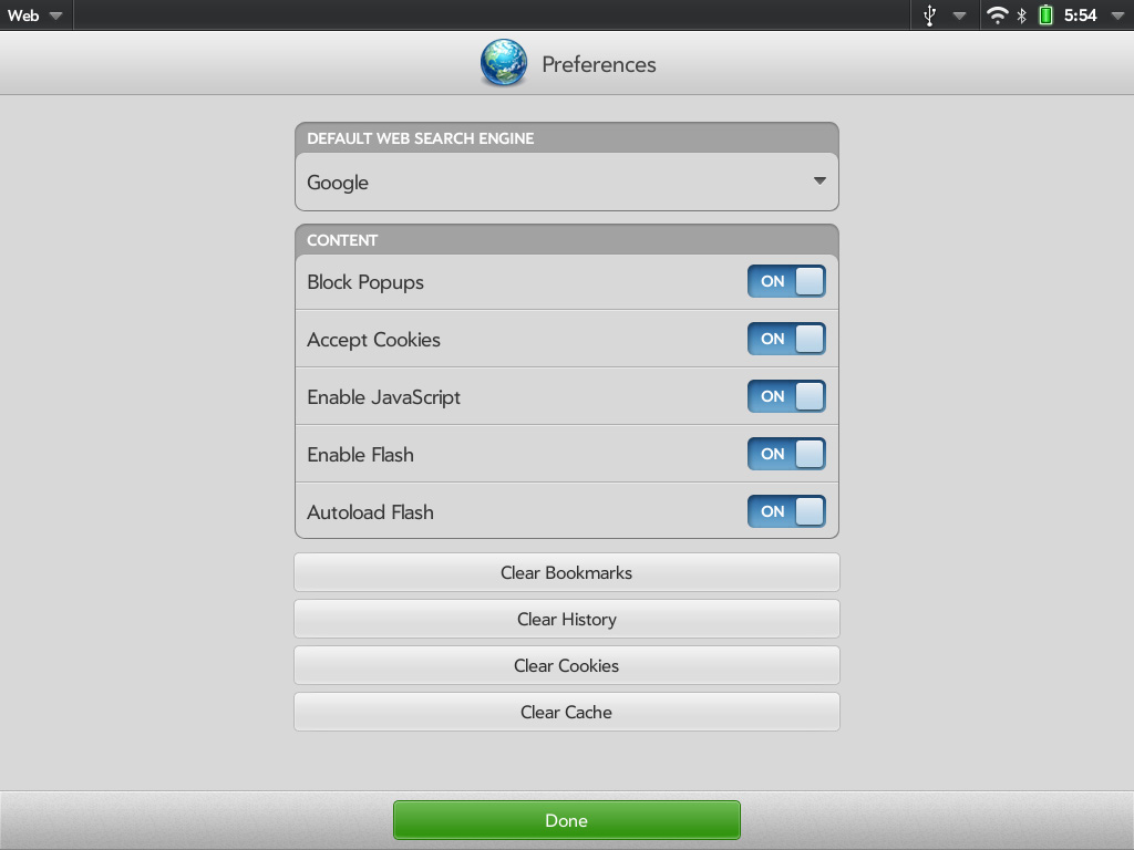
Settings in webOS take on more of a Mac/PC-like role. General system settings are accessed via the appropriate icon on the settings tab, but you also get per-app settings through each application's own app menu. I personally believe this is a more scalable setup to the iOS approach which puts all settings in one centralized location.
Having a really long page of settings just doesn't seem to be as good of an idea for scalability when you start adding a lot of apps, not to mention it slows you down when you want to change a setting within an app you're currently using.
So far everything seems pretty standard, albeit well executed. No bad decisions here. Now this where webOS gets awesome.
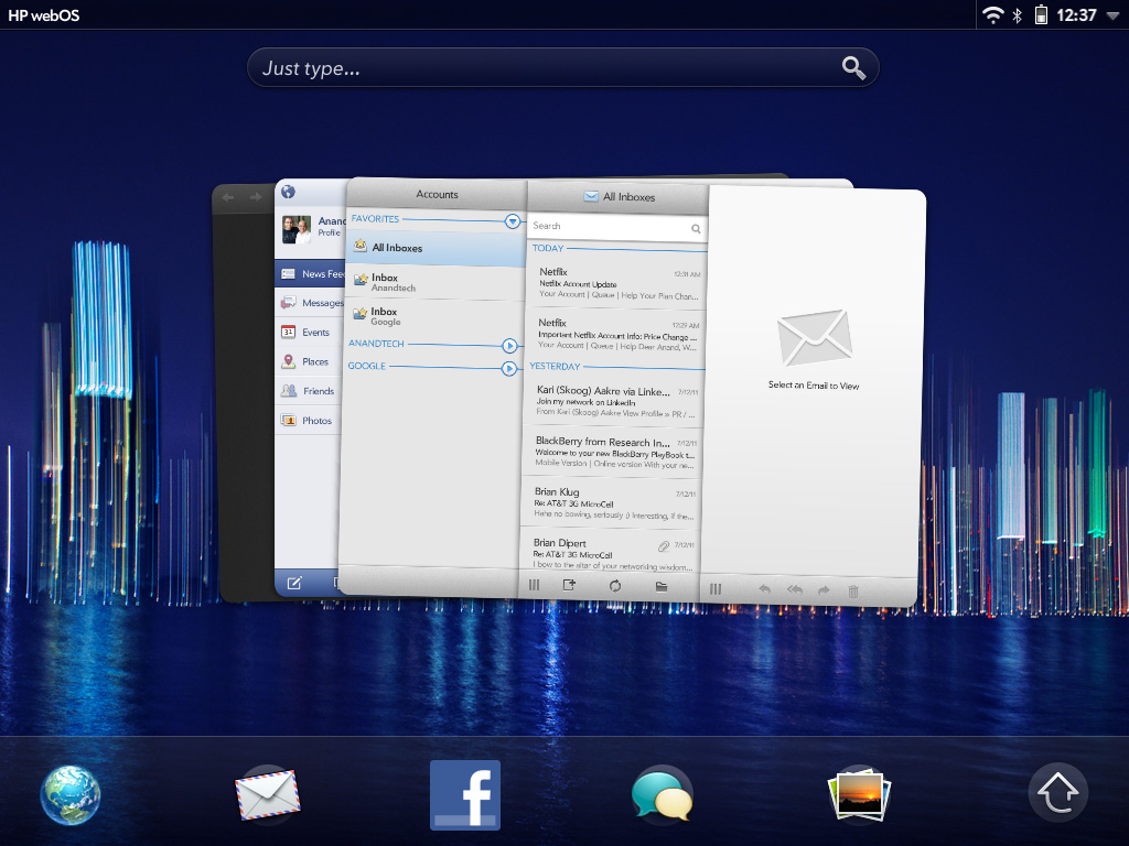
Apps launch as cards. Go to launch an app and it'll actually first start out as a small card before going full screen. Launch another app and it will appear as a card next to the first. Launch another and it gets tacked on to the end of the list, and so on and so forth.
You switch between apps in card view. To get to card view either hit the home button to zoom out of your currently active app or just swipe up from the bottom bezel. Unlike webOS based phones, swiping up from the bottom bezel is the only bezel gesture supported by the TouchPad.
Apps will continue to execute even when you've switched focus to another card, and they'll even continue to update if you're in card view and swiping around. To quit an app just flick the card up off the screen. No tablet OS does a better job of quitting apps than webOS. As soon as you throw a card off the screen, its memory is freed and available for use by other apps.
If you don't like flicking up, you can always drag a card all the way down to the bottom of the screen and let it go to rubberband shoot it off the screen. You'll even get a bad rubberband stretching sound while you do it.
The webOS card concept is the closest thing you can get on these mobile devices to having multiple windows on a desktop. They remain active when you switch away from them and it's super quick to switch between them. The webOS UI is really key in making this all happen. While Android and iOS both rely on icons or a thumbnail of the app for their task switching, the webOS approach gives you much more information about the current state of each app as well as a more intuitive UI for switching between them. Decades of innovation in GUI based desktop OSes have taught us that we can be more productive with multiple windows on a desktop and the webOS card system is the best approximation of that among mobile devices.
How do cards scale up to the big screen on the TouchPad? Very well indeed. One of my biggest complaints about tablet usage today is that multitasking is still a pain. Honeycomb addressed this with its task switcher but I honestly don't believe anyone does it quite as well as HP on the TouchPad. I'm both more likely to multitask on the TouchPad and get less frustrated (at least with the UI) while doing it. I'll get to this later but although the UI is the best I've seen on a tablet, the performance issues with webOS really keep it from reaching its potential - at least with this current iteration of webOS on the TouchPad.
While cards have been around since webOS 1.0, the concept of stacks was introduced with webOS 2.0 late last year. The idea here is simple. Whereas webOS originally just let you lay cards side by side, with webOS 2.0 and later you can actually stack cards on top of each other. The idea here is that when you have a lot going on at once your horizontal list of cards can get pretty long. It defeats the purpose of having a great multitasking UI if you have to spend several seconds scrolling just to find the card you're looking for. By stacking related cards on top of one another you cut down on the amount of scrolling and ideally keep UI efficiency high.
Stacks are created either by manually dragging a card on top of another one, or when an app spawns a new card which then appears on top. Cards in a stack fan out so you can still see a bit of what's behind the topmost card, you can also manually reorder cards within a stack or even move them out of the stack entirely.
While stacks definitely address the problem of dealing with long lists of cards, they don't solve it. Not everything makes sense to put in a stack and you don't always take the time to neatly organize your cards while you're off using your tablet, at least I don't. The one aid I believe webOS desperately needs is an Exposé like feature where you can get a look at all of your cards when you need to quick switch between the current app and one that's 10 cards away.


67 Comments
View All Comments
Conner_36 - Monday, July 18, 2011 - link
to put it simply on the ipad there are apps for thatHrel - Monday, July 18, 2011 - link
When did this become CellTech.com? Seriously at first I appreciated the coverage, but really when the OS and hardware is all basically the same you don't need to review EVERY SINGLE PRODUCT RELEASED!!!! Give us bench marks sure, so we can compare specs. Write maybe a page about your impressions on customizations and screen and what not; but that should be it. Why all the articles on this mostly the same crap? Why can't you be this devoted to laptops? There are still TONS of interesting laptops out there you haven't even talked about. I'm not just talking keyboards and screens here, but significant amounts of hardware you simply DO NOT have benchmarked.I almost feel like you need to move all this tablet/smartphone/blah blah blah crap to it's own site. I'm sick of seeing it. It's stupid and most people simply do not need it. It's not that interesting and you are focusing WAY too much on it.
Hrel - Monday, July 18, 2011 - link
P.S. WHY would I buy a 500 dollar tablet when I can get a pretty good laptop for that same price?Seriously these things need to drop down to 200 bucks or less without a 8000 dollar contract; this shit is insane. Only handheld I care about at all are PSP Vita and everything made my Archos and you guys haven't touched on any of that AT ALL!!!!!!
Honestly, FUCK anything and everything that requires a contract!!!!
jebo - Monday, July 18, 2011 - link
I disagree, I'm really enjoying Anand's looks at the mobile industry.Re: a $200 tablet, there's always the Nook Color.
Speaking of which, I would like to see the Nook Color mentioned more in these reviews. IMHO, it's still one of the top 3 choices for prospective Tablet buyers due to its cost and the screen quality. I would love to know how it more directly compares with the newer tablets.
kmmatney - Monday, July 18, 2011 - link
I bought a Nook for $189 on E-bay - direct from Barnes and Noble. It has flash enabled, but is a it under-powered. It works OK for my purposes - browsing on the couch, and entertainment while traveling. Other than that, it doesn't get used a whole lot, which is why I didn't want to spend more than $200.dookiex - Wednesday, August 17, 2011 - link
I don't understand the logic to this. You don't want to spend more than $200 so you ended up with a underpowered and under-supported nook and thus basing off your expectations of tablet devices off of your nook experience. Illogical.Mumrik - Monday, August 22, 2011 - link
And that's why so many of us just picked up HP Touchpads for 99 or 149 bucks.Impulses - Monday, July 18, 2011 - link
First off, your rant is way off base... Every single tablet can be bought sans contract. Are they overpriced? IMO, yes, but for millions of people who don't need a laptop (or who have a heavy/big laptop) these tablets are a prefect complement... And AT puts out the best tablet/smartphone reviews on the web, bar none. I really hope they don't slow down anytime soon, even though I'm not even in the market for a tablet right more.My next upgrade will probably be an ultraportable to replace my netbook (as you said, a better way to spend $500-700), but there's other places on the web doing competent laptop reviews. Smartphone reviews in particular are awful almost anywhere else, completely devoid of facts or any empirical testing. I do agree that maybe they don't need to review as many mid-range models tho, the three different reviews of single core LTE VZW phones didn't really tell us anything different... But then again, those phones ARE VZW's high end models right now so others would disagree about the reviews' priority.
sledge333 - Monday, July 18, 2011 - link
I totally agree! Sick of all these so wanabee products! Give me a laptop any day. Give me a normal phone any day! Boys and their toys! More suitable for women who carry handbags, but for men, huh! Get a tailored made pair of jeans with a crunch proof pocket to protect it!Add the cost whilst sitting outside some fancy coffee shop playing with your toy , because some bastard runs past and nicks it!
And anyone that wants to watch a movie on a piddley little screen or play games - save up your money for the opticians, you're gonna need it!
P.S I signed up today just because of the boring reviews on crap I will never use! Get back to computers not bloody toys!
SongEmu - Monday, July 18, 2011 - link
Personally, I appreciate his attention to the rapidly changing scene of mobile technology... Granted, I'd love some PC hardware bench's... but what he's doing isn't a bad thing.